Blog

The Christmas Decorators - Soho Interior Design

Christmas Will Be Here Before You Know It!

Soho Interior Design offers The Christmas Decorators.

Just a reminder to everyone that booking early to have me and my Christmas Decorators team dress up your home or business for the holidays is a great way to avoid last-minute frustration! Our available slots tend to fill up fast! We’ve been doing Christmas decorating for 5 years now, and have several very pleased repeat clients. If you’re hosting a Christmas or holiday-time party or having family visit for the holidays, we can decorate your home and create that warm, inviting Christmastime vibe!

If you think you’ll be in town and want your home done up for the holidays, early booking is a great way to lock things in. Click this link to check out some of my past holiday projects, showcased on my website. We’d love to customize your home for your Christmas! Just click the contact link on this website and message me here, or you can email me at: carmen@sohointeriordesign.com. And, of course, you can call me anytime at: (407) 947-7718. It’s easy to book The Christmas Decorators!

Read more
5 Decorating Tips to Make Your Home Cozy

5 Decorating Tips to Make Your Home Cozy

Regardless of the season, every home can benefit from adding a little cozy comfort.

Having a home that is inviting — that beckons to visitors and lingers in the minds of guests — makes for both an enjoyable and memorable place. And there’s a big benefit to creating a home that is inviting to guests: it’s more inviting to you — and that’s really the important thing — the added delight you’ll have spending time in your cozy home! I’ll share some tips to try that will help you craft a home that welcomes everyone who walks through its doors — and wraps you up in a little cozy comfort!


1. Touches from the outdoors create a cozy and organic look in your home: Use branches from your backyard to create a sculpture-like tabletop vignette. The best part of this is it’s free! What you see here is a branch arrangement that is paired with a nature-inspired bowl filled with succulents, coordinating with the grouping’s sea green and azure blue glassware.


2. Be Eclectic: Mixing and matching different styles creates a personalized look for your home.  Don’t be afraid to dive in and try it, just be sure to keep one dominant element and mix styles through the accessories.


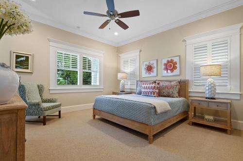
3. Layered Windows: Add more texture and warmth to a room by layering a simple shade with drapes. Here, bamboo shades are paired with a patterned drape. There are so many options available for incredibly stylish, warm and cozy results.


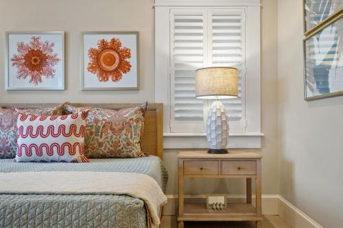
4. Upholstered Headboards: Choosing plush or upholstered furniture will set the cozy feeling throughout your home – especially for a headboard in your bedroom.


5.  Lighting: Create an “old-style” feel with a chandelier, flickering candle, or mod lamp. Having soft lighting can make a cozy and relaxing atmosphere.

Here are a few more tips to make your home feel warm and cozy:

  • Select a warm paint color
  • Incorporate wood
  • Layer with rugs
  • Add texture
  • Blend old and new
  • Add something organic in every room
  • Bring in small comforts like pillows and throws
  • Hang pictures at eye level

I hope you like these tips! Let me know what you think! If you’d like me to consult for creating more coziness in your home, I’d be glad to help! I’d love to hear from you, just click the contact link on this website and message me here, or you can email me at: carmen@sohointeriordesign.com And, of course, you can call me anytime at: (407) 947-7718.

Read more
No Entryway? No Problem! Here are 5 Beautiful Solutions!

No Entryway? No Problem! Here are 5 Beautiful Solutions!

I’ve found some exciting ideas for creating what might be described as a “faux entryway”, especially useful for homes that don’t have a foyer! These DIY small-space solutions will help you hack your way to an entryway (whether you already have one or not) — like hanging shelves, narrow tables, and cute cubbies — so you can store more in your faux entryway with style.


1. Shelf Solution

Install a wall-mount shelf that can house keys, sunglasses, and other rushing out the door essentials, while a large mirror allows for last minute checks. Be sure to use a shallow shelf, or you can risk nicking the door each time it opens.


2. Another Shelf Solution

Create your own side table with a large corbel and interesting top, the chalkboard is the perfect place to scribble last-minute reminders.


3. Color Explosion

Let the accessories do the talking. An intricately-carved table topped with glossy orange lamps and turquoise knickknacks is impressively eye-catching against white walls. Stacks of books on the bottom shelf, which doubles as storage, adds additional touches of color.


4. Vintage Charm

Old furniture is perfect for repurposing. A vintage desk, dresser or armoire near the front door collects everyday items but is also a conversation piece. This particular piece evokes country French charm; fresh florals and a hinged lamp complement the look.


5. Italian Marble Top Entry Table

Marble tables look incredibly artistic, and when attached to a wall in this fashion, can make your entryway look like an art museum. The metal bottom with the details breaks the monotony of the table and gives it an additional focal point.

Let me know what you think of these ideas! Have you created something similar in your home? Would you like to? I can help you determine what works best for your interior situation – I’d love to hear from you, just message me here, right below this blog post or at the “contact” link, or you can email me at: carmen@sohointeriordesign.com And, of course, you can call me anytime at: (407) 947-7718.

Read more
Living Coral is Pantone’s 2019 Color of the Year – Are You a Fan?

Living Coral is Pantone’s 2019 Color of the Year – Are You a Fan?

Color management company Pantone Color Institute announced its pick for Color of the Year for 2019. It’s an eye-popping orange-pink hybrid called Living Coral. You may sense and appreciate its boldness and vibrancy, so lets look at some successful uses of the new “it” color.

Pantone describes Living Coral as “an affable and animating shade whose golden undertone gives it a softer edge.” While I don’t find Living Coral particularly soft, if I’m going this bold to decorate a client’s home, I prefer to be a little less trendy. But if you’re loving this intense color, here are some ideas of how to use it in your home and yard.

Living Coral is bold and bright. Here are places to consider using it indoors and out: 


1. Textiles. An easy way to integrate and play with a bright color in a room is to start small and simple, such as with accent pillows and throws. These pieces offer a dash of color that isn’t overwhelming, and they aren’t a big commitment since they are affordable enough to swap out down the road if you get tired of the color.

2. Decorative accents. If you want to take things a bit further with Living Coral, think about sprinkling it in a few small areas throughout a room via artwork, floor or window treatments, or side tables or other small pieces of furniture. It’s a small amount of a big color, so this application doesn’t look too busy. By dispersing the color, you draw the eye all around the room.

3. Furniture. If you want to go bolder, consider larger, more statement-making coral-colored furniture. Now I would never advise someone to decorate with a color simply because it has been deemed fashionable, but having your favorite color become trendy means it will be easier to find all manner of items in that hue. So if you are a big fan of bright coral and want to decorate with it, 2019 will be your year to stock up on home furnishings.

4. Accent wall. Ready to go really bold with Living Coral? Painting one or two walls in a saturated coral is a great way to pack a punch with this color. Just think about keeping the other wall or walls light and neutral, especially if you are using this color as an accent in a bedroom. Too much of this hue could start to feel busy and anxiety-inducing, in my opinion.

5. Architectural accent. Because Living Coral is such a striking color, it can be called into service to bring attention to interesting architectural elements in your home. Whether using it on a beautiful built-in desk and bookcase or in a cool and contemporary stairway, go bold to make it stand out. Just keep in mind, if you attempt to make everything in a room stand out, then nothing does. So use the vivid hue thoughtfully on only those elements worth the attention.

6. Outside. A smart way to use a vibrant color that you love without knocking yourself or your guests over the head with it is to take it outside to furniture or accessories. Because of the abundance of natural light during the day (or the forgiveness of darkness at night), outdoor areas can take vivid color more easily than indoor rooms, especially dark or cramped indoor spaces that can feel claustrophobic when decorated with intense colors.


7. Front door. A favorite place to use a daring color is on the front door. The kinetic coral in this photo is energetic and inviting. To me, this is the best use of the lively hue — to welcome visitors to your home.

Let me know what you think of Pantone’s color choice? Have you used it in your home? Would you like to? I can help you determine what works best for your interior situation – I’d love to hear from you, just message me here, right below this blog post or at the “contact” link, or you can email me at: carmen@sohointeriordesign.com And, of course, you can call me anytime at: (407) 947-7718.

Read more
Holiday Decor that Lasts from Thanksgiving to Christmas

Holiday Decor that Lasts from Thanksgiving to Christmas

Here are some ways to keep your decor fresh throughout the holiday season with these easy tips and ideas. I’s easy to transition your holiday decor from Thanksgiving to Christmas with a few simple updates if you like, but these should cover your needs for the entire season.
 

Gather Ornaments in a Bowl
It’s never too early to unpack a pretty collection of ornaments, especially when you have a handsome way of displaying them. Take this silver bowl: It’s a lovely receptacle for ornaments. A few striped balls add just a pop of color. Tip: Try changing the color, finish, or shape for visual variety that blends seamlessly with your non-holiday decor.

Craft a Fruity Wreath
Place this lush, harvest-themed wreath on your mantel for a fresh-and-fruity take on holiday decor. To form the leafy wreath, we bunched lemon leaves and secured them around a wreath frame with floral wire. A little hot-glue joins faux pears, oranges, and nuts together, and a quick wrap in floral wire binds the fruity grouping to the wreath. You can use real fruit, if preferred, but we recommend faux fruit for long-lasting cheer.


Pile On the Apples
Make a modern cornucopia by piling Granny Smith apples, pine cones and greenery in a vintage suitcase. Double the visual impact by using the open suitcase top as a frame for your favorite winter photograph; just use double-sided tape to secure the image in place.

Dress Up Inexpensive Ornaments
Paint and glitter can be fantastic helpers to create miniature focal points around your house. For example, classic gray paint and a dusting of glitter add contrast and sparkle to ordinary decorations. Wrap a tiny box in neutral paper and add pinecones and greenery for color.
 

Play Up Natural Holiday Elements
Tuck a small vase inside a larger glass urn and fill the space between the two with mixed nuts. Fill the small vase with water and add fresh flowers or greenery.

Mismatch Glass Pieces for Your Mantel
To make your mantel holiday-ready in minutes, pair a few red-hue glasses, votives, vases, and champagne flutes together and fill with mini white candles. Tuck a few real or faux berries around the containers for a lovely interior accent that will please no matter the season.
 

Combine Colors and Accents
Pinecones evoke autumn, while silver and blue often call to mind winter. A deft combination of the two provides a dramatic yet easy decorating accent. Here, various shades of spray paint transform the textural beauty of pinecones.

Enhance Your Staircase with Twigs
Tie bundles of bare tree and winterberry branches to the spindles on your staircase for an autumnal look. After Thanksgiving, tie pine boughs to the branches with pretty velvet ribbon, and wire Christmas ornaments around the velvet ribbon for extra color.
 

Mix Fruit, Greenery, and Pinecones
For decorations that smoothly transition from Thanksgiving to Christmas, start with neutral basics. A beveled-edge mirror topped with simple white candles creates a classic foundation. For Thanksgiving add a simple fall garland and mini pumpkins. When Christmas draws near, replace harvest elements with pine boughs, clementines, and pinecones (as shown).

Combine Greenery and Ornaments
Trays filled with ornaments make a great holiday centerpiece. For warmth, temper the shine with small sprigs of greenery and miniature pinecones tucked between the ornaments or even inside small vases. Keep the vibe casual with a smattering of larger pinecones placed around or underneath the container.

If you’d like help in creating a lovely holiday mood for your home, email me at: Carmen Dick or call me at: (407) 947-7718 and we can discuss possibilities.

Read more
What I discovered at The International Window Covering Expo!

What I discovered at The International Window Covering Expo!

Well, it was time for another…field trip! The International Window Covering Expo was in Tampa in March, so I decided that, since it was so close to home, I had to make this one, no excuses! So, I drove over there and brought Mary with me. Mary has been with me since I started this journey of decorating, and she has stuck by me through thick and thin. She is an amazing seamstress, having produced hundreds of beautiful draperies, bedding, and pillows for all of my clients for the past 14 years. I would be lost without her. We ventured off early in the morning and had a great time and ,of course, had to indulge in some adult beverages afterwards, at my favorite venue, The Columbia Restaurant. So glad we went, very informative, and a LOT of great products and ideas!

Next month I’ll bring you up to date on the nursery decorating, and more photos to come! And speaking of the nursery, I’m also planning a “Parents to Be Party” in May for my son Ryan and daughter-in-law Jenny! I love throwing a good party and will post my tips for creating an elegant and fun event. Stay tuned.

Exciting new product idea

So, here’s what really stood out to me, and I’ll propose this for the right client (maybe you?)…Tableaux Decorative Grilles. These are grilles that allow for virtually unlimited use in interior or exterior home design or home decorating projects. They can be used for window treatments and transoms, ceiling treatments, decorative accents and wall art, partition screens, and miscellaneous decor. Checkout these photos…AMAZING, right!


#bwg_container1_0 #bwg_container2_0 .bwg-container-0.bwg-standard-thumbnails { width: 724px; justify-content: center; margin:0 auto !important; background-color: rgba(255, 255, 255, 0.00); padding-left: 4px; padding-top: 4px; max-width: 100%; } #bwg_container1_0 #bwg_container2_0 .bwg-container-0.bwg-standard-thumbnails .bwg-item { justify-content: flex-start; max-width: 360px; } #bwg_container1_0 #bwg_container2_0 .bwg-container-0.bwg-standard-thumbnails .bwg-item a { margin-right: 4px; margin-bottom: 4px; } #bwg_container1_0 #bwg_container2_0 .bwg-container-0.bwg-standard-thumbnails .bwg-item0 { padding: 0px; background-color:rgba(255,255,255, 0.30); border: 0px none #CCCCCC; opacity: 1.00; border-radius: 0; box-shadow: 0px 0px 0px #888888; } #bwg_container1_0 #bwg_container2_0 .bwg-container-0.bwg-standard-thumbnails .bwg-item1 img { max-height: none; max-width: none; padding: 0 !important; } @media only screen and (min-width: 480px) { #bwg_container1_0 #bwg_container2_0 .bwg-container-0.bwg-standard-thumbnails .bwg-item0 { transition: all 0.3s ease 0s;-webkit-transition: all 0.3s ease 0s; } #bwg_container1_0 #bwg_container2_0 .bwg-container-0.bwg-standard-thumbnails .bwg-item0:hover { -ms-transform: scale(1.1); -webkit-transform: scale(1.1); transform: scale(1.1); } } #bwg_container1_0 #bwg_container2_0 .bwg-container-0.bwg-standard-thumbnails .bwg-item1 { padding-top: 50%; } #bwg_container1_0 #bwg_container2_0 .bwg-container-0.bwg-standard-thumbnails .bwg-title2, #bwg_container1_0 #bwg_container2_0 .bwg-container-0.bwg-standard-thumbnails .bwg-ecommerce2 { color: #CCCCCC; font-family: segoe ui; font-size: 16px; font-weight: bold; padding: 2px; text-shadow: 0px 0px 0px #888888; max-height: 100%; } #bwg_container1_0 #bwg_container2_0 .bwg-container-0.bwg-standard-thumbnails .bwg-thumb-description span { color: #323A45; font-family: Ubuntu; font-size: 12px; max-height: 100%; word-wrap: break-word; } #bwg_container1_0 #bwg_container2_0 .bwg-container-0.bwg-standard-thumbnails .bwg-play-icon2 { font-size: 32px; } #bwg_container1_0 #bwg_container2_0 .bwg-container-0.bwg-standard-thumbnails .bwg-ecommerce2 { font-size: 19.2px; color: #CCCCCC; }
/*pagination styles*/ #bwg_container1_0 #bwg_container2_0 .tablenav-pages_0 { text-align: center; font-size: 12px; font-family: segoe ui; font-weight: bold; color: #666666; margin: 6px 0 4px; display: block; } @media only screen and (max-width : 320px) { #bwg_container1_0 #bwg_container2_0 .displaying-num_0 { display: none; } } #bwg_container1_0 #bwg_container2_0 .displaying-num_0 { font-size: 12px; font-family: segoe ui; font-weight: bold; color: #666666; margin-right: 10px; vertical-align: middle; } #bwg_container1_0 #bwg_container2_0 .paging-input_0 { font-size: 12px; font-family: segoe ui; font-weight: bold; color: #666666; vertical-align: middle; } #bwg_container1_0 #bwg_container2_0 .tablenav-pages_0 a.disabled, #bwg_container1_0 #bwg_container2_0 .tablenav-pages_0 a.disabled:hover, #bwg_container1_0 #bwg_container2_0 .tablenav-pages_0 a.disabled:focus, #bwg_container1_0 #bwg_container2_0 .tablenav-pages_0 input.bwg_current_page { cursor: default; color: rgba(102, 102, 102, 0.5); } #bwg_container1_0 #bwg_container2_0 .tablenav-pages_0 a, #bwg_container1_0 #bwg_container2_0 .tablenav-pages_0 input.bwg_current_page { cursor: pointer; text-align: center; font-size: 12px; font-family: segoe ui; font-weight: bold; color: #666666; text-decoration: none; padding: 3px 6px; margin: 0; border-radius: 0; border-style: solid; border-width: 1px; border-color: #E3E3E3; background-color: rgba(255, 255, 255, 1.00); box-shadow: 0; transition: all 0.3s ease 0s;-webkit-transition: all 0.3s ease 0s; } jQuery('.bwg_nav_cont_0').remove() if( jQuery('.bwg_nav_cont_0').length > 1 ) { jQuery('.bwg_nav_cont_0').first().remove() } function spider_page_0(cur, x, y, load_more) { if (typeof load_more == "undefined") { var load_more = false; } if (jQuery(cur).hasClass('disabled')) { return false; } var items_county_0 = 2; switch (y) { case 1: if (x >= items_county_0) { document.getElementById('page_number_0').value = items_county_0; } else { document.getElementById('page_number_0').value = x + 1; } break; case 2: document.getElementById('page_number_0').value = items_county_0; break; case -1: if (x == 1) { document.getElementById('page_number_0').value = 1; } else { document.getElementById('page_number_0').value = x - 1; } break; case -2: document.getElementById('page_number_0').value = 1; break; case 0: document.getElementById('page_number_0').value = x; break; default: document.getElementById('page_number_0').value = 1; } bwg_ajax('gal_front_form_0', '0', 'bwg_thumbnails_0', '0', '', 'gallery', 0, '', '', load_more, '', 0); } jQuery('.first-page-0').on('click', function () { spider_page_0(this, 1, -2, 'numeric'); return false; }); jQuery('.prev-page-0').on('click', function () { spider_page_0(this, 1, -1, 'numeric'); return false; }); jQuery('.next-page-0').on('click', function () { spider_page_0(this, 1, 1, 'numeric'); return false; }); jQuery('.last-page-0').on('click', function () { spider_page_0(this, 1, 2, 'numeric'); return false; }); /* Change page on input enter. */ function bwg_change_page_0( e, that ) { if ( e.key == 'Enter' ) { var to_page = parseInt(jQuery(that).val()); var pages_count = jQuery(that).parents(".pagination-links").data("pages-count"); var current_url_param = jQuery(that).attr('data-url-info'); if (to_page > pages_count) { to_page = 1; } spider_page_0(this, to_page, 0, 'numeric'); return false; } return true; } jQuery('.bwg_load_btn_0').on('click', function () { spider_page_0(this, 1, 1, true); return false; });
#bwg_container1_0 #bwg_container2_0 #spider_popup_overlay_0 { background-color: #000000; opacity: 0.70; }
if (document.readyState === 'complete') { if( typeof bwg_main_ready == 'function' ) { if ( jQuery("#bwg_container1_0").height() ) { bwg_main_ready(jQuery("#bwg_container1_0")); } } } else { document.addEventListener('DOMContentLoaded', function() { if( typeof bwg_main_ready == 'function' ) { if ( jQuery("#bwg_container1_0").height() ) { bwg_main_ready(jQuery("#bwg_container1_0")); } } }); }
Read more
Pantone's Color of the Year for 2018 is (drumroll please)...Ultra Violet!

Pantone’s Color of the Year for 2018 is (drumroll please)…Ultra Violet!

Just the name sounds powerful and mysterious, but this color is a strong bluish violet, that the Pantone Color Institute says is ‘inventive and imaginative, Ultra Violet lights the way to what is yet to come. A dramatically provocative and thoughtful purple shade, PANTONE 18-3838 Ultra Violet communicates originality, ingenuity, and visionary thinking that points us toward the future.’

Pantone is an international color-matching system, the industry standard, that provides complete matching of standardized color for all materials used in interior design, architecture, manufacturing and related industries (like textiles) and printing. If you have a brand color or colors – or just something you’re trying to match precisely – it’s likely Pantone will be involved in the process.

Laurie Pressman, vice-president of the Pantone Colour Institute, said: “The Pantone colour of the year has come to mean so much more than ‘what’s trending’ in the world of design; it’s truly a reflection of what’s needed in our world today.” Leatrice Eiseman, executive director of the institute, said: “We are living in a time that requires inventiveness and imagination. It is this kind of creative inspiration that is indigenous to Pantone 18-3838 ultra violet, a blue-based purple that takes our awareness and potential to a higher level.”

So back to Ultra Violet. Wow, at first blush, it looks pretty intense, a bit tough to dive into. But the more I spent studying it, I could see a variety of ways to use it that would not only enhance, but totally beautify designs. And when I went online and looked at how some people have already used the color in their design work, I was blown away, and I’ll be sharing some of those images with you below. This bold, blue-tinged purple hue, while highly regal, is not as easy to decorate with as a color like blue, for example. But here are a few ways to work Ultra Violet into interiors:

Use it as an accent – The easiest way to start decorating with a new color is to take baby steps, like having a rug with a few violet threads, or a pair of purple throw pillows, or a few sprigs of violet flowers (or lilacs) in a vase.

Soften it with other purples, pinks, and blues – This is a great way to utilize a bold color like Ultra Violet, by working with other shades in the same family of colors – mauve, blue, blush lilac, etc. – which will soften it and have the color feeling completely at home.

Create a moody theme – “Moody” is a great description of purple, dark and romantic. A very bold approach would be to embrace other supersaturated dark colors and rich luxe fabrics like leather, velvet and dark-colored woods. Big, bold…deep and intense…are you up for it?

So check out some examples of some wonderful interiors utilizing this new color in various ways (isn’t Pinterest great?!). Of course these designs are copyrighted by their respective designers, but that’s what PInterest and Google are for…inspiration! Have at it – and let me know what you think, if you find yourself inspired with this vibrant, interesting, rich new color for 2018. Is this color inspiring you? I’d love to hear your thoughts! Email me at: carmen@sohointeriordesign.com or call me at: (407) 947-7718


Read more
Designing thoughts on a pink & gold nursery

Designing thoughts on a pink & gold nursery

If you received my newsletter, you know it’s “Grandbaby time!” Our son Ryan and daughter in law Jenny are expecting their first baby in July! Jenny and I came up with a theme of a perfectly pink-and-gold nursery. A palette of soft pinks and ivories, enlightened by gently touches of more saturated pink tones and pops of gold finishes. I showed a few idea images of pink and gold nurseries in the newsletter, but want to share more images here in the blog. Some very exciting and inspirational ideas here. Let me know what you think. Email me at: carmen@sohointeriordesign.com or call me at: (407) 947-7718

Read more
More Flowers! Council of 101 Spring Luncheon 2017

More Flowers! Council of 101 Spring Luncheon 2017

Floral centerpieces for a good cause and a great group! Colorful Spring flower pom-pom balls…

I created the centerpieces for our annual Ladies’ Luncheon as hand-held bouquets wrapped in brown floral paper, that could be purchased for a donation! They were a huge hit and we had lots of fun (and collected a LOT of donations!) – you’ll notice I also dressed for the part (color-wise and round flowers). For me, flowers are such a joy and you can’t have too many of them in your life!

Read more
Flowers for Baby Jack's Baby Shower

Flowers for Baby Jack’s Baby Shower

One of my closest friends asked me to create centerpieces for her daughter-in-law’s baby shower.

I was so excited, particularly since I love working with flowers, and know how they can set the tone for an event. I wanted to make some joyful and memorable pieces, but never something to interfere with what really counts: the joyful emotions and experiences taking place at the event itself. Color choices are very important, and since it was a boy, I selected baby blue hydrangea for the key color component. I also chose white roses for a baby’s purity and innocence, along with Bells of Ireland, beautiful outward-reaching greens signifying thriving good health and growth. Together, these colors would weave a subtle story of love and promise. For the overall shape, I was inspired by an arrangement I had at home, and once I got going, the organization of the elements came naturally…and beautifully! My friend was so pleased with the result, and the guests all wanted to take them home. The event itself was such a joy, and my friend is a proud, beaming Grandmother of a happy, healthy…and loud baby boy!

Read more