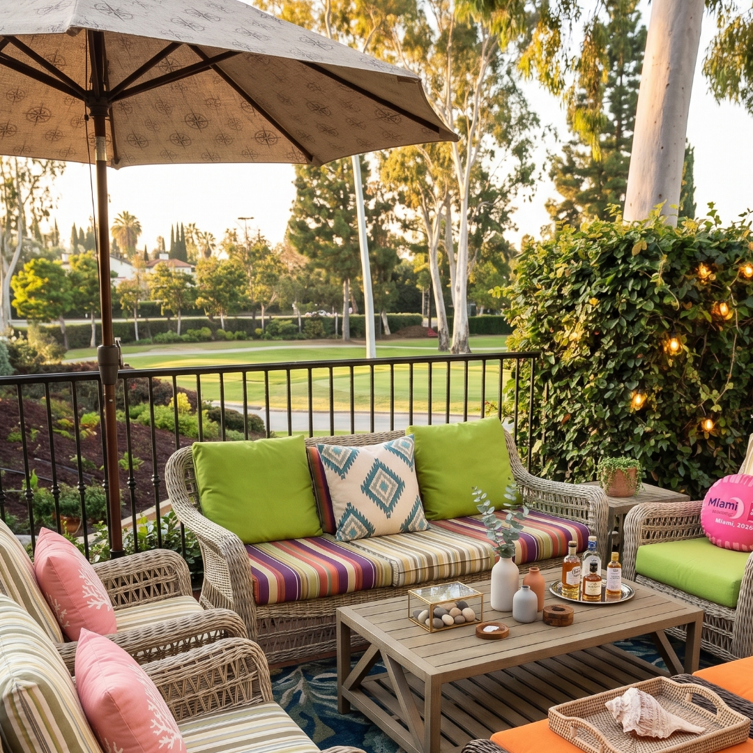
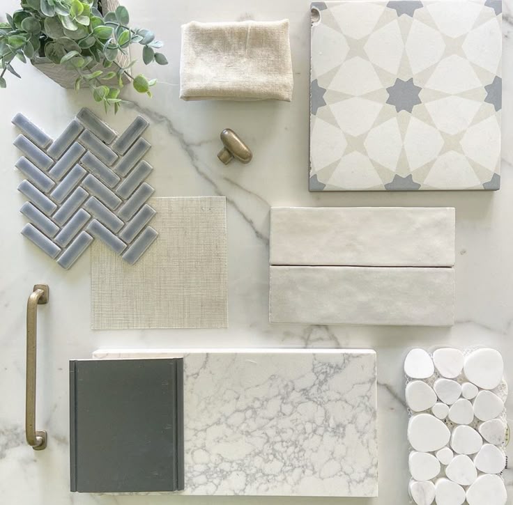
Archives for RESIDENTIAL

The warm neutrals designers are reaching for in 2026

Beyond Gray: The Warm Neutrals Designers Are Reaching For in 2026

Gray had a wonderful run, and it earned it. For more than a decade it was the neutral that went with everything — calm, flexible, easy to live with. If you have a gray home and you love it, nothing about that has changed, and you won't hear me say otherwise. But something has shifted: gray used to be the default, the safe pick you reached for without thinking. In 2026, it has company. The whole warmer side of the neutral family is getting attention again, and it's worth knowing your options — because "neutral" no longer means one thing.

Why is gray no longer the only neutral?

It isn't that gray went wrong. It's that the menu got bigger. After years of cool, sleek, gray-and-greige rooms, designers everywhere are reaching for warmer foundations — and homeowners are following, because those rooms simply feel good to walk into. The look defining this year is layered, textural, and lived-in, and warm neutrals are the easiest way into it. So this isn't a "gray is out" story. It's a "you have more to choose from now" story.

What are warm neutrals?

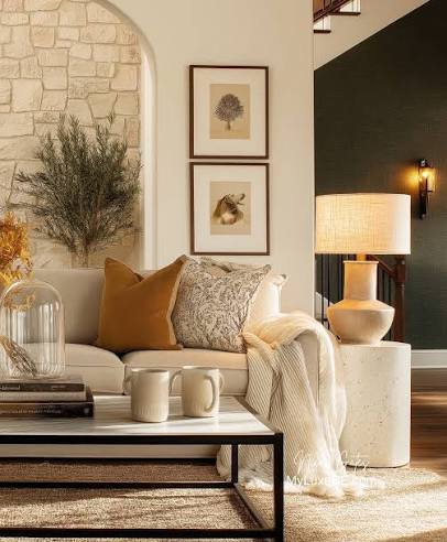
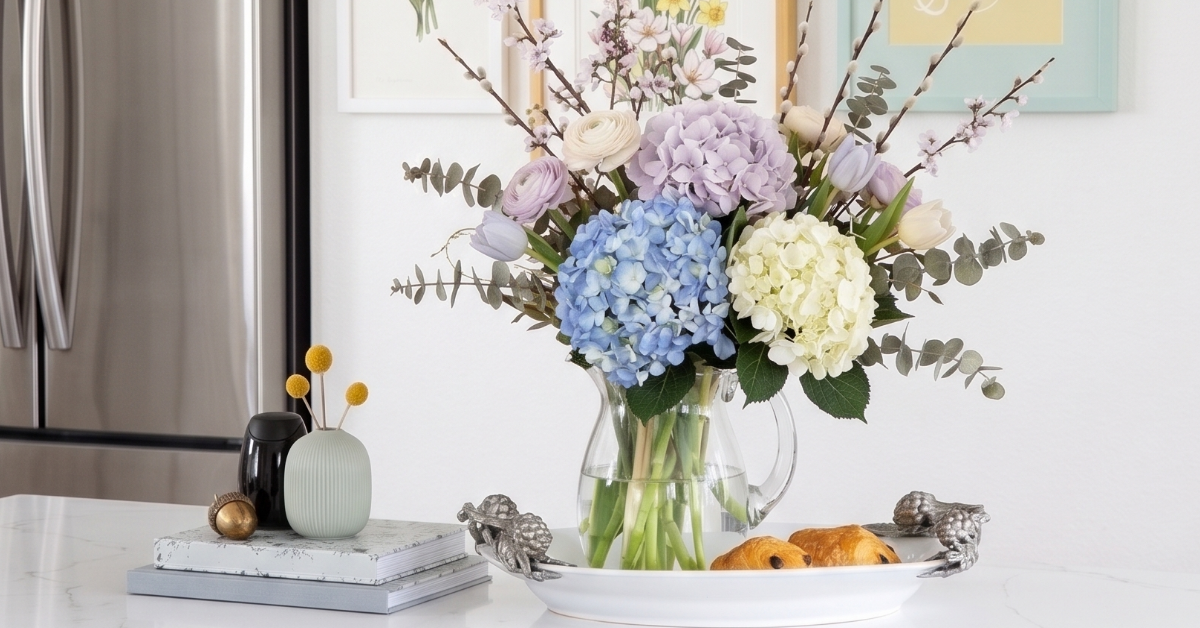
Warm neutrals are the soft, grounded shades on the warmer end of the neutral family — creamy ivories, warm whites, putty, oatmeal, taupe, and gentle browns. Where cool grays have a blue or silver undertone, warm neutrals carry hints of yellow, red, or earth, which makes a room feel cozier and more enveloping. The neutral spectrum runs from cool (gray, greige) through soft middle tones to warm (taupe, ivory, brown) — and your home can sit anywhere on it.
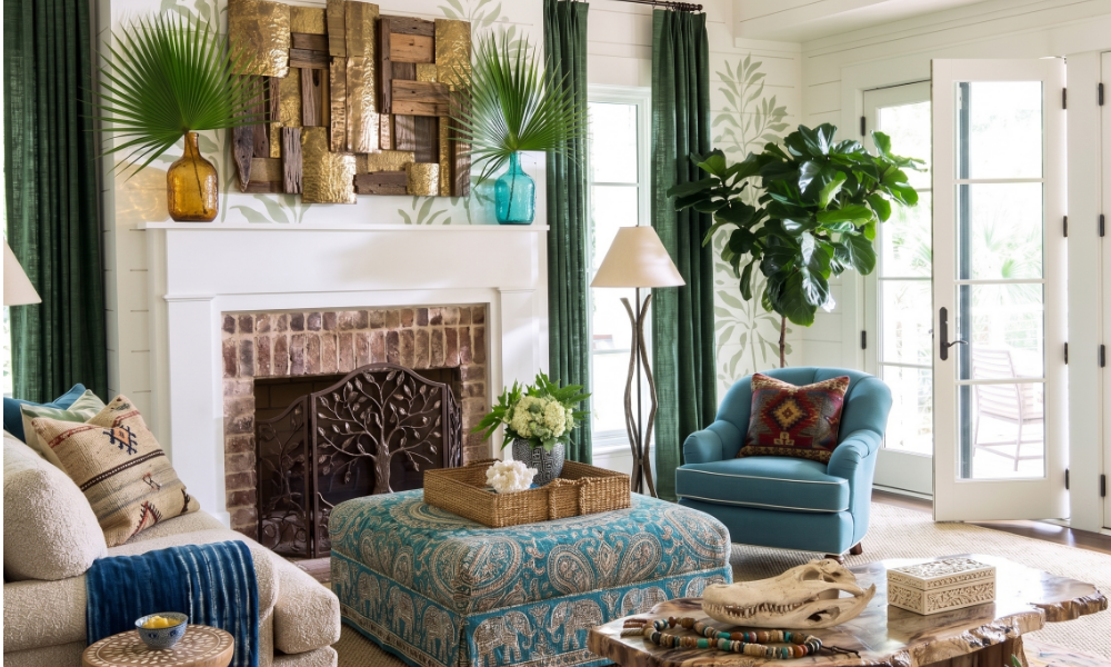
warm neutrals designers are loving in 2026
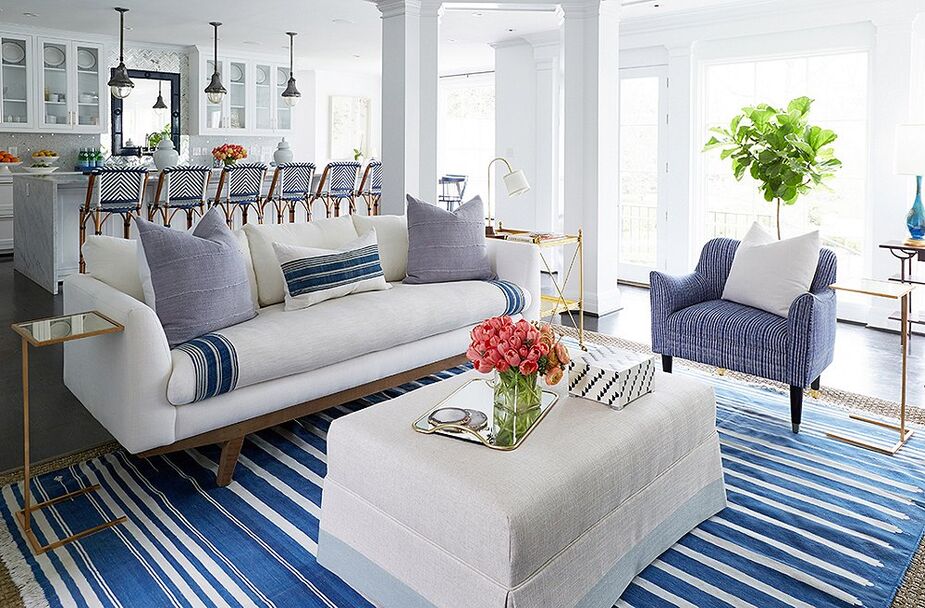
the warm neutrals designers are reaching for in 2026

How do warm neutrals work in Florida light?

This is the part that matters most here, because our light is unlike almost anywhere else. We get a lot of sun, it's strong, and it's with us all year — and it reads color honestly. Cool grays can fall a little flat under that intensity, sometimes shading toward blue or looking cooler on the wall than they did on the chip. Warm neutrals tend to do the opposite: that same strong light makes them glow, soft and golden rather than stark. It's the same reason warm fabrics and natural textures are everywhere this year — in Florida light, warmth simply holds up better than cool does.

Are warm neutrals just beige all over again?

Fair question — and no. The flat, sad tan of 2005 is not what's coming back. Today's warm neutrals are about depth, not blandness: a creamy white with a whisper of warmth, a putty that shifts beautifully through the day, a taupe layered against linen, wood, and woven texture so the whole room feels rich instead of one-note. It's the same idea as a well-dressed window — quiet on its own, but it makes everything around it feel finished.

Can you warm up a gray room without repainting?

Absolutely — and this is the best news in the whole conversation. If you love your gray, you don't have to touch the walls. Warmth is something you can layer in, and a few small moves will shift the whole feeling of a room.

The neutrals designers are loving in 2026

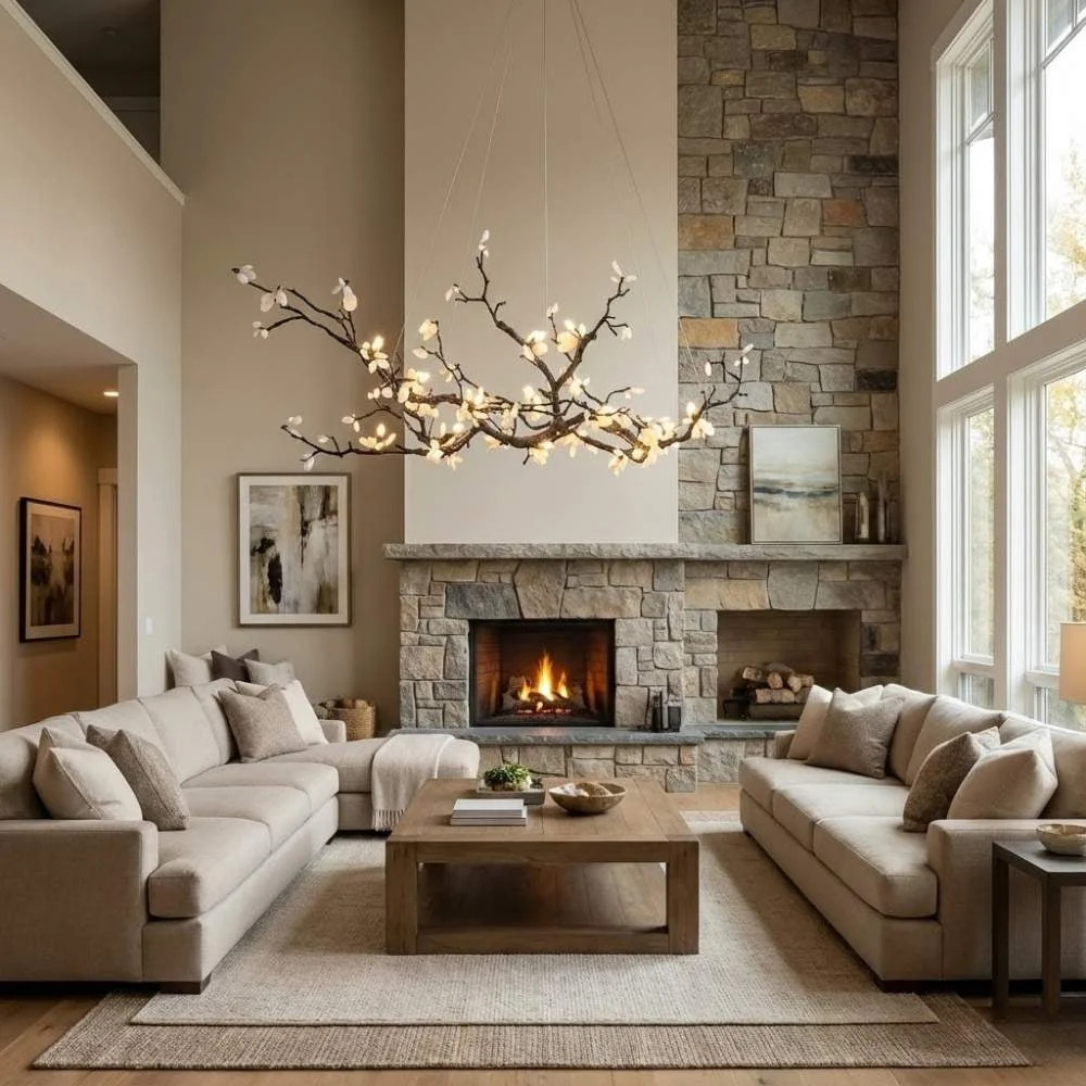
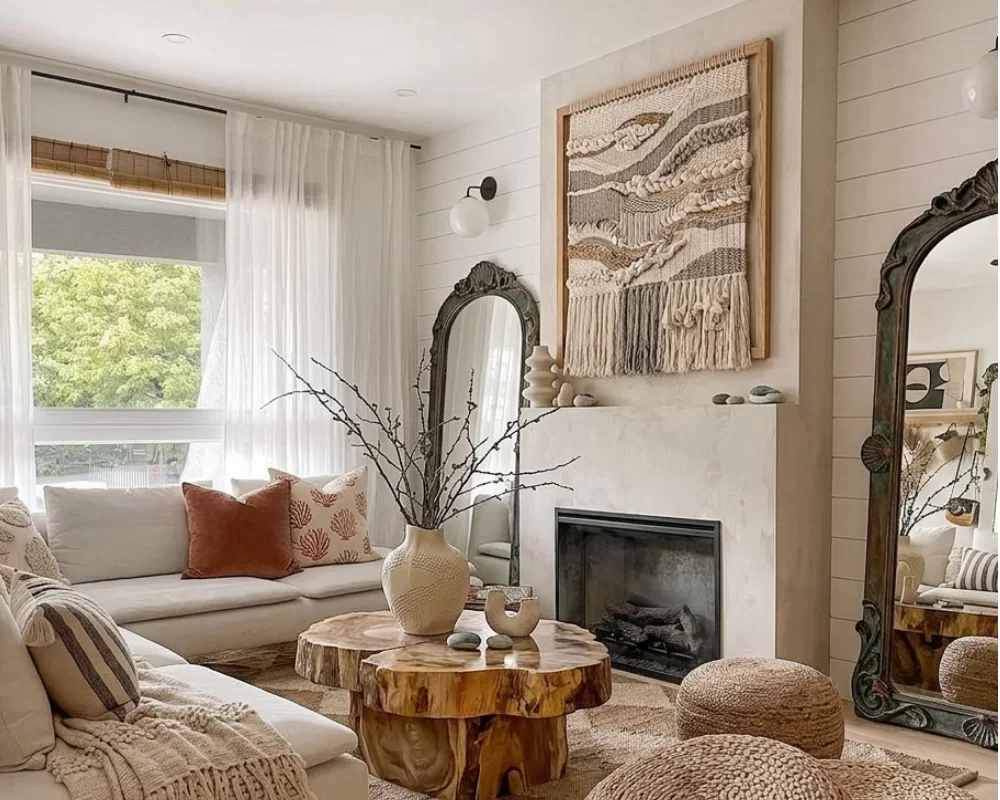
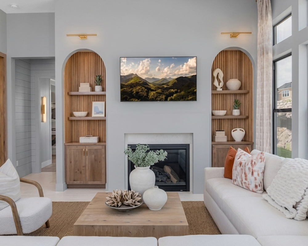
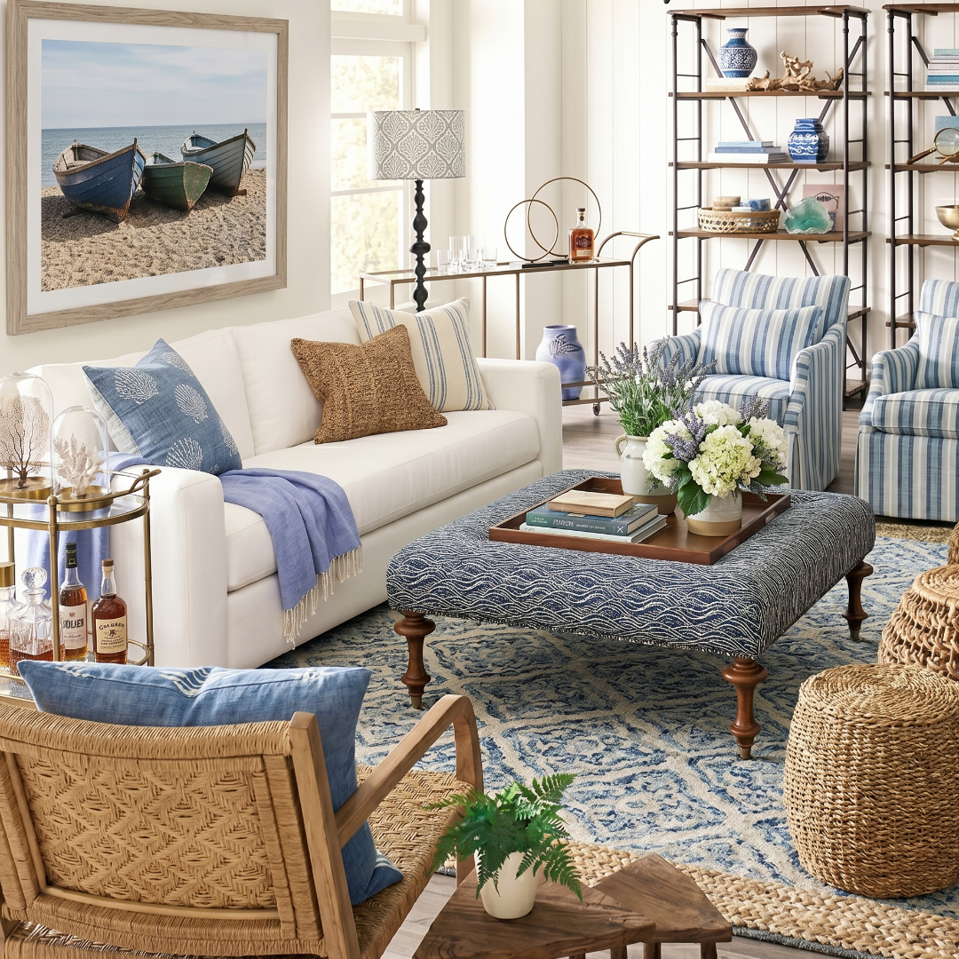
Proof that gray and warm aren't opposites — soft gray walls stay put while a textured rug, creamy upholstery, and a terracotta pillow or two bring all the warmth.

Easy ways to warm a cool room (no repainting required)
  • Add wood tones. A warm-wood table, stool, or frame instantly takes the chill off a gray palette.
  • Layer natural texture. Linen, jute, rattan, and wool bring warmth that color alone can't.
  • Swap cool textiles for warm ones. Trade icy whites and cool grays in your pillows and throws for cream, oatmeal, and soft caramel.
  • Choose brass over chrome. Warm metals in lighting and hardware do a lot of quiet work.
  • Warm the light itself. Soft-white bulbs over cool-white make any room feel cozier the moment they're on.

And if you are ready to ease toward warm neutrals on the walls, you don't have to commit the whole house at once. Start with one room you spend real time in, live with it, and let it tell you where to go next.

Where should you start with warm neutrals?

A few reliable first moves, depending on how far you want to go:

  • Trim and ceilings: swapping a cool white for a warm white is the smallest change with the biggest payoff.
  • The main living room: the room you use most rewards a warm neutral the fastest — it's where "cozy" registers.
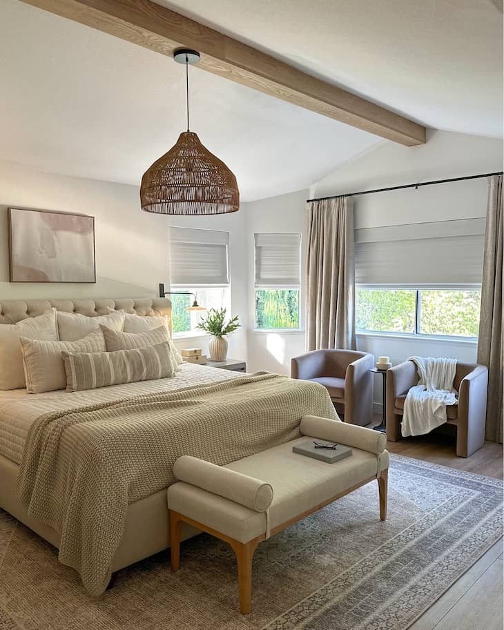
  • Bedrooms: putty, oatmeal, and soft taupe make a primary bedroom feel calm and enveloping.
  • Open-plan spaces: one warm neutral carried across connected rooms keeps everything cohesive and light.
  • North-facing or shaded rooms: warm tones counter the flatter light these rooms tend to get.
the warm neutrals designers are reaching for in 2026

A warm neutral worth trying: Sundew

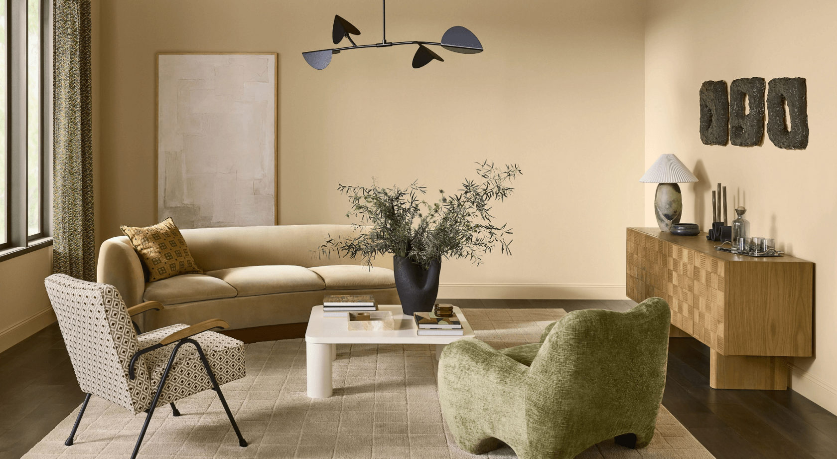
If you'd like a specific place to start, Sundew from Sherwin-Williams is a lovely one — a soft gold-beige that gives you real, sun-touched warmth without a hint of heaviness. It's a true do-anything neutral, right at home in the spaces you live in most, like a living room or kitchen, where a color has to play well with everything. Pair it with natural materials and warm wood tones, and that creamy backdrop comes alive with texture. Whether you lean toward a calm, organic feel or something a little more laid-back and luxurious, Sundew goes whichever way you do.

At the end of the day, this was never about right or wrong, or about anyone needing to repaint a home they love. It's simply that "neutral" has more meaning than it used to — and more ways than ever to make a space feel like yours.

Warm Neutrals Designers are loving in 2026
Photo Credit: Sherwin-Williams Color of the Month June 2026 Sundew

Curious which neutral would suit your home and your light? Let's find the one that feels right for the way you live.

Get in touch with Carmen
Read more
Why a room isn't finished until the windows are

The Last Layer: Why a Room Isn’t Finished Until the Windows Are

I can walk into a room that's been put together with real care — a good sofa, art on the walls, a rug someone clearly agonized over — and still feel that something's not quite right. Nine times out of ten, it's the windows. Either they're bare, or they're wearing a thin pair of panels that stop a few inches above the floor, hung right at the top of the frame like they're a little embarrassed to be there. For years, window treatments were the thing everyone saved for last and then never quite got around to. In 2026, designers have flipped that completely — and honestly, it's about time.

The reason is simple. Everything in design right now is moving toward warmth: softer palettes, natural texture, rooms that feel layered and lived-in instead of hard and bare. And nothing warms a room the way fabric at the window does.

Why are window treatments suddenly a design statement?

Because a bare window is a hard edge. Drapery does quiet, powerful things to a space. It softens the architecture. It adds a vertical line that makes ceilings feel taller. It absorbs sound, so a room feels calmer the moment you walk in. And it brings in the kind of texture — linen, a nubby weave, a fabric you want to touch — that everyone's chasing this year. A beautifully dressed window is often the difference between a room that looks decorated and a room that looks finished.

Why a Room Isn't Finished Until the Windows Are

The whole room softens the moment these curtains go up. A gentle green, floor-length and full — proof that the last layer is the one that matters

What are window treatments?

Window treatments are the fabrics and coverings used to dress a window — drapery panels, sheers, Roman shades, woven shades, and blinds. Beyond privacy and light control, they're one of the most powerful tools for making a room feel warm, finished, and intentional.

What makes window treatments work in Florida light?

Our light is a gift and a problem at the same time. We get a lot of it, it's strong, and it's with us all year — so the way you handle it matters more here than almost anywhere. Done right, window treatments let you keep the brightness you love while taming the hard midday glare, and they protect what's underneath it. That afternoon sun will quietly fade a rug, a sofa, a piece of art, and good drapery and sheers are the easiest insurance you can buy against it.

I almost always layer here. Sheers or a fine linen filter the harshest part of the day into something soft and golden, while lined panels you can actually draw give you real control when you want it — in a bedroom, especially, where our early sunrise will wake you whether you asked it to or not. And on those big sliders out to the lanai, the goal is to dress the glass so it reads intentional and soft, never bare and never blocked.

why a room isn't finished until the windows are

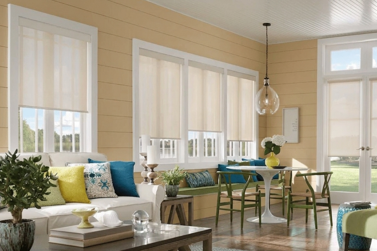
The quiet workhorse of window treatments: roller shades filter our strong Florida sun while keeping the view and the light you fell in love with

How do you hang window treatments so they look custom?

This is where most rooms go wrong, and the fixes aren't complicated. Here's what I'm always watching for:

Carmen's rules for drapery that looks custom
  • Hang high and wide. Mount the rod up near the ceiling and let the panels extend past the glass. The window looks bigger, the ceiling looks taller, and more light comes in.
  • Give it fullness. Skimpy panels always look store-bought. Enough fabric to fall in generous folds is what reads as custom.
  • Get the length right. Drapery should just kiss the floor or break gently against it — never float awkwardly above it like high-water pants.
  • Line everything. Lining makes fabric hang beautifully, blocks more light, and protects the material from our sun. It's the unglamorous detail that does the most work.
  • Treat the hardware as jewelry. The rod, rings, and finials are part of the look. Choose them on purpose.

Which window treatments work best, room by room?

There's no single right answer, but there are reliable starting points:

  • Living and dining rooms: lined drapery layered over sheers — softness by day, real coverage by night.
  • Bedrooms: blackout-lined panels, because a Florida sunrise doesn't negotiate.
  • Kitchens and baths: tailored Roman shades or woven shades that sit clean and out of the way.
  • Walls of glass and sliders: wide-stacking panels that pull completely off the glass, so you keep the view and the flow.
  • Offices and flex rooms: woven woods for warmth and a beautifully filtered, get-things-done light.
why your room isn't finished until your windows are

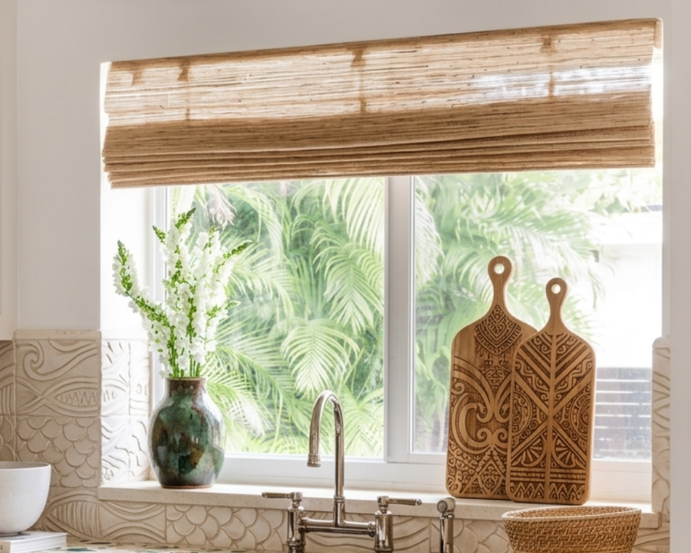
A woven shade is all this kitchen window needed — natural texture, warm filtered light, and a tidy look right where you need it over the sink

Is it worth doing window treatments custom?

In a word, yes — and not for the reason people assume. It isn't really about luxury. It's about fit. Store-bought panels come in a handful of lengths and hope one of them is close; custom means the fabric, the lining, the fullness, and the length are all right for your actual window and your actual light. That's the whole difference between something that looks like an afterthought and something that looks like it was always meant to be there. Good drapery also lasts, which makes the math friendlier than it first appears.

The room that finally feels finished

I think this is why I love window treatments so much — they're the last layer, the one that warms everything that came before it and quietly pulls the room together. I'm in the middle of a set right now for a guest bedroom over in College Park, and even at the fabric stage you can feel the room starting to soften and settle.

So if you've got a space that's beautifully furnished and still somehow feels unfinished, go look at the windows. That's usually the missing piece — and it's a wonderful one to get right.

Have a room that feels almost-but-not-quite finished? Let's talk about the window treatments that would pull it together.

Get in touch with Carmen
Read more
How to style a coffee table like a designer

How to Style a Coffee Table Like a Designer

Here's a small confession from a designer: I think most coffee tables don't belong in the rooms they're sitting in.

That's not anti-coffee-table. Some living rooms genuinely need one, and when a coffee table is the right size, the right shape, and styled with a little intention, it can be the most beautiful piece in the room. But somewhere along the way, the coffee table became the default — something every living room is supposed to have, regardless of whether the space actually calls for it. So we end up with too-big tables crowding small rooms, too-small tables floating in front of sectionals, and surfaces piled with remotes, mail, and last week's magazines.

If you've ever looked at your coffee table and thought something is off here and I can't say what, this is for you. We're going to walk through three questions in order: does your living room actually need a coffee table, what should you buy if it does, and how do you style the one you have so it always looks pulled together.

What is the three-layer rule for styling a coffee table?

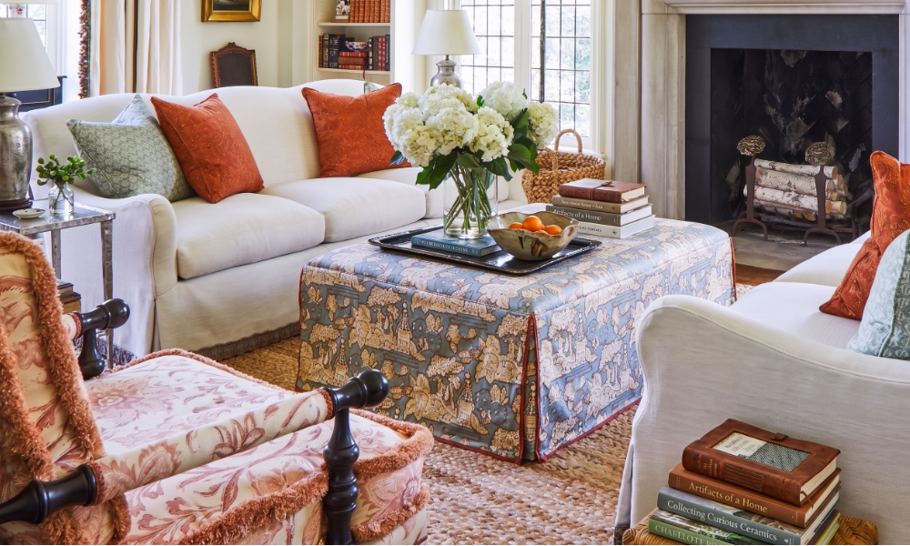
Designers style coffee tables in three layers: an anchor (a tray, a stack of books, a large object that grounds the arrangement), an organic element (flowers, greenery, or something natural that adds movement), and a personal touch (something meaningful — a beautiful book, an object from a trip, a small piece of art). Three layers, one tray, a little breathing room around it all.

Does your living room actually need a coffee table?

Not every living room does. Before you buy one, or before you commit to keeping the one you have, it's worth asking what the room actually needs from that piece of furniture.

When a coffee table is the right call: if your living room is built around a long sofa or a sectional, if you regularly entertain, if you and your family actually use the surface (drinks, board games, books), and if the room has the proportions to hold a real piece without crowding. In that case, the coffee table earns its place — and a beautiful one becomes a focal point.

When a coffee table isn't the right call: if your living room is small, if you have young children running through it, if you've never once used your current coffee table for anything except as a place where mail accumulates, or if the room is more of a passageway than a sit-and-stay space. In those cases, you'll be happier with one of the alternatives below.

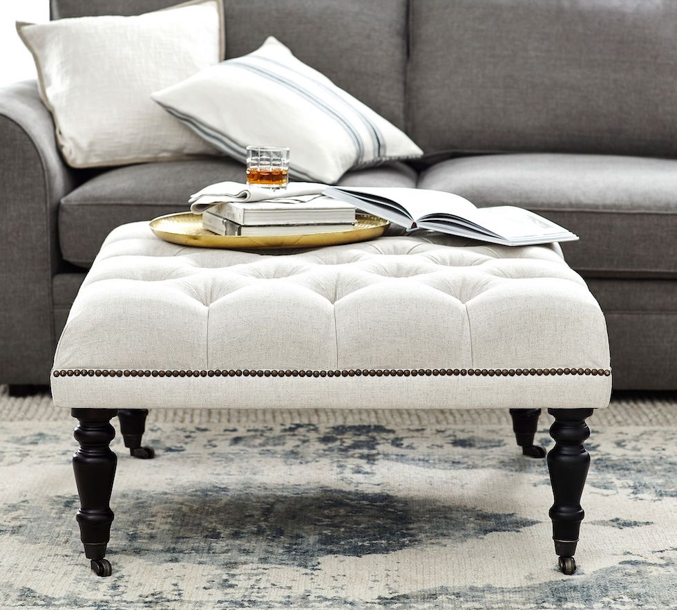
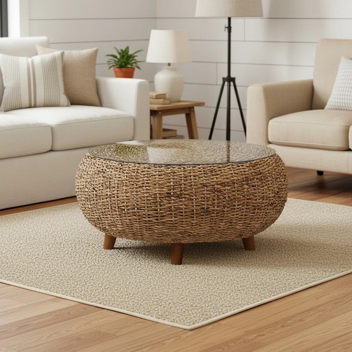
Ottoman as a coffee table

An ottoman. Soft, no sharp corners, doubles as seating, and you can still put a tray on it to hold drinks. For families with young kids or for casual, family-first rooms, this is a great choice.

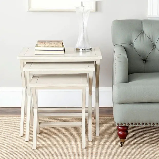
Nesting tables

A pair of small side tables or nesting tables. Gives you the surface you need without committing the whole center of the room to one piece. Flexible, easy to rearrange, beautiful when chosen well.

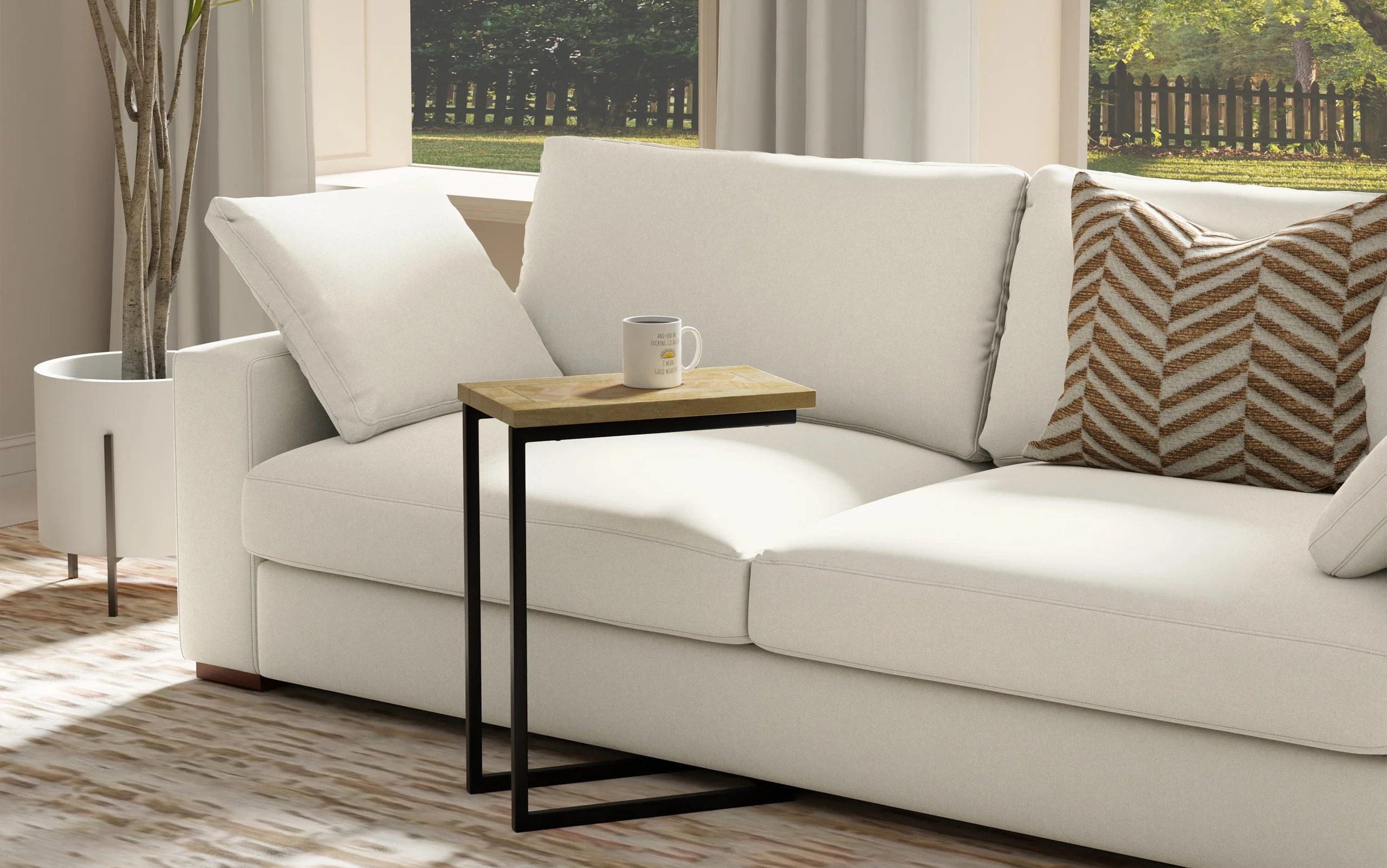
C Table How to style a coffee table like a designer

A single C-table next to the sofa. Slides right up to where you're sitting, holds a drink and a book, and disappears when you don't need it. Particularly good for sectionals where a central coffee table feels disproportionate.

If a coffee table is right for your room: what to look for

Once you've decided a coffee table earns its place, the buying decision matters more than most homeowners realize. Here's what to think through before you commit.

Shape. Round tables work beautifully in small spaces, in rooms with young children (no sharp corners), and in rooms where traffic flows around the seating. Rectangular tables are the right call for sectionals and long sofas — anything else looks under-scaled. A pair of square tables, pushed together or used separately, gives you flexibility in larger rooms.

Size. The most-broken rule in living room design: your coffee table should be roughly two-thirds the length of your sofa. Smaller than that and it floats; larger and it crowds. Measure before you shop, and tape out the footprint on your floor with painter's tape if you're not sure.

Height. This is the rule almost nobody knows. Your coffee table should be within an inch or two of the height of your sofa cushion — same height, or slightly lower. A coffee table that's too tall makes the sofa feel low and awkward; one that's too short looks disconnected.

Distance from the sofa. Plan for 14 to 18 inches of clearance between the front of the sofa and the edge of the coffee table. Close enough to set down a drink without leaning, far enough to walk past comfortably.

Material. This is where personality lives. A piece of natural wood adds warmth and softens a room. Stone or marble feels grounded and sculptural. A glass top keeps a small room feeling open. An upholstered ottoman is the softest option. Choose the material that contrasts with what's around it — if your sofa is upholstered and your floors are wood, a stone or glass table adds a third element. If your room is full of hard surfaces, soften it with an ottoman.

How to style a coffee table like a designer

How to style a coffee table that always looks pulled together

Once the table is right, the styling is the easy part. Designers use a simple three-layer framework, and once you see it, you can't unsee it.

Layer 1: The anchor. Start with something that grounds the arrangement and gives it edges. A tray is the simplest and most forgiving anchor — it instantly turns "clutter" into "vignette." A stack of two or three beautiful books works too. The anchor is what tells the eye where the arrangement begins and ends.

Layer 2: The organic. Something natural and alive. Fresh flowers, a small plant, a bowl of fruit, a sprig of greenery from your yard, even a single beautiful branch. This is the layer most homeowners skip, and it's the layer that makes the coffee table feel lived in instead of staged.

Layer 3: The personal. Something that says you actually live here. A beautiful book you've actually read. An object from a meaningful trip. A small piece of art propped against a stack. A handwritten card on a tiny easel. This layer is what separates a styled coffee table from a magazine-set coffee table — and it's what your guests will remember.

How to style a coffee table like a pro

The rules that hold it all together

A few small principles make the difference between a coffee table that looks designed and one that looks accidental.

  • Use a tray. Everything inside a tray reads as intentional. Everything outside a tray reads as clutter. This is the single biggest unlock for most homeowners.
  • Vary the height. Stack books, place something tall (a candle, a small vase) next to something low. Flat arrangements look accidental; varied heights look composed.
  • Odd numbers, usually three. Three or five elements tends to read more designed than two or four. It's the rule designers follow without thinking about it.
  • Leave breathing room. At least one-third of the surface should be empty. The empty space is part of the design — it's what lets the eye rest.

What to take off your coffee table today

A few things almost always make a coffee table look worse, no matter how beautifully you've styled around them:

  • TV remotes. Corral them in a small basket on a nearby shelf or in a drawer.
  • Mail. Open it, file it, recycle it — but it doesn't live on the coffee table.
  • Phone chargers and electronics cables. Find them a home in a drawer.
  • Old magazines. If you haven't read it in three months, it's not styling.
  • Too many candles. One beautiful candle reads as intentional. Five reads as a clearance display.

Take five minutes, clear everything off, and start fresh with the three-layer framework. You'll be surprised how different the whole room feels.

Where should I start if I only do one thing?

Put a tray on your coffee table. Move everything that lives on the table into the tray. Add a small plant or a few fresh flowers next to the tray. That's it — three minutes of work, and the whole room will feel more pulled together. Once you see the difference, you'll want to keep going.

Ready to make your living room feel like it was designed just for you?

Whether you want help choosing the right coffee table, styling a space that's not quite working, or thinking through a whole room from scratch, I'd love to walk through it with you. Let's start the conversation.

Get in Touch
Read more
5 Upgrades that make your kitchen feel like a custom build

5 Upgrades that Make Your Kitchen Feel Like a Custom Build

If you've walked into your kitchen lately and thought, I'd love to do something about this, but I don't have $40,000 sitting around — you are not alone. Most builder-grade kitchens leave homeowners stuck between two extremes: live with it forever, or save up for a full gut renovation that never quite happens.

There's a much better option in the middle, and it's the one I find myself recommending most often. The right five builder-grade kitchen upgrades can completely shift the way the room feels, without replacing your cabinets and without tearing anything apart. You keep the bones. You change everything around them.

Here's how to make it happen.

What does "builder-grade" actually mean?

Builder-grade refers to the standard finishes a builder installs in a new construction home to keep costs predictable. Think basic oak or white cabinets, simple knobs, a single overhead light, a basic faucet, and an over-the-range microwave instead of a vent hood. Nothing is wrong with these choices — they're functional. They're just not custom, and they tend to make every kitchen feel like every other kitchen in the neighborhood.

Why do builder-grade kitchens feel flat?

The short answer: every surface in the room is competing at the same volume.

Nothing draws your eye.

There's no focal point, no contrast, no detail that signals someone made decisions about the space.

The five upgrades below work because each one introduces a moment of intention — a place for your eye to land.

1. Paint the island or lower cabinets

If you do only one thing on this list, do this one. A two-tone kitchen — upper cabinets in their original color, island or lower cabinets in a contrasting paint — is the single biggest visual shift you can make without replacing anything.

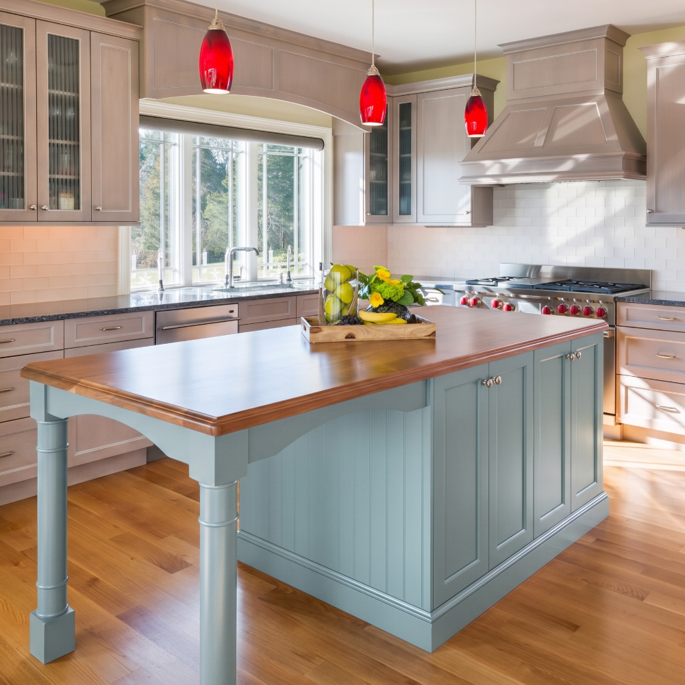
Which color works best for a builder-grade kitchen? A soft, grounded color tends to read more custom than a trendy one. Sherwin-Williams Tradewind (SW 6218), a calming blue with subtle green undertones, is having a moment for islands right now. It's coastal without being too beachy, and it pairs beautifully with both white and natural wood uppers — which covers most builder-grade kitchens.

You can hire this out for around $800 to $1,500 depending on the size of your island, or take it on as a weekend project if you're comfortable with prep work. The key is the prep, not the paint.

Builder grade kitchen upgrades- paint the island

Sherwin-Williams Tradewind (SW 6218) on a kitchen island — calm, coastal, and just enough color to give the room a focal point without committing the whole kitchen to blue.

2. Swap out the cabinet hardware

Builder-grade hardware is almost always small, basic, and chosen for cost. Replacing it is the fastest way to make cabinets read as custom — and it's the upgrade that delivers the most transformation per dollar.

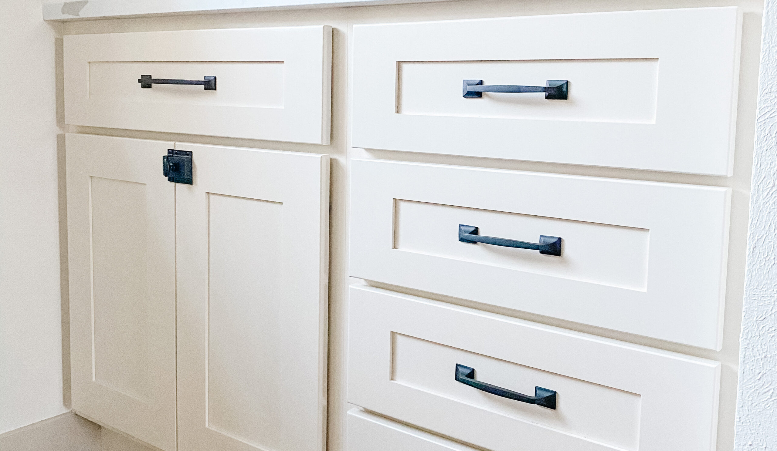
What hardware finish should you choose? Unlacquered brass and matte black are both safe long-term picks. If your faucet and lighting are stainless or chrome, mixing in brass or black hardware actually looks more designed, not less.

A few rules that will save you from a redo:

  • Size up. Most builder-grade pulls are too small for the cabinet doors they sit on. A 5- or 6-inch pull on a standard cabinet door reads more custom than the 3-inch version that came with the house.

  • As a general rule, use pulls on drawers and knobs on doors. This is the convention in higher-end kitchens. But don't be afraid to use the style that best suits your kitchen.

  • Buy one of each first. Order a single knob and pull before committing to 30 of them.

kitchen upgrades - hardware
kitchen upgrade with hardware

3. Upgrade the lighting

Builder-grade kitchens are almost always under-lit, and the lighting that is there tends to be a single flush-mount fixture in the center of the ceiling. Two changes make an outsized difference:

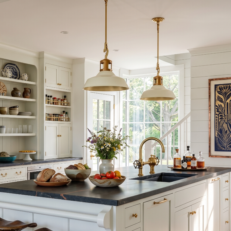
Pendant lights over the island. Two or three pendants instantly create a focal point and define the island as its own zone. This is the lighting move that shows up in every magazine-worthy kitchen.

Kitchen remodel - pendent lights
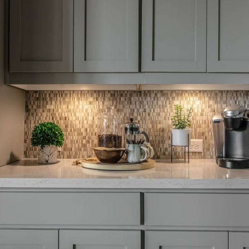
Kitchen remodel under cabinet lighting

Under-cabinet lighting. Less obvious, but transformative. It eliminates the shadow your upper cabinets cast on your counters, makes the backsplash look intentional, and gives the kitchen a layered, evening-friendly glow. Battery-operated puck lights work; hardwired LED strips look better.

4. Change the faucet

The faucet is the one fixture in the room that gets touched every single day, and builder-grade faucets are designed to be the cheapest functional option — not the best one. Replacing it costs less than most people expect (often under $400 installed) and the upgrade is felt every time you use the sink.

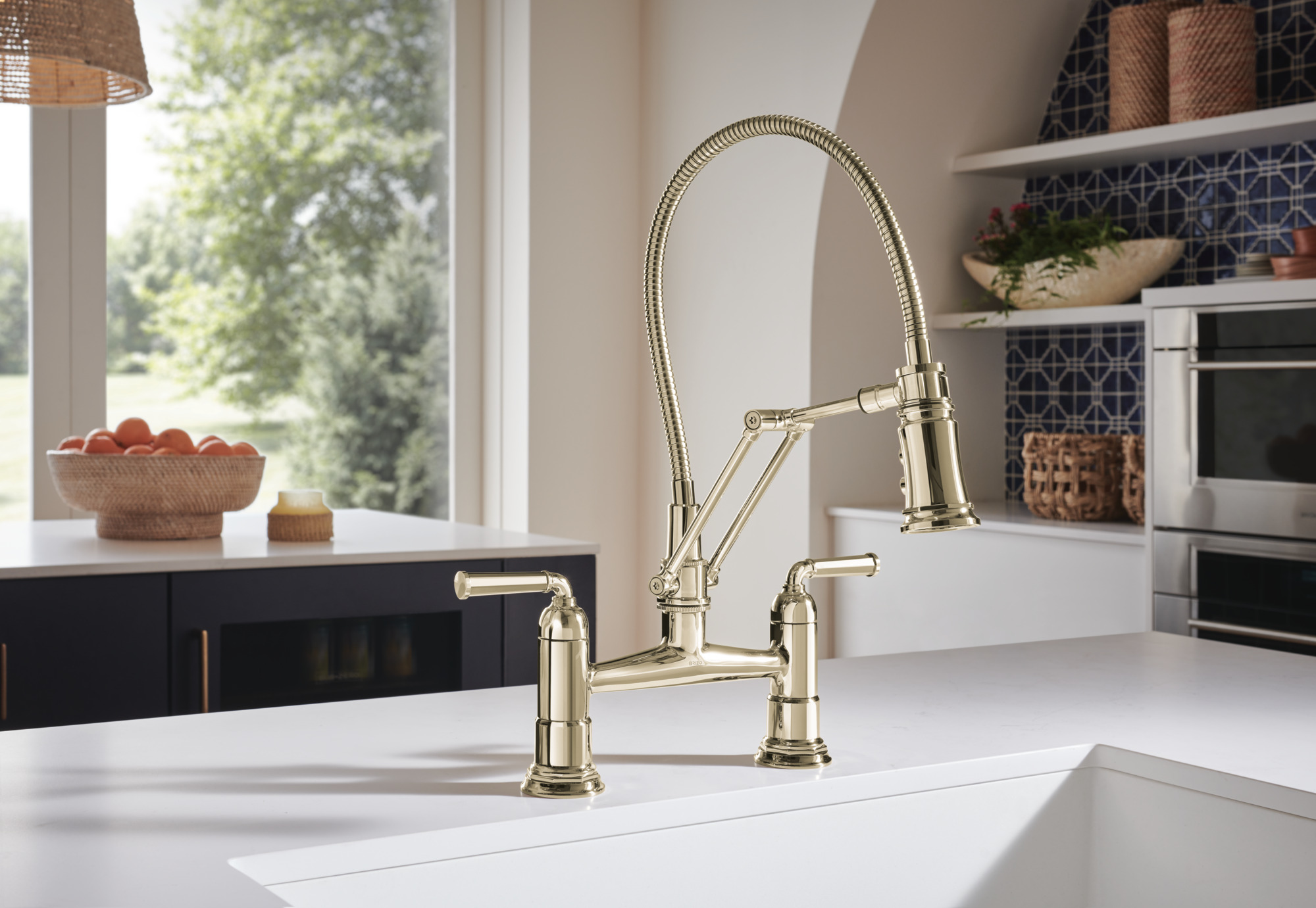
What faucet style works in a builder-grade kitchen? A tall arc with a pull-down sprayer is the most versatile choice. If you want a more custom look, a bridge faucet or an articulating arm faucet signals "designer kitchen" without committing you to a specific style for the rest of the room.

Match the finish to your new hardware, not the appliances. The hardware and faucet are the design layer; the appliances can sit quietly behind them.

kitchen renovation -  bridge faucet

5. Replace the microwave with a real range hood

This is the upgrade that separates a kitchen that looks updated from a kitchen that feels custom — and it's the one most homeowners don't think they're allowed to do.

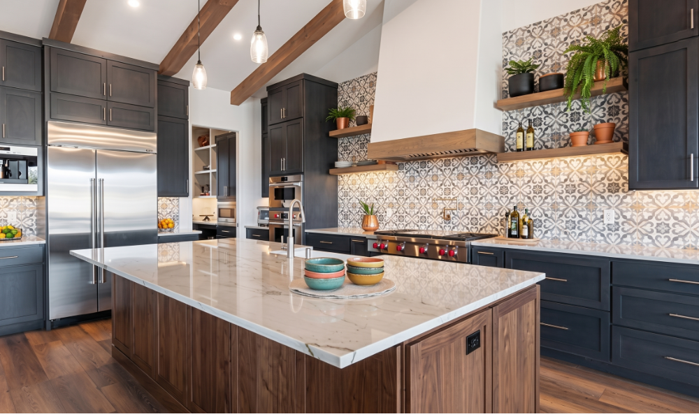
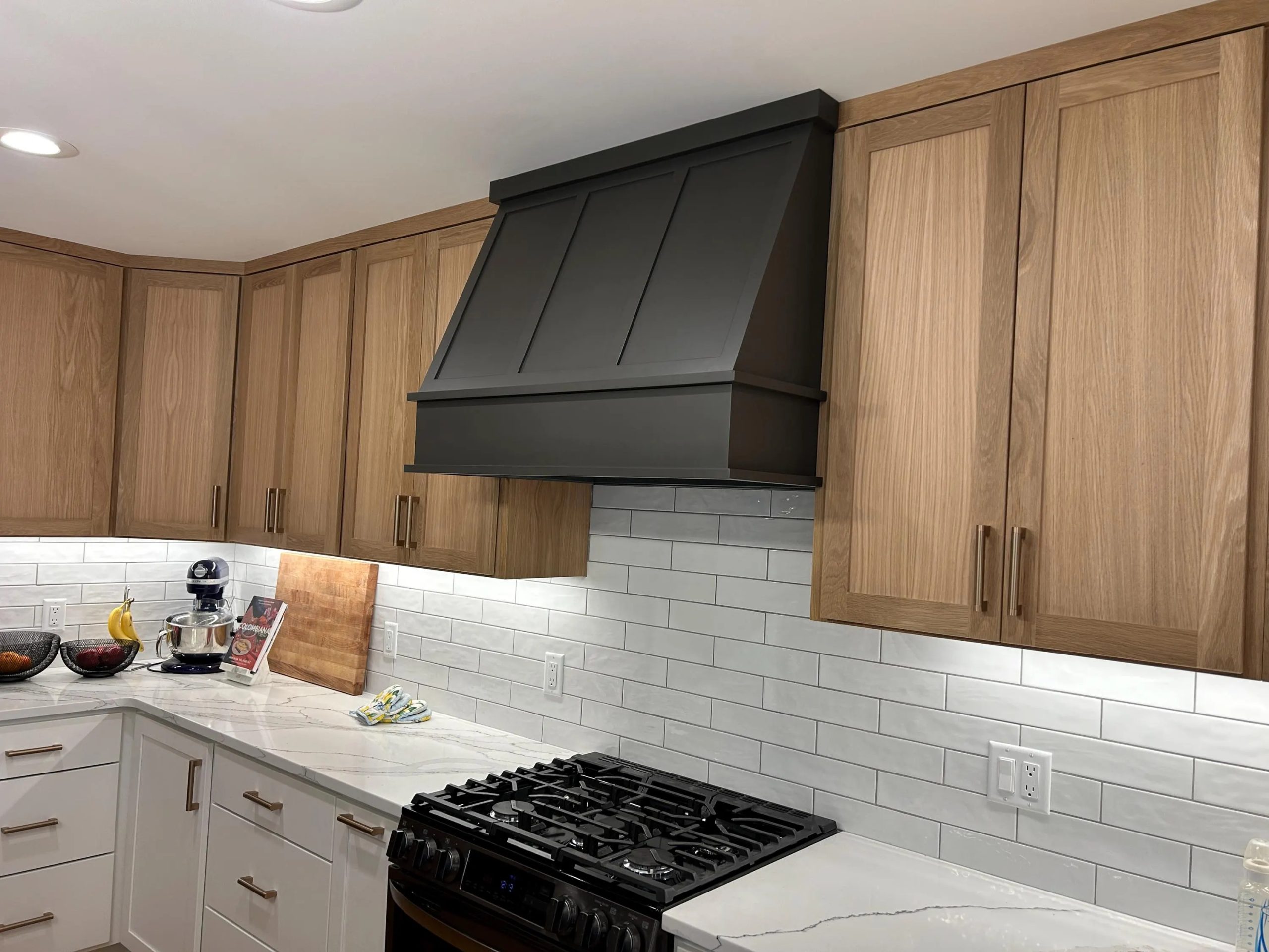
Builder-grade kitchens almost always come with an over-the-range microwave doing double duty as the ventilation. It's a compromise that saves cabinet space and keeps construction costs down, but it also flattens the entire wall above your range. Replacing it with a real vent hood — or a custom hood surround that wraps a hood insert in painted wood, plaster, or shiplap — creates a second focal point in the room and gives the cooktop the architectural moment it deserves.

Kitchen remodel Hood

A few options at different price points:

  • Stainless steel chimney hood: The simplest swap. Clean, modern, photographs well. Typically $400 to $1,200 for the hood plus installation.

  • Painted wood hood surround: Built around a hood insert and painted to match either the uppers or the island (like the one pictured above). This is the look most homeowners pin without realizing what they're looking at.

  • Plaster or limewashed hood: The most architectural option. Quiet, sculptural, and absolutely custom.

You will need to relocate the microwave — typically into a lower cabinet, a pantry, or a built-in drawer. Plan for this before you start.

Do I need to do all five upgrades at once?

No. Each upgrade stands on its own, and the kitchen will feel better after every one. Most homeowners do them in stages over a year or two. If you want to prioritize, the highest-impact sequence is: paint the island first, then hardware, then the hood. Lighting and the faucet can happen anytime.

The thing I tell every client

You don't need to replace your kitchen to love your kitchen. You need to give it the layers it was built without. Five smart changes, made thoughtfully, will do more for how the room feels — and how it photographs the day you do decide to sell — than waiting another five years for the renovation budget.

The cabinets you already have are not the problem. They're just waiting for the rest of the room to catch up.

Ready to make your kitchen feel like it was designed just for you?

Whether you want help picking the right paint color, sourcing the right hardware, or planning all five upgrades together, I'd love to walk through it with you. Let's start the conversation.

Get in Touch
Read more
Spring Refresh

Spring Home Refresh Ideas for Florida Living (No Big Renovation Required)

There's something about April in Florida that just asks you to open the windows. The light gets softer, the mornings feel a little more generous, and the house suddenly seems ready for something new. You don't need a renovation — honestly, you don't even need a full weekend. The best spring home refresh ideas are the small, thoughtful changes that make a room feel lighter, brighter, and more like the season you're actually living in.

Here in Central Florida, our "spring" looks different than it does up north. We're not thawing out; we're gearing up for months of sunshine, afternoon storms, and long evenings on the lanai. That means our spring refresh is less about warming up and more about lightening up — pulling back the heaviness of the season just past and letting the house breathe.

Here's how I approach it for my own home and for clients.

What Is a Spring Home Refresh?

A spring home refresh is a series of small, low-cost updates that lighten and brighten your home for the warmer months — swapping heavy textiles for lighter fabrics, clearing cluttered surfaces, adding living greenery, and updating small details like pillow covers, lampshades, rugs, and candles. Unlike a renovation, a refresh requires no contractors, no major spending, and usually no more than an afternoon per room.

Start With What You Take Away, Not What You Add

This is the step most people skip, and it's the one that makes the biggest difference. Before you buy a single new thing, walk through each room and take something out. A heavy throw blanket you've been draping over the sofa. The chunky knit pillows you loved in January. A piece of decor that feels dark or dense next to the rest of the room. You don't have to get rid of these things — just put them away until fall.

Your house will instantly feel lighter. Not because you added anything, but because you gave the room room to breathe.

Spring Refresh living room

Spring Home Refresh Ideas for the Living Room

The living room is where most of us spend our evenings, and it's the first place a spring refresh shows up. A few easy moves:

  • Swap your pillow covers for lighter fabrics and colors. Linen, cotton, and lightweight woven blends in whites, soft greens, warm neutrals, or pale blues instantly shift the mood. You don't even need new pillows — just the covers.

  • Introduce something green and living. A real plant, a fresh eucalyptus arrangement, a simple bowl of lemons on the coffee table. Living elements bring a room to life in a way nothing else can.

  • Rethink your lampshades. This sounds small, but swapping a dark shade for a crisp white linen one can transform the feel of an entire corner. It's one of my favorite low-cost, high-impact changes.

Lighten Up the Bedroom

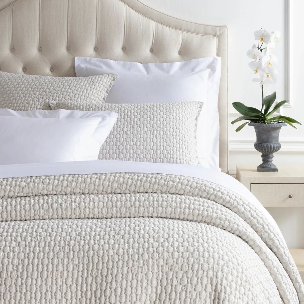
Your bedroom deserves the same treatment your living room gets, and it's often the room we neglect first. For spring, I pack away the heavier duvet and switch to crisp white or pale-toned linens. Lightweight matelassé coverlets are a personal favorite — they feel beautifully Floridian and they layer well.

spring refresh matelasse coverlet

While you're at it, look at your nightstands. Clear them down to just the essentials — a lamp, a small stack of books, maybe a candle or a small vase. Bedrooms breathe better when the surfaces around the bed aren't working overtime.

Refresh the Entryway (It's Working Harder Than You Think)

The entry is the room that sets the tone for the whole house, and it's usually the last one we update. Three quick moves:

  • Swap the rug. A lightweight natural-fiber rug — jute, sisal, or a flatweave cotton — signals "warm weather" the moment you walk in. If you've been using a heavier wool or patterned rug, trade it for something airier.

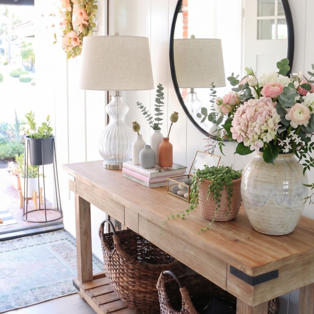
  • Update the console styling. Whatever bowl, tray, or vignette lives on your entry table probably hasn't been touched in months. Swap in a bowl of fresh fruit, a simple ceramic vessel with greenery, or a stack of books topped with one beautiful object. Keep it simple — the entry should feel curated, not crowded.

  • Check the lighting. Entry lamps often get overlooked, but a warm bulb in a clean shade makes a real difference when you walk in from a bright Florida afternoon.

Spring refresh foyer

Spring Home Refresh Ideas for the Outdoor Spaces

This is where Florida homeowners have an advantage that the rest of the country doesn't. Our lanais, porches, and patios are essentially bonus living rooms, and April is the month they start earning their keep again.

A few ways to bring them back to life:

  • Clean and rearrange. A deep clean, a careful rearrangement of the furniture, and a fresh set of outdoor cushions can make the space feel brand new without a single new purchase.

  • Add layers of light. String lights, a pair of lanterns, a simple candle on the coffee table. Outdoor spaces transform at dusk, and the right light makes you actually want to stay out there.

  • Bring plants into the conversation. A few new potted plants — herbs near the grill, a statement palm in the corner, trailing greenery on a side table — make the outdoor space feel intentional rather than utilitarian.

Spring refresh outdoor space

Freshen the small stuff that nobody notices (until they do)

Some of the most effective spring refresh moves are the ones your guests can't quite put their finger on. These are the details:

  • New dish towels. Linen, waffle-weave, or crisp white cotton. It's a small thing that makes the kitchen feel cared-for.
  • Fresh hand soap and a new hand towel in every bathroom. Bathrooms are the fastest room in the house to feel tired. This reverses it in ten minutes.
  • One new candle in your main living space. Something clean and seasonal — citrus, linen, sea salt, or green tea. Skip the heavy florals and the leftover winter scents.

A Coat of Paint (If You're Feeling Ambitious)

If you want to go a little bigger, paint is still the highest-impact change per dollar. You don't have to paint a whole room. A powder room in a beautiful soft green. An entry wall in a warm, grounded neutral. A home office bookcase in something unexpected. One painted surface can recalibrate the whole feel of a home.

Why Does Spring Refreshing Matter in Florida?

Because in a climate where the seasons blur together, it's easy to let your home stay in one mood year-round. Moving with the seasons — even gently — keeps a home feeling alive, present, and cared-for. A spring refresh isn't about transforming your home. It's about reintroducing it to itself.

That's the real difference. A house that shifts with the seasons feels lived in, intentional, and loved.

Need a second set of eyes?

If one of these ideas has been nagging at you — a room that's felt heavy, a lanai that needs attention, an entry that's lost its spark — I'd love to help you think it through. Sometimes a second set of eyes is all it takes to know where to start.

Schedule a Consultation
Read more
adult bunk beds

Custom Bunk Beds for Adults: Not Just for Kids Anymore

Let me be honest with you — when most people hear "bunk beds," they picture a kids' bedroom with a wobbly ladder and a twin mattress that's seen better days. But what I designed for a client's vacation home in Reunion? That's a completely different story.

This client came to me with a wonderful problem. She has a large, close family — the kind that actually wants to vacation together — and a beautiful VRBO property that needed to sleep as many people as comfortably as possible. Her solution? Two custom bunk beds for adults, designed and built specifically for her home. And let me tell you, these are not your childhood bunk beds.

Why Adult Bunk Beds Are Having a Moment

Here's something the vacation rental world figured out before the rest of us: bunk beds, when done right, are actually a brilliant solution for adult guests. They maximize sleeping capacity without eating up floor space, they can be designed to look absolutely beautiful, and — this is the part people don't expect — they can be genuinely comfortable.

The key words there are "when done right." Custom bunk beds for adults are designed with grown-up comfort in mind from the very start. That means full or queen-sized mattresses instead of twins, generous headroom between bunks, sturdy construction that doesn't wobble or creak, and easy-to-navigate ladders or stairs that don't require the agility of a ten-year-old. When you check all of those boxes, a bunk bed stops being a compromise and starts being a feature guests actually love.

What We Designed for Reunion

For this project, we designed two distinct custom bunk beds — each built to fit the specific room it lives in and styled to feel intentional rather than institutional. These aren't pieces that look like they were ordered from a catalog and assembled on a Saturday afternoon. They were designed as part of the room, with the overall aesthetic of the home in mind.

The result is sleeping space that feels elevated and comfortable — the kind of setup where adult guests actually look forward to claiming their bunk rather than feeling like they drew the short straw. That's exactly what great vacation rental design should do.

adult custom bunk beds

Plenty of headroom plus individual night lights make this custom adult bunk bed comfortable, cozy, and practical. 

custom adult beds
custom bunk bed with trundle underneath

What to Think About If You're Considering This

If you own a vacation home and you're thinking about adding custom bunk beds for adults, here are the things I always tell my clients to consider:

Size matters — a lot. Twin bunk beds are fine for kids, but adults need more room. Queen-over-queen configurations are incredibly popular right now for good reason. They sleep four people in the footprint of one bed, and nobody feels cramped.

Headroom is everything. There needs to be enough space between bunks for someone to sit up comfortably, and the person on the top bunk needs to be able to get in and out without a gymnastics routine. This is where custom design really earns its keep — you can get the proportions exactly right for your specific ceiling height.

The ladder or stairs can make or break the experience. A well-designed staircase with storage built in is not only safer and easier to navigate, it adds another layer of function to the room. Details like these are what separate a thoughtfully designed space from one that just technically works.

Style it like the rest of the home. Bunk beds don't have to look utilitarian. With the right finish, hardware, and bedding, they can look just as polished and intentional as any other piece of furniture in the room.

adult bunk beds
adult bunk beds rugged

The Bigger Picture for Vacation Rental Owners

If you own a VRBO or Airbnb, sleeping capacity is directly tied to your booking potential. More guests means more revenue — but only if those guests are comfortable. Custom bunk beds for adults let you have it both ways: maximum capacity and a guest experience that earns you five-star reviews.

Our Reunion client understood this perfectly. She didn't want her family — or her guests — to feel like they were roughing it. She wanted everyone to feel taken care of. That's a design problem I love solving.

And this isn't the first time we've gone the custom bunk bed route for a vacation property. A few newsletters back, I shared the transformation we did for a New Smyrna Beach house where we built custom bunk beds with a fun nautical theme — navy, red, crisp white shiplap — perfect for the kids and beach-loving guests that property attracts. That project was a great reminder that custom bunk beds can be tailored to any age, any style, and any vibe. Click here to read all about that beach house transformation. 

The Reunion project took that same philosophy and scaled it up for adults — different rooms, different needs, same commitment to making every guest feel like the space was designed just for them.

If you have a vacation rental property and you're thinking about how to maximize your space without sacrificing style or comfort, I'd love to talk. Whether it's bunk beds, themed rooms, or a full property refresh, this is exactly the kind of creative, functional design challenge that gets me excited — and the results always speak for themselves.

Call me for a free consultation at (407) 743-2399 or email me at carmen@sohointeriordesign.com

Read more
boho green decor

The Green Effect: Sophisticated Green Home Décor Ideas for Spring

There's something that happens when you walk into a room that just feels right. You exhale. Your shoulders drop. You slow down without even realizing it. Chances are, there's some green in that room — and right now, the most beautiful green home décor ideas aren't loud or obvious. They're quiet. Refined. The kind of color choices that make guests ask, "What is it about this room?" Sage. Olive. Celadon. Eucalyptus. These are the colors that make a space feel like a breath of fresh air, and spring is the perfect moment to welcome them home.

Why Green Does Something to Us

Before we get into the how, let's talk about the why — because the science here is genuinely fascinating.

Green sits right in the middle of the visible color spectrum, which means our eyes process it more easily than almost any other color. No straining, no adjusting. Just instant ease. That ease translates directly into how we feel in a space. Research shows that green is linked to relaxation, balance, and renewal — and it's one of the colors most recommended by interior designers and mental health experts for creating stress-free spaces.

It goes even deeper than that. Green is considered to represent purity, health, and freshness. It's gentle and relaxing yet invigorating, and it inspires connection. There's a reason hospital designers have used green for decades — it genuinely calms the nervous system. And there's a reason your favorite boutique hotel lobby probably has some green in it.

This is also at the heart of what designers call biophilic design — the idea that we feel better when our interiors connect us to the natural world. Earthy olive and sage tones promote calmness and stability, while green in general connects indoor spaces with the restorative power of nature. When you bring a soft, nature-inspired green into your home, you're not just making a design choice. You're making a wellness choice.

The Green Shades Worth Knowing Right Now

Not all greens are created equal, and the ones that feel most sophisticated right now are the ones that don't try too hard. Here are the four I'm most excited about this spring.

Sage Decor

Sage  The classic that earned its place. Soft, silvery, and a little gray around the edges, sage goes with almost everything. It layers beautifully with warm creams, blond wood, and linen. If you've been curious about adding green but aren't ready to commit, sage is your entry point.

olive green decor
The Green Effect

Olive and Moss — Olive leans back, serene and self-assured, with warmth that other greens don't have — a little golden, a little earthy — which makes it pair beautifully with terracotta, warm wood tones, and matte black hardware. This is the green that makes a room feel collected and timeless rather than trendy.

Eucalyptus decor bathroom

Eucalyptus — Think of this as the green that can't quite make up its mind between green and gray — and that's exactly what makes it so elegant. Softer than sage, cooler than olive, it's particularly lovely in bedrooms and bathrooms where serenity is the goal.

Celadon decor

Celadon — This one is having a real moment. Falling somewhere between very pale gray and vibrant green, celadon takes its name from ancient Chinese pottery known for its smooth, jade-like surface. It's sophisticated without being serious, and it works beautifully in spaces where you want to feel refreshed rather than cocooned.

Five Green Home Décor Ideas You Can Try Right Now

The good news? You don't have to repaint a single wall to feel the green effect. Here are five ways to work it in — from the smallest commitment to the most statement-making:

1. Start with textiles. A sage linen throw, an olive velvet pillow, a eucalyptus-toned rug — textiles are the lowest-risk way to test a color. They're also incredibly effective. Layer a few tones of green together in your living room and watch how the room comes alive.

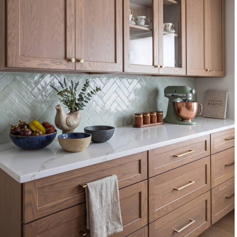
2. Try it on cabinetry. Soft greens like celadon, sage, and misty olive bring subtle color without overwhelming the room — especially on kitchen or bathroom cabinets, where they read as fresh and considered rather than bold. Pair with warm brass hardware and you have something that looks like it came straight out of a magazine.

green decor cabinetry

3. Bring in ceramics and vessels. A celadon vase. An olive pottery bowl. A sage-toned planter. Small moments of green can anchor a shelf or a tabletop beautifully without requiring any real commitment — and they're easy to swap out as seasons change.

4. Consider wallpaper. A subtle botanical or textural wallpaper in a muted green tone can do extraordinary things for a powder room, a dining room, or a home office. It adds depth and personality in a way that paint sometimes can't.

green decor wallpaper ideas

5. Let the light work for you. Here's one of my favorite things about green — it shifts. In natural light, soft greens appear airy and fresh. Under warm LEDs, they deepen and enrich, adding coziness and depth. It's like getting two rooms in one, depending on the hour.

The Art of Pairing Green

One of the questions I hear most often is: "What do I put with green?" The answer: more than you'd think.

Sage pairs beautifully with cream, blond wood, light beige, and off-white. Olive loves terracotta, sand, matte black, and ochre. Celadon, with its cool undertones, comes alive when you layer in smoky wood finishes and warm metals. And eucalyptus? Pair it with soft whites and natural linen for a bedroom that feels like the most restorative place on earth.

The one rule I always follow: let green be the color and let everything else support it. Give it room to breathe and it will do all the work.

green and blue bathroom
green and blue living room
green and modern mixed decor
green decor english countryside

This Spring, Go Green — Thoughtfully

St. Patrick's Day may have us all thinking green this month, but the best green home décor ideas have nothing to do with shamrocks and everything to do with how you want to feel when you walk through your front door. Calm. Grounded. Restored.

That's what the right shade of green can do for a space. And honestly? It's one of my favorite things to help clients discover.

If you're curious about how subtle greens might work in your home — whether it's a full room refresh or just a few thoughtful touches — I'd love to talk.

Call me for a free consultation at (407) 743-2399 or email me at carmen@sohointeriordesign.com  

Read more
small guest bathroom changes

Small Guest Bathroom Ideas: The One Change That Transforms Everything
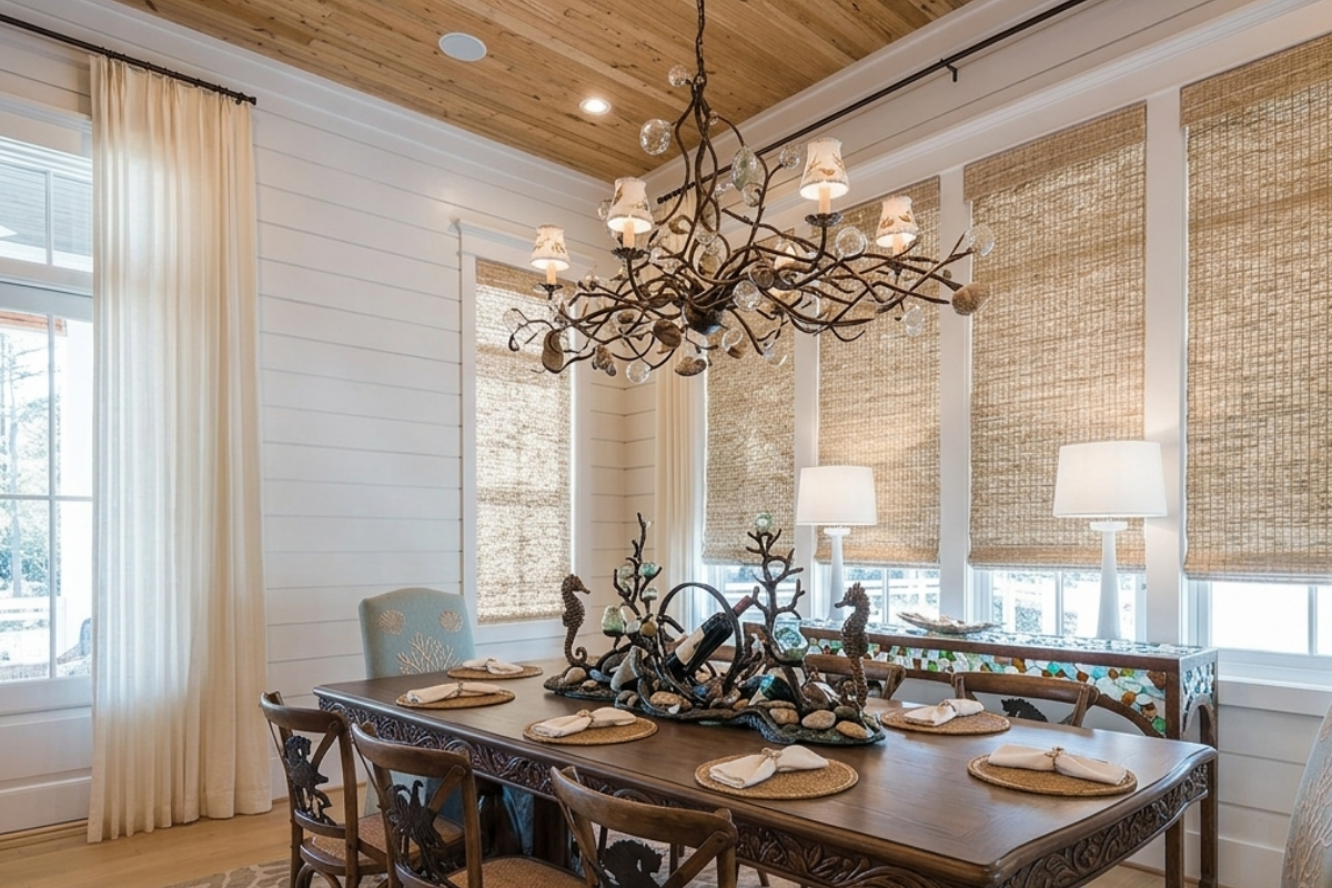
When clients ask me for small guest bathroom ideas, they almost always assume they need a full renovation to make a real difference. New tile, new vanity, new fixtures — the whole nine yards. And look, I love a good bathroom remodel. But one of my favorite transformations happened with a single change that took a fraction of the time and budget: wallpaper. 

I'm not talking about the wallpaper your grandmother had in the '80s. I'm talking about a bold, intentional design choice that can completely change the personality of a small space — and I have the project to prove it.

One Room, One Change, Total Transformation

Recently, I worked on a small guest bathroom that was perfectly functional but felt flat. There was nothing wrong with it, exactly — it just didn't have any personality. It was the kind of bathroom guests would use and forget about five minutes later.

small bathroom changes - before
small guest bathroom changes after

The fix? We papered the walls in a rich, textured solid navy blue wallpaper. That's it. No new tile. No new vanity. Just wallpaper.

The difference was stunning. That deep, saturated navy made the walls really pop, and here's the part that surprises most people — it actually made the bathroom feel bigger, not smaller. There's a common misconception that dark colors shrink a room, but when you use a rich, enveloping color like navy in a small space, it creates depth. The walls recede instead of closing in, and suddenly the whole room feels bolder, more sophisticated, and yes, more spacious.

Why Small Guest Bathrooms Are the Perfect Place to Go Bold

If there's one small guest bathroom idea I wish more homeowners would embrace, it's this: the guest bath is the best room in your house to take a design risk. It's a small space, which means less material and less cost. Guests are only in there for a few minutes, so it doesn't need to be a room you live with all day long. And because it's compact, one strong design choice can carry the entire room.

A bold wallpaper in a guest bathroom does something that paint simply can't — it adds texture, dimension, and a sense of intention. It tells your guests that every room in your home was thoughtfully designed, even the smallest one. And trust me, people notice. That little bathroom becomes the room everyone talks about.

small guest bathroom changes

How to Choose the Right Wallpaper for a Small Bathroom
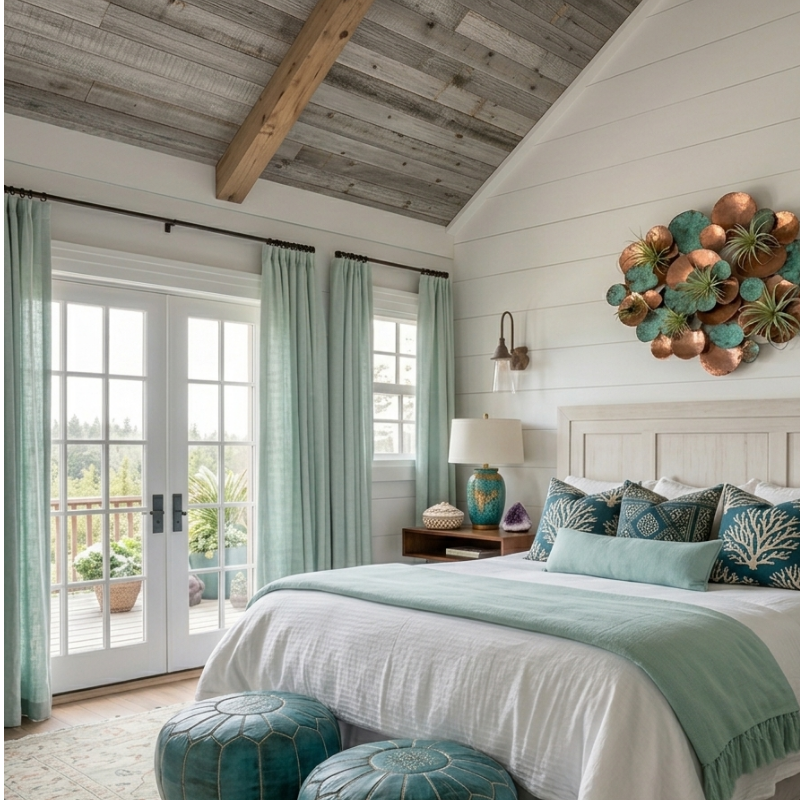
If you're inspired to try this in your own home, here are a few things I always keep in mind when selecting wallpaper for a small guest bathroom.

  • First, don't be afraid of dark or saturated colors. As we proved with our navy project, going dark in a small room can actually work in your favor. Deep greens, rich blues, moody charcoals — they all create that cocooning effect that makes a tiny bathroom feel like a jewel box rather than a closet.
  • Second, texture matters. A textured wallpaper adds depth and interest that a flat printed pattern can't match. Even in a solid color, a wallpaper with a grasscloth-like or linen-like texture gives the walls a richness that transforms the entire feel of the space.
  • Third, consider what's staying. If your existing vanity, mirror, and fixtures are in good shape, choose a wallpaper that complements them rather than competing. The beauty of this approach is that you're working with what you have — you're just giving it a completely new backdrop.

And finally, think about moisture. Guest bathrooms typically see far less humidity than a primary bath, making them excellent candidates for wallpaper. That said, always choose a wallpaper rated for bathroom use or talk to your designer about the best options for your specific space.
small guest bathroom changes
The Biggest Small Guest Bathroom Idea? Think Smaller
The best small guest bathroom ideas aren't always about adding more or spending more. Sometimes the most transformative thing you can do is make one confident, well-chosen change. A wallpaper that shifts the entire mood. A color that makes the room feel intentional instead of overlooked.
That navy bathroom we did? It went from forgettable to unforgettable with a single decision. And that's exactly the kind of impact I love helping clients create — the kind where one smart choice changes everything.

If your guest bathroom is feeling a little tired and you're not sure where to start, let's talk. Sometimes all it takes is a fresh set of eyes and one bold move.


Call me for a free consultation at (407) 743-2399 or email me at carmen@sohointeriordesign.com

Read more
spring curb appeal

Spring Curb Appeal Ideas: The “Early” Spring Door

If you're searching for spring curb appeal ideas that actually make a difference, start where it matters most — your front door. While the rest of the country is still bundled up and dreaming of warmer days, we're already getting a head start on spring right here in Florida. February is one of my favorite times of year because the weather is absolutely perfect for refreshing your front entry — and nothing makes a statement quite like the combination of bright bougainvillea pinks and lush boxwood greens. 

I've always believed your front door sets the tone for your entire home. It's the first thing guests see, and it's what greets you every single day. So why not make it feel like a celebration?

Why February Is the Sweet Spot for Spring Curb Appeal

When it comes to spring curb appeal ideas that really work in Central Florida, timing is everything. Our cool snaps in February are actually a gift for your landscaping. Bougainvillea loves our mild winters — the cooler nights encourage those gorgeous blooms to really pop, and boxwood stays beautifully dense and green year-round. It's the ideal window to plant, repot, or restyle your entryway before the real heat sets in.

Think of it this way: while your neighbors up north are scrolling through seed catalogs, you could already be living in full color.

spring curb appeal - the early spring door

Front Door Styling That Boosts Curb Appeal

You don't need a complete overhaul to make a big impact. Here are a few of my favorite spring curb appeal ideas using bougainvillea and boxwood: Start with a pair of potted boxwood topiaries flanking your front door. Whether you go with classic spheres or a more relaxed, natural shape, they create instant structure and sophistication. They're low-maintenance, they love our climate, and they look beautiful in just about any style of planter — from traditional urns to sleek modern containers.

spring curb appeal - boxwoods
spring curb appeal

And here's a little designer trick — carry that color story into your doormat, a seasonal wreath, or even a couple of accent pillows on a porch bench. It ties the whole look together and makes your entry feel intentional and polished. These small details are what separate good spring curb appeal ideas from truly great ones.

Practical Tips for Florida Homeowners

Bougainvillea does best in full sun and well-drained soil, so make sure your entry gets plenty of light. They don't love to be overwatered, which honestly makes them pretty easy for our Florida lifestyle. Boxwood prefers a little afternoon shade in our summers, so placing them under a porch overhang is actually ideal.

If you're not sure where to start or you'd love some help choosing the right planters, colors, or layout for your specific entry, that's exactly the kind of thing I love helping clients with. Sometimes it just takes a fresh set of eyes to see the potential that's already right there at your front door.

Spring is knocking early this year — let's make sure your front door is ready to answer.

Call me for a free consultation at (407) 743-2399 or email me at carmen@sohointeriordesign.com

spring curb appeal
Read more
mural NSB

Custom Vacation Home Design: A Beach House Transformation

You might remember the stunning Hollywood Glam home we featured in a previous article. Well, that client came back to us with an exciting new challenge--and a tight deadline. 

He had just purchased a vacation property in New Smyrna Beach, completely sight unseen. The goal? Have it guest-ready before the holidays. Most of the home was already furnished, but two bedrooms needed our attention, and the client wanted something special--a unique feature that would make visitors remember this beach house long after they checked out.

This is exactly the kind of custom vacation home design project we love!

A Bunk Room Built for Adventure

One of the bedrooms needed to accommodate a crowd. Families traveling to the beach often bring everyone--kids, cousins, grandparents--and having flexible sleeping arrangements can make or break a property's appeal. 

bunk beds

My team built custom bunk beds designed to maximize the space while creating a room that feels intentional, not improvised. We went with a navy blue and red nautical theme that nods to the coastal location without veering into kitschy territory. The result is a space that kids love and parents appreciate--sturdy, stylish, and perfectly suited for a beach house. 

nautical beds

Crisp white shiplap on the walls beside the bunk beds complete the look, adding texture and that classic coastal charm.

A Serene Retreat for Grown-Ups

The second bedroom called for a different approach entirely. While not the master suite, this room needed to feel like a true retreat for adult guests--a place to unwind after long days on the sand.  

adult suite

We designed the space around a palette of soft creams with contemporary, crisp lines that give the room a fresh and modern feel. Blue and tan bedding brings in just enough coastal warmth to remind you that you're steps from the Atlantic, while the overall aesthetic stays sophisticated and calming. It's the kind of room where you actually want to sleep in. 

The Mural That Makes Memories

Now for the showstopper.

Our client wanted something guests would talk about, photograph, and remember. We brought in a talented mural artist to transform the wall beside the pool into a celebration of everything that makes New Smyrna Beach special. 

mural pool view

The mural features the Atlantic Ocean, palm trees swaying in the breeze, and surfers catching waves--a scene that captures the laid-back spirit of this beloved beach town. The centerpiece is the iconic Ponce de Leon Inlet Lighthouse, located just across the inlet from New Smyrna Beach. Standing as the second tallest masonry lighthouse in the country and designated a National Historic Landmark in 1998, it remains a destination for visitors from around the world. Having it featured in the mural gives guests a beautiful visual connection to the area's history and charm. 

And here's another fun detail: there's a basketball hoop built right into the center of the mural. Guests swimming in the pool can shoot hoops against that gorgeous backdrop. It's playful, unexpected, and exactly the kind of detail that elevates a property from nice to unforgettable. 

Custom Vacation Home Design That Delivers

This project reminded me why I love this work. Every design choice serves a purpose--comfort, functionality, and that little spark of magic that turns a house into an experience.

Whether you're preparing a vacation property for guests, updating a second home, or simply want spaces that feel both beautiful and functional, custom vacation home design can make all the difference. 

I'd love to chat about how we can transform your space! 

Call me for a free consultation at (407) 743-2399 or email me at carmen@sohointeriordesign.com

Read more