Archives for RESIDENTIAL - HOME STAGING

Bright, cheery living room area, inviting home!

Why You Need a Real Estate Agent Who is a Home Stager & Interior Designer

As both an interior designer and a realtor, I can help sellers maximize the market value for their home and get it sold faster. My staging and design skills are an added bonus and come in handy when helping a buyer imagine how a home could look.

Over the past 60-days, I managed the renovation of a home located in the Colonial Town area. After the construction was completed, I staged every room, except one bedroom. I researched recent home sales in the area. The owner and I agreed to list the house just under $300 per sq. ft.

Carmen selling home staged property

Within 48-hours we had eight offers from pre-qualified buyers. The house is under contract and set to close on March 25. Here’s the good news, the final offer went $10,000.00 over the asking price.

Let Me Show You Why Home Staging Works! 🙂

Take a look at some of these before and after photos from the offering of the staged property.

before staging: 3 D's: dirty, dingy, and dark

The home is well lived-in and rather dark overall. Not very inviting for buyers to see possibilities easily. Now, check out the results from AFTER my remodeling and staging work:

It starts with the very first impression

It all starts with the very first impression…

inside the front door

Bright and cheery, right?

entering the living room

comfy, inviting sofa

dining area

kitchen 1

kitchen 2

kitchen 3

spacious inviting bedroom

settle into that bed

bright airy, attractive bathroom

As you can imagine, I see many homes packed to the gills, closets overflowing and cereal boxes stored on top of the refrigerator. It doesn’t show well or let potential home buyers feel there is room for their stuff.

The staging skills I employ have helped my buyers use their imagination to what a home could look like with certain arrangements of furniture or color. I think you’ll agree, the “after” images make a BIG difference. That’s the power of staging.

While there aren’t a lot of us interior designers who are both a realtor and offer home staging, we certainly bring a lot to the table, especially in terms of selling speed and higher prices realized.

The Real Estate Staging Association reports that 90 percent of all staged homes successfully sell within a month of hitting the market.

Also, the National Association of Realtors conducted an in-depth home staging survey a few years ago which showed that 49% of buyers’ agents cited that home staging had an effect on most buyer’s view of the home. It also showed that 21% of respondents stated that staging a home increased the dollar value of the home between 6-10%.

Even a little Home Staging can go a Long Way

My experience has shown me that a little home staging in a listing goes a long way. In most cases, the seller is more than willing to let me enhance their home with the possessions they already have. Decluttering is essential.

Being an interior designer and realtor who offers home staging r cross-pollinates to help me do better as a real estate agent. My education as an interior designer and my work doing home staging helps me establish immediate communication with my sellers. It’s important to have a good rapport with whoever you’re working with, and I’ve found that, professionally, staging and real estate work go hand in hand.

My ability to either use a homeowner’s possessions for staging or using my own inventory or furnishings and accessories to give life to an empty home greatly helps my real estate seller clients.

For those purchasing a home, my resources and discounts as an interior designer help my real estate buyer clients, especially since I make some of my commission available to them for my interior design services.

Home staging is an excellent method of letting buyers see the potential of a home. So many times, I’ve seen typical buyers unable to “see” past an owner’s possessions – there’s a lot of clutter inherent in a “lived-in” home. All that gets in the way of a buyer being able to envision the home as theirs. Buyers today want a move-in-ready home. Staging gets rid of the mess and highlights the focal points of a space.

Also, marketing a staged home becomes a much easier task than one that is empty or cluttered. Photographs can be done with wide-angle lenses to capture everything that is important to buyers.

There are many misconceptions about home staging and redesign. Many sellers, buyers, and agents think that staging is about bringing in furniture. In my experience, it is more about reorganization, deep cleaning, and repurposing.

Sometimes just staging a few rooms can make a big impact. Entry points are most important when home staging a house for sale. The first impression starts at the curb.

Real Estate and Staging is a very Natural Marriage

Staging can often begin with fixing up the porch, painting the front door, planting colorful flowers or a planter, mowing the lawn, trimming the bushes, and putting new lights up, or getting a new mailbox. If people aren’t attracted to the front of the house most likely they won’t be stepping inside the door (unless they are flippers).

As an extension of my interior design work and knowledge, staging goes hand in hand with my real estate practice. While It takes a bit of time to prepare and implement a staging project, real estate and staging is a very natural marriage.

Soho’s home staging brings out the potential of a home while staying as neutral as possible – so that each prospective buyer can imagine the home as they would decorate it. Let’s transform your house into someone’s dream home. Call me at 407-710-9949 and let’s have a conversation. And check out my home staging page on my website at this link.
Read more
Warm, bright, colorful interior

Interior Design Trends to Know in 2021

With all of us having to stay in our homes and turning inward, the past year has created a push towards new interior design trends for 2021. It used to be that our homes were a place for just a part of our lives. Much of the day was spent at the workplace, with a commute by train, bus, or car on either end. Often, we’d have plans for before and after work too: maybe an early morning spin class, or a dinner at a favorite neighborhood restaurant. Simply put: many of us weren’t actually in our houses or apartments that much.

The coronavirus pandemic changed all that. Now, much of America is working, socializing, exercising (and, well, doing almost everything that ends in -ing) from our homes. And as we adjust the way we live, we’re also adjusting the spaces we live in.

So it makes sense that when several top interior designers were asked what home trends we’re likely to see in 2021, one word dominated above all: comfort. “Comfort, practicality, and making your home your sanctuary on every level,” says Martyn Lawrence Bullard. “Comfort in all forms is becoming more paramount,” says Timothy Corrigan. “Comfort over concept,” says Roman and Williams co-founder Robin Standefer. “The importance of comfort, wellness, and sustainability will continue to be a priority,” says Sheila Bridges.

comfortable sofas, living room, calm colors

2021 interior design trends: It’s All About Comfort – So What Does Comfort Look Like?

What does comfy look like, exactly? Think plushy, sink-into furniture, chestnut woods, warm colors, overflowing bookshelves (but not the color-coordinated kind, rather, ones stocked with tattered covers of novels you’ve read and loved). Less mass-produced furniture and more reworking of passed-down family pieces or ones you already own. (There’s nothing more thrilling than giving new life to ancestral pieces,” says Kathryn Ireland.) Fluffy towels, luxurious candles, objets d’art from local artisans rather than e-commerce giants. Essentially: “The trend is to embrace what lasts, what’s well made, and what makes you smile,” says Standefer.

We will also be reworking our homes to, well, work: as offices remain closed across the country, people are investing in making their own Zoom-friendly spaces.

As a result of our newfound focus on 24/7 livability, some previously hot trends are falling fast out of favor. The decline of mid-century modern, once the design choice du jour, continues: “While the mid-century look was very popular, now that people are actually hanging out in their living spaces for hours at a time, there is a strong trend towards furniture that is big on soft, comfy sofas and chairs that allow you to lounge with ease,” says Timothy Corrigan. Robert McKinley also predicts a similar fate for another style: minimalism. “I think minimalism will begin to go by the wayside in 2021,” he says. “As we spend more time in our homes, we need more objects to hold our attention. All that empty space can be suffocating.” Oh, and perhaps back off of the beige. “The all-beige catalog look is out,” proclaims Ireland. “Be bold and decorate with conviction.”


How the Experts See Interior Design Trending for 2021

2021 interior design trends

Seven experts share how unprecedented times will affect interior tastes and the trends they will usher in.

“With everyone spending more time at home, there is a renewed emphasis on rooms that not only look good but can live up to increased use. Durability will continue to be more important and we will see a rise in using outdoor materials inside the home: there are so many great outdoor fabric options that allow you to make a mess and not worry about the clean-up, without having to sacrifice beauty.” -Timothy Corrigan,  Timothy Corrigan Inc.

“Wallpaper and pattern play will continue to dominate rather than subtle, more monochromatic schemes.” -Sheila Bridges, Sheila Bridges Home

“As we spend more time in our homes, we need more objects to hold our attention—all that empty space can be suffocating. I’m not advocating for clutter, however. I’d say that 2021 will be a year of attributing meaning to carefully selected pieces—the year of the craftsperson, the artist, the artisan.” -Robert McKinley, Studio McKinley

statement piece of furniture

“Most of us used to just sleep and shower in our spaces, but now people are really investing more time, money, and energy into decor details, bringing meaningful small goods and statement pieces into their homes. We’re paying attention to everything from what we’re drinking water out of, to the kind of bath towels we use.” -Harry Nuriev, Crosby Studios

Bringing More Warmth into Our Environments

“We are loving warm cinnamon and marigolds. Those rich oranges, chestnuts, warm woods, bring some heat and spice to a room.” -Robin Standefer and Steven Alesch, Roman and Williams

the warm chestnut colors, woods

“Real decorating is back in—colors, textures, a mix of old and new. Repurpose things. Shuffle artwork around. Move furniture to another room. Re- accessorize what you have rather than starting over. Keep the pieces that have meaning.” -Kathryn M. Ireland

“Out for 2021. . . rooms with no purpose, rooms only used for high days and holidays, furniture that has no other function but to make a statement. In 2020 we learned our lives are for living and need to be lived out in the best way we possibly can. Needless excess is out, functionality and duality in the home is in.” -Martyn Lawrence Bullard, Martyn Lawrence Bullard Design

“We will see less beige and grey and more green, pink, and my favorite color, blue.” -Harry Nuriev

“Everyone can be transported through the use of pattern and color (muted and grounded shades mixed with brighter and more hopeful colors like yellows or bright greens).” -Sheila Bridges

bright cheery colorful walls and furniture

Brighter Spaces Putting Smiles on Faces

“Crisp, clear colors are continuing to grow in popularity with yellows, light blues/turquoises, and greens being used to brighten up spaces and put a smile on your face during these challenging times.” -Timothy Corrigan

comfortable furnishings living room

“I think we will move away from grand, sweeping styles and towards a rawer, more casual aesthetic. Homes will become textural and layered with elements of warmth—grounded elements. I expect that we will see design that is more regional and place-based than ever.” -Robert McKinley

“With people spending hours on Zoom calls, there has been an increase in popularity for table lamps that provide a soft glow on your face and counteracts the harshness of recessed overhead lighting that is found in so many homes today.” -Timothy Corrigan

“Sustainability is a consideration in design that will remain important—2020 slowed us down and made us take stock of our consumption. Sustainable, durable brands will continue to grow in prominence, especially in the home space.” -Robert McKinley

If you would like to introduce any of these interior design trends for 2021 into your space(s), I’m always here to help you with that. Just message me here, right below this blog post or at the “contact” link, or you can email me at: carmen@sohointeriordesign.com And call me anytime at: (407) 947-7718.

Read more
Quadrille wallpaper in living room with red chairs.

Classic Interior Design Treatments that I Love!

I thought you’d enjoy seeing some of the things that I love, in my interior design work. Some of these are trending, but they all are classic treatments with staying power. Most of what you see here will just be the tip of the iceberg, in terms of what’s available, or possibilities, so if you like something, let me know and I can help you bring it into your life.

Quadrille Wallpaper (and Fabrics)!

Quadrille fabric and wallpaper have been a long-time favorite home resource of mine. Because I’m such a big fan of these prints, whenever I need to consider a fabric or wallpaper I always take a look at Quadrille’s selection on their site. While Quadrille is “to the trade” only, let me know if you are interested in using this in your space and I can make it happen for you. I hope you like the styles as much as I do. Here are some lovely examples.

Quadrille blue & white bathroom wallpaper

Quadrille orange and white wallpaper, bedroom

Lovely Quadrille blue and white trellis design

Lime & white Quadrille wallpaper in bedroom accented with pink.

Blue and white trellis background Quadrille

Decorative Books

These handmade parchment, vibrant metallic, and leather-bound books are some of my favorite accessories to decorate any bookshelves. I use them in my own personal spaces as well. If you want to explore these for yourself, visit their site: elawrenceltd.com The examples I’m giving here are just the tip of the iceberg.

Metallic binding adds touch of luxury.

Turquoise marbling on bookbinding adds another shot of color.

Art quote made up of decorative bound books.

Personalized geo location on decorative book binding is a neat touch.

Old world style decorative books add a nice antique touch.

Humorous literary quote made through stack of decorative books.

Custom Draperies

Draperies can be a key element in a room’s design. From adding a splash of color to completely pulling a room together, drapery is as beautiful as it is functional. Windows offer so many possibilities to add beauty and style to a room, and custom draperies can perfectly accommodate any space or functional situation, especially in conjunction with other window treatments, to create a unique impression. With custom drapes, you never have to settle – they are made just for you!
Elegant sweep of custom draperies.
Box cornice with custom draperies.
Tri-tone color and pattern for a fabulous look!
Sculpted valance and custom draperies add unmatched elegance.
Two-tone solid and pattern custom draperies combined with other window treatments for a look that ties everything together.
Old world elegance with these sophisticated custom draperies.

Custom Bedding – One of the True Classic Interior Design Treatments

The bed is the centerpiece of every bedroom, and the core of every well-designed bedroom, anchoring the overall theme throughout. I love how custom bedding can layer on some wonderful colors and textures, pulling the room together beautifully. More so with accessories, headboards, or other treatments, few things immediately impart “luxury” as nicely as custom bedding. And don’t discount the”snuggle factor” either!

custom bedding 1

custom bedding 2

custom bedding 3

custom bedding 4

Maybe some of my favorite things can become your favorite things too! If anything you’ve seen here lights a fire, please let me know and I can show you how to add any of these classic interior design treatments into your space. Just message me here, right below this blog post or at the “contact” link, or you can email me at: carmen@sohointeriordesign.com And, of course, you can call me anytime at: (407) 947-7718.

Read more
Cozy up with orange - living room accents

Cozy Up with Orange!

Orange is a contemporary, fun and warm color, but it can be tricky to decorate with. No worries, here are some sweet ideas to inspire you in decorating with orange! With my help, you’ll soon be an expert on how to decorate with orange to add some contemporary flair and warmth to a room.

So, how to get started decorating with orange? First of all, you don’t have to spend a fortune or redo your house to add orange. The color works beautifully with earth tones and neutrals such as taupes, beiges, and grey. It is such a vibrant and eye-catching tone that a little can go a long way. And because of that, you don’t have to commit to a lot of orange to make things work nicely, just choose a few elements instead, starting with some of the ideas below.

Let’s Start with Your Front Door

Painting your front door orange expresses positivity to your neighborhood and draws people to your home! Its festive warmth is very inviting!

Decorating with Orange in the Kitchen Area

Look how fun this is!  Orange pendant lamps add a cheerful vibe to a transitional open kitchen space.

Living Area Space

A well-balanced variety of orange home accents includes wall art, throw pillows, an area rug, and porcelain vases.

Dining Space

Orange leather dining chairs are carried forward into the large vertical artwork that adds height to the dining room.

Dining Space (part two)

How about adding a burnt orange rug under a dining table to make a subtler statement.

Bathroom

Now, this is fun (and stylish)! Whimsical ocean-inspired wallpaper is enhanced with s few bright orange elements on the vanity to help draw attention to the orange fish.

Decorating with Orange in the Bedroom Space

Paint the interior of an alcove in a bold, vibrant orange for a fresh, modern look. The color is repeated in a lovely mix of fabrics that support each other but don’t overwhelm.

Autumnal Orange Palette

Here is a nice paint palette I selected if you choose to use it as a starting point. You may not see a lot of color differentiation between these colors, but lighting (natural and artificial) can make a huge difference in selecting the right color for the right mood; finish makes a big difference too. Talk to me. I can help guide you to the perfect palette for your specific space. Just reply to this email.

Let me know your thoughts about working orange into your holiday decorating – as well as your general decor, I’d love to hear what you think. It’s a great color to start with and works beautifully with very muted complementary, analogous colors and warm creams, grays, and beiges – or even greiges (it’s exactly what you’re thinking it is; the ratio of beige to gray in your greige determines whether it is a cool or warm neutral).

If you would like ideas for decorating with orange (or adding in just the right touch of this fun color) in your home or office space, let me know. It all depends on your taste for orange in general, but it’s a delightful color to add some pizazz to your decor this Fall – or any – season. I’d love to hear from you, just click the contact link on this website and message me here, or you can email me at: carmen@sohointeriordesign.com And, of course, you can call me anytime at: (407) 947-7718.
Read more
classic round mirror in dining room

Decorating with Mirrors!

Mirrors Reflect Your Image

mirror at entryway

The most common reason to have a mirror is to view your own reflection, of course. But while you most certainly have mirrors in each of your bathrooms, and perhaps your bedroom too—you may not have thought to put a mirror in an entryway, mudroom or hallway! In these spaces, they’re perfect for last-minute checks of your appearance before heading out the door. Decorating with mirrors can really open up a room or space, and bring extra light into places that could use it.

You’ll be surprised how much you use and appreciate a mirror when placed, as this one is, near a set of hooks, a shelf or console where you can stash other items you may need to freshen up. Or, so you can easily grab your necessities on your way out the door.

This stylish idea has a convenience factor that’s hard to beat, and luckily it’s easy to find mirrors that are beautiful enough for even the grandest of entries. Let’s look at a variety of ways decorating with mirrors can enhance style and functionality in your rooms.

Mirrors Reflect Light

mirror reflecting outside light into a room

Here’s a real “mirror no-no” when it comes to design: Try not to place your mirrors on walls that reflect other walls, or your TV setup, or even worse, just the ceiling (what?!). It really doesn’t do much for your space.

Instead, opt for art on these walls (and don’t angle anything towards the ceiling) and place your mirror where it can catch the light from a window or the rest of a nice, open room, instead.

Dark rooms, or dens without windows, would especially benefit from a mirror. They help bounce natural light around the room, even if it’s coming from a lamp or a ceiling light. For extra sparkle at night, consider placing candles or lamps in front of a mirror that hangs above a console table or buffet for a truly glowy atmosphere.

Mirrors Reflect Space

large mirror making a room feel larger

Just as mirrors can give the illusion of more light, they can also make a room feel larger than it really is, which is great when you’re living in a small home or apartment. When hung low or when propped against a wall, large mirrors, in particular, give the illusion of more space.

Mirrors in tight spaces and small rooms are great, as they can reflect a larger area, even extending into adjacent rooms. Although it is true that larger mirrors come with heftier price tags, they also take up lots of wall space, which can be a benefit if your room is art-challenged. (And it will cost less than framing tons of smaller pieces.)

The sense of depth that mirrors lend to small spaces may be worth the higher price. And, consider turning lots of smaller, inexpensive mirrors into a larger singular installation.

6 small inexpensive mirrors grouped as one large mirror

Mirrors Reflect Your Style

stylish mirrored wall art

As I’ve discussed so far, mirrors can serve a lot of important purposes beyond just looking pretty and helping make sure you look good, too. They are also useful accessories to choose for small or dark spaces because they give the illusion of more space and light—both of which are also good things.

In addition to these practical purposes, the sheer variety of mirror styles, colors and shapes available these days make it fun to choose one (or more) for your space. Sometimes, you don’t need a mirror, you just want one. Maybe, it would make a great accent in your room, or you found it at a flea market and couldn’t say no, or the color of the frame just spoke to you.

A driftwood mirror is perfect for a coastal space, while no mid-century modern home would be complete without a starburst mirror. Mirrors can have rustic wood finishes, mosaic tile borders, lacquered baroque frames, gilded leaves, leather with nailhead trim, and even fur or cowhide frames.

Here Are Some Tips on Decorating with Mirrors

luxurious round mirror makes bedroom sparkle

Mirrors are great for so many reasons—they reflect light, they open up spaces, and they just make rooms look better in general. But before you start hanging them left, right, and center there are some things to keep in mind. Here are a few tips on how to decorate with mirrors.

Consider the Reflection

As I indicated earlier, before you hang a mirror take into account what is across from it. While we often hang mirrors based on available wall space, it’s important to think about what will be reflected in it. When hung opposite an important architectural element, painting, or piece of furniture it will give that item even more importance—as it will if hung across from something unattractive. Also, whenever possible hang a mirror across from a window. It will significantly increase the amount of light in the room.

Placement Matters when Decorating with Mirrors

Aside from placing it across from something visually appealing, a mirror should always be hung at the appropriate height for the space. Unlike art which should always be hung at eye level, mirror placement will depend on what you want to be reflected. Eye-level works in many cases, but higher or lower can work better, depending on the situation.

Think Big with Mirrors

Don’t be afraid to use a large mirror in a small space. Mirrors create the illusion of depth and space so they can really help make a small room feel bigger. A full-length mirror leaning against the wall is a great decorative element to use in a tiny room. Mirrors are also great for narrow spots such as hallways. And a mirror wall can completely open up a room!

Decorating with Mirrors can Create a Focal Point

Mirrors make great focal points. It’s why they are so often placed above mantels and dining room buffets. Hang sconces on either side and you’ve got the perfect focal point in any room.

Don’t Forget About Style

Mirrors can be modern, traditional, edgy, classic—pretty much anything. It all depends on the frame. Consider what effect you want to create when choosing a mirror in a frame. A beautiful Chinoiserie mirror will have a far different effect on a room than a simple wood frame. There’s also the mirror itself, smoky glass and antique mirrors with imperfections can be very moody and greatly contribute to the look of a space.

Hang Mirrors Properly

A small nail hammered into the wall won’t cut it. Use proper wall hooks or picture hangers and be sure to use two (one at either end). This will ensure the mirror is held flat to the wall. A wire hung on a single hook is not only dangerous but it can cause the mirror to rest against the wall at an angle, distorting the reflection. If the mirror is very heavy, have it hung by professionals.

Use Several Mirrors at Once

Don’t be afraid to create a gallery wall with mirrors. Like with any photo wall, treat them as one unit when deciding on placement. That said, a mirrored gallery wall will look best in a room with little clutter. All of the frames can be visually busy—add that to a small, cluttered room and it could be too much.

About Mirrored Furniture

Mirrored furniture has gone through a few periods of popularity. While it can be great for reflecting light and elongating walls, don’t use it in a room that has a lot going on. The extra reflections will just be too much.

Everybody loves mirrors, for a variety of reasons, but using mirrors properly can be a bit tricky. What they say about real estate applies here too: location, location, location (and laying flat against the wall). Spoiler alert: the key takeaway is to always consider what is being reflected in a mirror, and that will dictate where it’s hung. I hope you like these tips about decorating with mirrors! Let me know what you think! If you’d like me to consult for finding your perfect mirror(s) and that perfect location, I’m always here to help! I’d love to hear from you, just click the contact link on this website and message me here, or you can email me at: carmen@sohointeriordesign.com And, of course, you can call me anytime at: (407) 947-7718.

Read more
No Entryway? No Problem! Here are 5 Beautiful Solutions!

No Entryway? No Problem! Here are 5 Beautiful Solutions!

I’ve found some exciting ideas for creating what might be described as a “faux entryway”, especially useful for homes that don’t have a foyer! These DIY small-space solutions will help you hack your way to an entryway (whether you already have one or not) — like hanging shelves, narrow tables, and cute cubbies — so you can store more in your faux entryway with style.


1. Shelf Solution

Install a wall-mount shelf that can house keys, sunglasses, and other rushing out the door essentials, while a large mirror allows for last minute checks. Be sure to use a shallow shelf, or you can risk nicking the door each time it opens.


2. Another Shelf Solution

Create your own side table with a large corbel and interesting top, the chalkboard is the perfect place to scribble last-minute reminders.


3. Color Explosion

Let the accessories do the talking. An intricately-carved table topped with glossy orange lamps and turquoise knickknacks is impressively eye-catching against white walls. Stacks of books on the bottom shelf, which doubles as storage, adds additional touches of color.


4. Vintage Charm

Old furniture is perfect for repurposing. A vintage desk, dresser or armoire near the front door collects everyday items but is also a conversation piece. This particular piece evokes country French charm; fresh florals and a hinged lamp complement the look.


5. Italian Marble Top Entry Table

Marble tables look incredibly artistic, and when attached to a wall in this fashion, can make your entryway look like an art museum. The metal bottom with the details breaks the monotony of the table and gives it an additional focal point.

Let me know what you think of these ideas! Have you created something similar in your home? Would you like to? I can help you determine what works best for your interior situation – I’d love to hear from you, just message me here, right below this blog post or at the “contact” link, or you can email me at: carmen@sohointeriordesign.com And, of course, you can call me anytime at: (407) 947-7718.

Read more
Living Coral is Pantone’s 2019 Color of the Year – Are You a Fan?

Living Coral is Pantone’s 2019 Color of the Year – Are You a Fan?

Color management company Pantone Color Institute announced its pick for Color of the Year for 2019. It’s an eye-popping orange-pink hybrid called Living Coral. You may sense and appreciate its boldness and vibrancy, so lets look at some successful uses of the new “it” color.

Pantone describes Living Coral as “an affable and animating shade whose golden undertone gives it a softer edge.” While I don’t find Living Coral particularly soft, if I’m going this bold to decorate a client’s home, I prefer to be a little less trendy. But if you’re loving this intense color, here are some ideas of how to use it in your home and yard.

Living Coral is bold and bright. Here are places to consider using it indoors and out: 


1. Textiles. An easy way to integrate and play with a bright color in a room is to start small and simple, such as with accent pillows and throws. These pieces offer a dash of color that isn’t overwhelming, and they aren’t a big commitment since they are affordable enough to swap out down the road if you get tired of the color.

2. Decorative accents. If you want to take things a bit further with Living Coral, think about sprinkling it in a few small areas throughout a room via artwork, floor or window treatments, or side tables or other small pieces of furniture. It’s a small amount of a big color, so this application doesn’t look too busy. By dispersing the color, you draw the eye all around the room.

3. Furniture. If you want to go bolder, consider larger, more statement-making coral-colored furniture. Now I would never advise someone to decorate with a color simply because it has been deemed fashionable, but having your favorite color become trendy means it will be easier to find all manner of items in that hue. So if you are a big fan of bright coral and want to decorate with it, 2019 will be your year to stock up on home furnishings.

4. Accent wall. Ready to go really bold with Living Coral? Painting one or two walls in a saturated coral is a great way to pack a punch with this color. Just think about keeping the other wall or walls light and neutral, especially if you are using this color as an accent in a bedroom. Too much of this hue could start to feel busy and anxiety-inducing, in my opinion.

5. Architectural accent. Because Living Coral is such a striking color, it can be called into service to bring attention to interesting architectural elements in your home. Whether using it on a beautiful built-in desk and bookcase or in a cool and contemporary stairway, go bold to make it stand out. Just keep in mind, if you attempt to make everything in a room stand out, then nothing does. So use the vivid hue thoughtfully on only those elements worth the attention.

6. Outside. A smart way to use a vibrant color that you love without knocking yourself or your guests over the head with it is to take it outside to furniture or accessories. Because of the abundance of natural light during the day (or the forgiveness of darkness at night), outdoor areas can take vivid color more easily than indoor rooms, especially dark or cramped indoor spaces that can feel claustrophobic when decorated with intense colors.


7. Front door. A favorite place to use a daring color is on the front door. The kinetic coral in this photo is energetic and inviting. To me, this is the best use of the lively hue — to welcome visitors to your home.

Let me know what you think of Pantone’s color choice? Have you used it in your home? Would you like to? I can help you determine what works best for your interior situation – I’d love to hear from you, just message me here, right below this blog post or at the “contact” link, or you can email me at: carmen@sohointeriordesign.com And, of course, you can call me anytime at: (407) 947-7718.

Read more
What I discovered at The International Window Covering Expo!

What I discovered at The International Window Covering Expo!

Well, it was time for another…field trip! The International Window Covering Expo was in Tampa in March, so I decided that, since it was so close to home, I had to make this one, no excuses! So, I drove over there and brought Mary with me. Mary has been with me since I started this journey of decorating, and she has stuck by me through thick and thin. She is an amazing seamstress, having produced hundreds of beautiful draperies, bedding, and pillows for all of my clients for the past 14 years. I would be lost without her. We ventured off early in the morning and had a great time and ,of course, had to indulge in some adult beverages afterwards, at my favorite venue, The Columbia Restaurant. So glad we went, very informative, and a LOT of great products and ideas!

Next month I’ll bring you up to date on the nursery decorating, and more photos to come! And speaking of the nursery, I’m also planning a “Parents to Be Party” in May for my son Ryan and daughter-in-law Jenny! I love throwing a good party and will post my tips for creating an elegant and fun event. Stay tuned.

Exciting new product idea

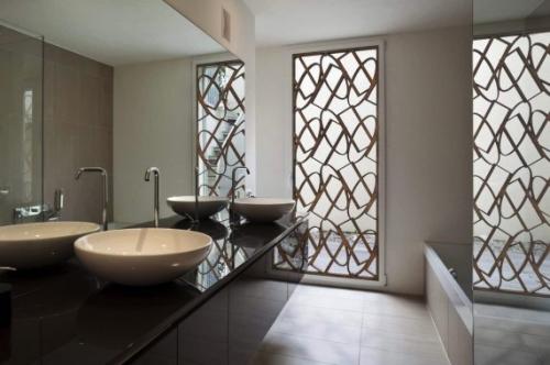
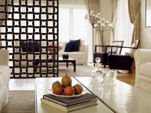
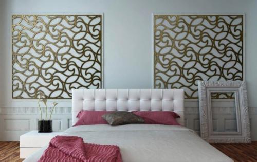
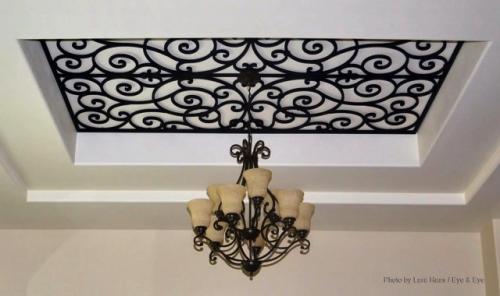
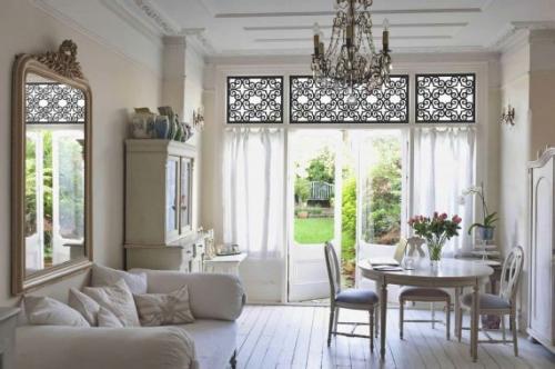
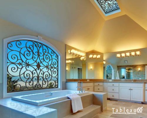
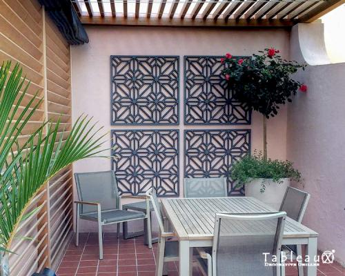
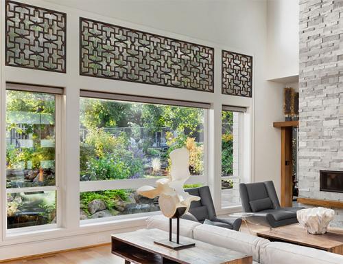
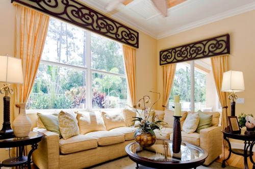
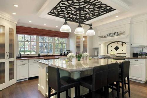
So, here’s what really stood out to me, and I’ll propose this for the right client (maybe you?)…Tableaux Decorative Grilles. These are grilles that allow for virtually unlimited use in interior or exterior home design or home decorating projects. They can be used for window treatments and transoms, ceiling treatments, decorative accents and wall art, partition screens, and miscellaneous decor. Checkout these photos…AMAZING, right!


#bwg_container1_0 #bwg_container2_0 .bwg-container-0.bwg-standard-thumbnails { width: 724px; justify-content: center; margin:0 auto !important; background-color: rgba(255, 255, 255, 0.00); padding-left: 4px; padding-top: 4px; max-width: 100%; } #bwg_container1_0 #bwg_container2_0 .bwg-container-0.bwg-standard-thumbnails .bwg-item { justify-content: flex-start; max-width: 360px; } #bwg_container1_0 #bwg_container2_0 .bwg-container-0.bwg-standard-thumbnails .bwg-item a { margin-right: 4px; margin-bottom: 4px; } #bwg_container1_0 #bwg_container2_0 .bwg-container-0.bwg-standard-thumbnails .bwg-item0 { padding: 0px; background-color:rgba(255,255,255, 0.30); border: 0px none #CCCCCC; opacity: 1.00; border-radius: 0; box-shadow: 0px 0px 0px #888888; } #bwg_container1_0 #bwg_container2_0 .bwg-container-0.bwg-standard-thumbnails .bwg-item1 img { max-height: none; max-width: none; padding: 0 !important; } @media only screen and (min-width: 480px) { #bwg_container1_0 #bwg_container2_0 .bwg-container-0.bwg-standard-thumbnails .bwg-item0 { transition: all 0.3s ease 0s;-webkit-transition: all 0.3s ease 0s; } #bwg_container1_0 #bwg_container2_0 .bwg-container-0.bwg-standard-thumbnails .bwg-item0:hover { -ms-transform: scale(1.1); -webkit-transform: scale(1.1); transform: scale(1.1); } } #bwg_container1_0 #bwg_container2_0 .bwg-container-0.bwg-standard-thumbnails .bwg-item1 { padding-top: 50%; } #bwg_container1_0 #bwg_container2_0 .bwg-container-0.bwg-standard-thumbnails .bwg-title2, #bwg_container1_0 #bwg_container2_0 .bwg-container-0.bwg-standard-thumbnails .bwg-ecommerce2 { color: #CCCCCC; font-family: segoe ui; font-size: 16px; font-weight: bold; padding: 2px; text-shadow: 0px 0px 0px #888888; max-height: 100%; } #bwg_container1_0 #bwg_container2_0 .bwg-container-0.bwg-standard-thumbnails .bwg-thumb-description span { color: #323A45; font-family: Ubuntu; font-size: 12px; max-height: 100%; word-wrap: break-word; } #bwg_container1_0 #bwg_container2_0 .bwg-container-0.bwg-standard-thumbnails .bwg-play-icon2 { font-size: 32px; } #bwg_container1_0 #bwg_container2_0 .bwg-container-0.bwg-standard-thumbnails .bwg-ecommerce2 { font-size: 19.2px; color: #CCCCCC; }
/*pagination styles*/ #bwg_container1_0 #bwg_container2_0 .tablenav-pages_0 { text-align: center; font-size: 12px; font-family: segoe ui; font-weight: bold; color: #666666; margin: 6px 0 4px; display: block; } @media only screen and (max-width : 320px) { #bwg_container1_0 #bwg_container2_0 .displaying-num_0 { display: none; } } #bwg_container1_0 #bwg_container2_0 .displaying-num_0 { font-size: 12px; font-family: segoe ui; font-weight: bold; color: #666666; margin-right: 10px; vertical-align: middle; } #bwg_container1_0 #bwg_container2_0 .paging-input_0 { font-size: 12px; font-family: segoe ui; font-weight: bold; color: #666666; vertical-align: middle; } #bwg_container1_0 #bwg_container2_0 .tablenav-pages_0 a.disabled, #bwg_container1_0 #bwg_container2_0 .tablenav-pages_0 a.disabled:hover, #bwg_container1_0 #bwg_container2_0 .tablenav-pages_0 a.disabled:focus, #bwg_container1_0 #bwg_container2_0 .tablenav-pages_0 input.bwg_current_page { cursor: default; color: rgba(102, 102, 102, 0.5); } #bwg_container1_0 #bwg_container2_0 .tablenav-pages_0 a, #bwg_container1_0 #bwg_container2_0 .tablenav-pages_0 input.bwg_current_page { cursor: pointer; text-align: center; font-size: 12px; font-family: segoe ui; font-weight: bold; color: #666666; text-decoration: none; padding: 3px 6px; margin: 0; border-radius: 0; border-style: solid; border-width: 1px; border-color: #E3E3E3; background-color: rgba(255, 255, 255, 1.00); box-shadow: 0; transition: all 0.3s ease 0s;-webkit-transition: all 0.3s ease 0s; } jQuery('.bwg_nav_cont_0').remove() if( jQuery('.bwg_nav_cont_0').length > 1 ) { jQuery('.bwg_nav_cont_0').first().remove() } function spider_page_0(cur, x, y, load_more) { if (typeof load_more == "undefined") { var load_more = false; } if (jQuery(cur).hasClass('disabled')) { return false; } var items_county_0 = 2; switch (y) { case 1: if (x >= items_county_0) { document.getElementById('page_number_0').value = items_county_0; } else { document.getElementById('page_number_0').value = x + 1; } break; case 2: document.getElementById('page_number_0').value = items_county_0; break; case -1: if (x == 1) { document.getElementById('page_number_0').value = 1; } else { document.getElementById('page_number_0').value = x - 1; } break; case -2: document.getElementById('page_number_0').value = 1; break; case 0: document.getElementById('page_number_0').value = x; break; default: document.getElementById('page_number_0').value = 1; } bwg_ajax('gal_front_form_0', '0', 'bwg_thumbnails_0', '0', '', 'gallery', 0, '', '', load_more, '', 0); } jQuery('.first-page-0').on('click', function () { spider_page_0(this, 1, -2, 'numeric'); return false; }); jQuery('.prev-page-0').on('click', function () { spider_page_0(this, 1, -1, 'numeric'); return false; }); jQuery('.next-page-0').on('click', function () { spider_page_0(this, 1, 1, 'numeric'); return false; }); jQuery('.last-page-0').on('click', function () { spider_page_0(this, 1, 2, 'numeric'); return false; }); /* Change page on input enter. */ function bwg_change_page_0( e, that ) { if ( e.key == 'Enter' ) { var to_page = parseInt(jQuery(that).val()); var pages_count = jQuery(that).parents(".pagination-links").data("pages-count"); var current_url_param = jQuery(that).attr('data-url-info'); if (to_page > pages_count) { to_page = 1; } spider_page_0(this, to_page, 0, 'numeric'); return false; } return true; } jQuery('.bwg_load_btn_0').on('click', function () { spider_page_0(this, 1, 1, true); return false; });
#bwg_container1_0 #bwg_container2_0 #spider_popup_overlay_0 { background-color: #000000; opacity: 0.70; }
if (document.readyState === 'complete') { if( typeof bwg_main_ready == 'function' ) { if ( jQuery("#bwg_container1_0").height() ) { bwg_main_ready(jQuery("#bwg_container1_0")); } } } else { document.addEventListener('DOMContentLoaded', function() { if( typeof bwg_main_ready == 'function' ) { if ( jQuery("#bwg_container1_0").height() ) { bwg_main_ready(jQuery("#bwg_container1_0")); } } }); }
Read more
Pantone's Color of the Year for 2018 is (drumroll please)...Ultra Violet!

Pantone’s Color of the Year for 2018 is (drumroll please)…Ultra Violet!

Just the name sounds powerful and mysterious, but this color is a strong bluish violet, that the Pantone Color Institute says is ‘inventive and imaginative, Ultra Violet lights the way to what is yet to come. A dramatically provocative and thoughtful purple shade, PANTONE 18-3838 Ultra Violet communicates originality, ingenuity, and visionary thinking that points us toward the future.’

Pantone is an international color-matching system, the industry standard, that provides complete matching of standardized color for all materials used in interior design, architecture, manufacturing and related industries (like textiles) and printing. If you have a brand color or colors – or just something you’re trying to match precisely – it’s likely Pantone will be involved in the process.

Laurie Pressman, vice-president of the Pantone Colour Institute, said: “The Pantone colour of the year has come to mean so much more than ‘what’s trending’ in the world of design; it’s truly a reflection of what’s needed in our world today.” Leatrice Eiseman, executive director of the institute, said: “We are living in a time that requires inventiveness and imagination. It is this kind of creative inspiration that is indigenous to Pantone 18-3838 ultra violet, a blue-based purple that takes our awareness and potential to a higher level.”

So back to Ultra Violet. Wow, at first blush, it looks pretty intense, a bit tough to dive into. But the more I spent studying it, I could see a variety of ways to use it that would not only enhance, but totally beautify designs. And when I went online and looked at how some people have already used the color in their design work, I was blown away, and I’ll be sharing some of those images with you below. This bold, blue-tinged purple hue, while highly regal, is not as easy to decorate with as a color like blue, for example. But here are a few ways to work Ultra Violet into interiors:

Use it as an accent – The easiest way to start decorating with a new color is to take baby steps, like having a rug with a few violet threads, or a pair of purple throw pillows, or a few sprigs of violet flowers (or lilacs) in a vase.

Soften it with other purples, pinks, and blues – This is a great way to utilize a bold color like Ultra Violet, by working with other shades in the same family of colors – mauve, blue, blush lilac, etc. – which will soften it and have the color feeling completely at home.

Create a moody theme – “Moody” is a great description of purple, dark and romantic. A very bold approach would be to embrace other supersaturated dark colors and rich luxe fabrics like leather, velvet and dark-colored woods. Big, bold…deep and intense…are you up for it?

So check out some examples of some wonderful interiors utilizing this new color in various ways (isn’t Pinterest great?!). Of course these designs are copyrighted by their respective designers, but that’s what PInterest and Google are for…inspiration! Have at it – and let me know what you think, if you find yourself inspired with this vibrant, interesting, rich new color for 2018. Is this color inspiring you? I’d love to hear your thoughts! Email me at: carmen@sohointeriordesign.com or call me at: (407) 947-7718


Read more