Archives for COMMERCIAL

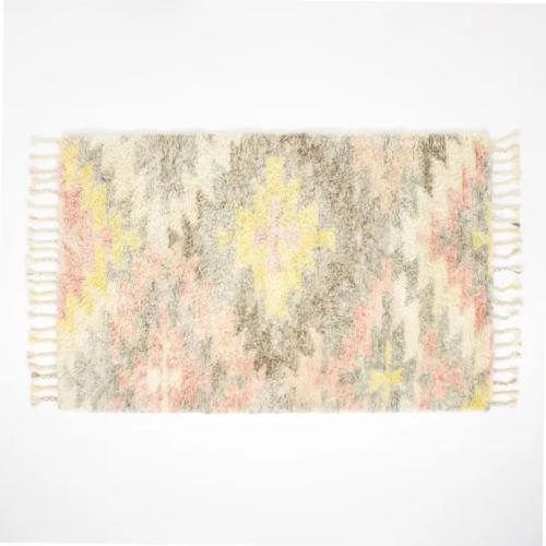
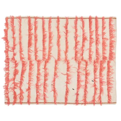
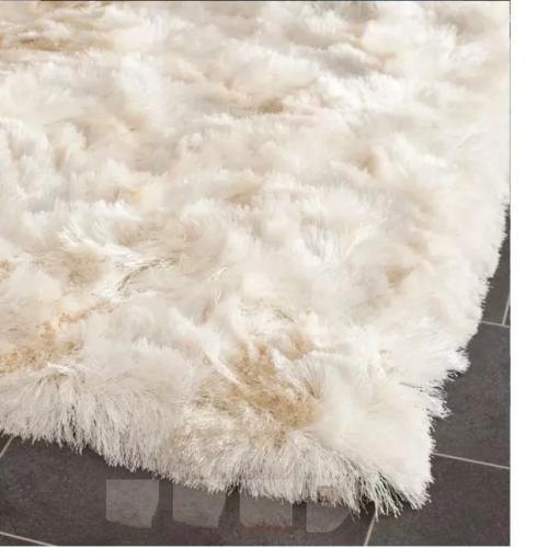
Shag rugs help anchor a room's design and add a warm, cozy touch.

Shag Rugs Are Back: The Coziest Options for Your Feet

It seems that shag is back, and, while we typically associate the deep-pile carpet with the ’60s and ’70s – hello, Carol and Mike Brady’s living room – the origins of the shag rug are in fact more ancient than vintage.

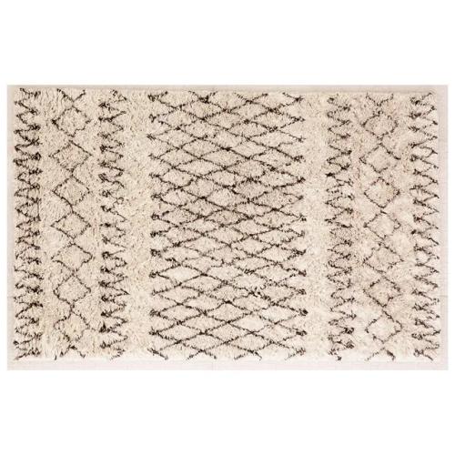
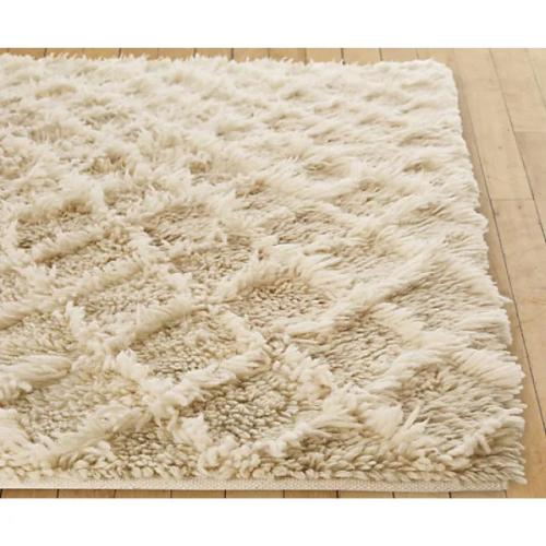
Berber shag rug.

Referred to by many different names – rya, berber, flokati, tulu – the shag rug has a long and colorful history. In Greece, flokati rugs were popular as early as the 4th century B.C., when Alexander the Great used flokati wool in his tents and clothing during his military campaigns. (Think Colin Farrell in Alexander keeping warm with a shag rug.) Centuries earlier in the Atlas Mountains of Morocco, the shepherding Beni Ourain tribes began weaving wool into blankets, and by the mid-20th century had attracted such famed devotees as Le Coubusier, Frank Lloyd Wright, and Eero Saarinen. Today these Beni Ourain rugs are some of the most highly prized.

Beni Ourain shag rug.

Moroccan Beni Ourain shag rug.

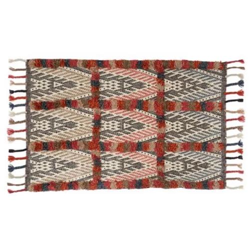
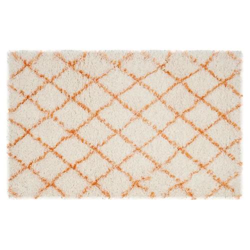
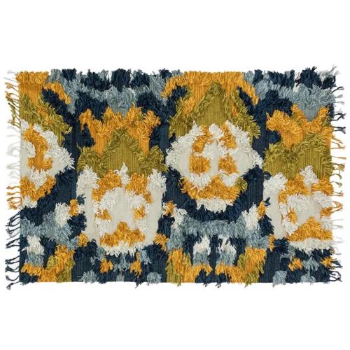
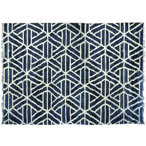
Coming in a variety of colors, materials, and weights, there is sure to be a shag for everybody. So kick off your shoes and get comfortable – here are some shag rugs to keep you cozy all through the house.

#bwg_container1_0 #bwg_container2_0 .bwg-container-0.bwg-standard-thumbnails { width: 1254px; justify-content: center; margin:0 auto !important; background-color: rgba(255, 255, 255, 0.00); padding-left: 4px; padding-top: 4px; max-width: 100%; } #bwg_container1_0 #bwg_container2_0 .bwg-container-0.bwg-standard-thumbnails .bwg-item { justify-content: flex-start; max-width: 250px; } #bwg_container1_0 #bwg_container2_0 .bwg-container-0.bwg-standard-thumbnails .bwg-item a { margin-right: 4px; margin-bottom: 4px; } #bwg_container1_0 #bwg_container2_0 .bwg-container-0.bwg-standard-thumbnails .bwg-item0 { padding: 0px; background-color:rgba(255,255,255, 0.30); border: 0px none #CCCCCC; opacity: 1.00; border-radius: 0; box-shadow: 0px 0px 0px #888888; } #bwg_container1_0 #bwg_container2_0 .bwg-container-0.bwg-standard-thumbnails .bwg-item1 img { max-height: none; max-width: none; padding: 0 !important; } @media only screen and (min-width: 480px) { #bwg_container1_0 #bwg_container2_0 .bwg-container-0.bwg-standard-thumbnails .bwg-item0 { transition: all 0.3s ease 0s;-webkit-transition: all 0.3s ease 0s; } #bwg_container1_0 #bwg_container2_0 .bwg-container-0.bwg-standard-thumbnails .bwg-item0:hover { -ms-transform: scale(1.1); -webkit-transform: scale(1.1); transform: scale(1.1); } } #bwg_container1_0 #bwg_container2_0 .bwg-container-0.bwg-standard-thumbnails .bwg-item1 { padding-top: 56%; } #bwg_container1_0 #bwg_container2_0 .bwg-container-0.bwg-standard-thumbnails .bwg-title1 { position: absolute; top: 0; z-index: 100; width: 100%; height: 100%; display: flex; justify-content: center; align-content: center; flex-direction: column; opacity: 0; } #bwg_container1_0 #bwg_container2_0 .bwg-container-0.bwg-standard-thumbnails .bwg-title2, #bwg_container1_0 #bwg_container2_0 .bwg-container-0.bwg-standard-thumbnails .bwg-ecommerce2 { color: #FFFFFF; font-family: segoe ui; font-size: 16px; font-weight: bold; padding: 2px; text-shadow: 0px 0px 0px #888888; max-height: 100%; } #bwg_container1_0 #bwg_container2_0 .bwg-container-0.bwg-standard-thumbnails .bwg-thumb-description span { color: #323A45; font-family: Ubuntu; font-size: 12px; max-height: 100%; word-wrap: break-word; } #bwg_container1_0 #bwg_container2_0 .bwg-container-0.bwg-standard-thumbnails .bwg-play-icon2 { font-size: 32px; } #bwg_container1_0 #bwg_container2_0 .bwg-container-0.bwg-standard-thumbnails .bwg-ecommerce2 { font-size: 19.2px; color: #CCCCCC; }
/*pagination styles*/ #bwg_container1_0 #bwg_container2_0 .tablenav-pages_0 { text-align: center; font-size: 12px; font-family: segoe ui; font-weight: bold; color: #666666; margin: 6px 0 4px; display: block; } @media only screen and (max-width : 320px) { #bwg_container1_0 #bwg_container2_0 .displaying-num_0 { display: none; } } #bwg_container1_0 #bwg_container2_0 .displaying-num_0 { font-size: 12px; font-family: segoe ui; font-weight: bold; color: #666666; margin-right: 10px; vertical-align: middle; } #bwg_container1_0 #bwg_container2_0 .paging-input_0 { font-size: 12px; font-family: segoe ui; font-weight: bold; color: #666666; vertical-align: middle; } #bwg_container1_0 #bwg_container2_0 .tablenav-pages_0 a.disabled, #bwg_container1_0 #bwg_container2_0 .tablenav-pages_0 a.disabled:hover, #bwg_container1_0 #bwg_container2_0 .tablenav-pages_0 a.disabled:focus, #bwg_container1_0 #bwg_container2_0 .tablenav-pages_0 input.bwg_current_page { cursor: default; color: rgba(102, 102, 102, 0.5); } #bwg_container1_0 #bwg_container2_0 .tablenav-pages_0 a, #bwg_container1_0 #bwg_container2_0 .tablenav-pages_0 input.bwg_current_page { cursor: pointer; text-align: center; font-size: 12px; font-family: segoe ui; font-weight: bold; color: #666666; text-decoration: none; padding: 3px 6px; margin: 0; border-radius: 0; border-style: solid; border-width: 1px; border-color: #E3E3E3; background-color: rgba(255, 255, 255, 1.00); box-shadow: 0; transition: all 0.3s ease 0s;-webkit-transition: all 0.3s ease 0s; }
if( jQuery('.bwg_nav_cont_0').length > 1 ) { jQuery('.bwg_nav_cont_0').first().remove() } function spider_page_0(cur, x, y, load_more) { if (typeof load_more == "undefined") { var load_more = false; } if (jQuery(cur).hasClass('disabled')) { return false; } var items_county_0 = 1; switch (y) { case 1: if (x >= items_county_0) { document.getElementById('page_number_0').value = items_county_0; } else { document.getElementById('page_number_0').value = x + 1; } break; case 2: document.getElementById('page_number_0').value = items_county_0; break; case -1: if (x == 1) { document.getElementById('page_number_0').value = 1; } else { document.getElementById('page_number_0').value = x - 1; } break; case -2: document.getElementById('page_number_0').value = 1; break; case 0: document.getElementById('page_number_0').value = x; break; default: document.getElementById('page_number_0').value = 1; } bwg_ajax('gal_front_form_0', '0', 'bwg_thumbnails_0', '0', '', 'gallery', 0, '', '', load_more, '', 1); } jQuery('.first-page-0').on('click', function () { spider_page_0(this, 1, -2, 'numeric'); return false; }); jQuery('.prev-page-0').on('click', function () { spider_page_0(this, 1, -1, 'numeric'); return false; }); jQuery('.next-page-0').on('click', function () { spider_page_0(this, 1, 1, 'numeric'); return false; }); jQuery('.last-page-0').on('click', function () { spider_page_0(this, 1, 2, 'numeric'); return false; }); /* Change page on input enter. */ function bwg_change_page_0( e, that ) { if ( e.key == 'Enter' ) { var to_page = parseInt(jQuery(that).val()); var pages_count = jQuery(that).parents(".pagination-links").data("pages-count"); var current_url_param = jQuery(that).attr('data-url-info'); if (to_page > pages_count) { to_page = 1; } spider_page_0(this, to_page, 0, 'numeric'); return false; } return true; } jQuery('.bwg_load_btn_0').on('click', function () { spider_page_0(this, 1, 1, true); return false; });
#bwg_container1_0 #bwg_container2_0 #spider_popup_overlay_0 { background-color: #000000; opacity: 0.70; }
if (document.readyState === 'complete') { if( typeof bwg_main_ready == 'function' ) { if ( jQuery("#bwg_container1_0").height() ) { bwg_main_ready(jQuery("#bwg_container1_0")); } } } else { document.addEventListener('DOMContentLoaded', function() { if( typeof bwg_main_ready == 'function' ) { if ( jQuery("#bwg_container1_0").height() ) { bwg_main_ready(jQuery("#bwg_container1_0")); } } }); }

If you’d like to explore a shag area rug for your home (or business) environment but aren’t sure where to start, let me know and I can show you how to find the perfect shag rug for your needs and aesthetic, or I can source it for you. There are a lot of things to consider like size, color(s), texture, and pile, just for starts, and I can definitely help you with all of that.

You can choose a contact method right below this blog post. And feel free to give me a call anytime at (407) 743-2399, and we can explore some exciting living room decor ideas together. You can also email me at: carmen@sohointeriordesign.com and you can also click this link to message me via my website.

Read more
These 7 Colors Will Be Everywhere in 2023

These 7 Colors Will Be Everywhere in 2023

Buckle up for a rainbow renaissance.

“There isn’t a shade or color I’ve ever seen that I haven’t liked,” Mario Buatta, with characteristic wit, observed. The late great decorator, who passed away in 2018, would be pleased, then, to see the spectrum of shades and tints that are poised to dominate our homes in the year ahead. Gone are the days of straight-laced, all-white rooms; instead, as we emerge from three (have I got that right?) years of uncertainty, experts predict a rainbow-bright renaissance in 2023 colors.

“The colors [consumers] choose are reflecting their mood—and they are much freer in how, when, and where they use it on themselves and in their homes,” Gemma Riberti, head of interiors at the trend forecasting agency WGSN, tells us. “Going into 2023, color is reflecting well-being, discovery, acceptance, transformation, comfort, simplicity, and (why not) pleasure.”

While some of these observations might sound like sound bites from your last therapy session, the “It” hues I’ve seen come to the fore these last few years show a collective desire for coziness and a closeness to nature (read: green-everything) and more expressive materials (see one of the year’s biggest trends, bold marble). “One of the most significant themes we’ve identified for the 2023 colors is warmth,” Sherwin-Williams’s Sue Wadden affirms. “People are moving away from the cool grays that defined the past decade and exploring hues that exude kindness, serenity, and empathy.”

There were also some surprises in the mix, according to the color experts we spoke to, namely the emergence of a genre of, literally, out-of-this-world colors: “Near-neons and hyper-brights are also making a comeback, driven by the metaverse, with colors making an impact in both digital and physical realms,” Ribaldi says. That entails vivid, bold hues—especially as Gen Zers begin decorating their first homes.

But if you aren’t entirely ready to paint your bedroom acid green just yet, read on for a list of the seven color trends that will be all the rage in 2023.

Green: Sage is giving way to deeper emerald green in 2023 colors.

Green is a hot 2023 color!

The color experts have said it before and they’re saying it again: Green shows no sign of fading in our homes, and it’s a surefire bet—whether you opt for a soothing sage or a pale pistachio—the hue will remain in fashion for years to come. “We’ve definitely seen an increased interest in greens this year, with that shade representing three of our top six colorways for 2022,” says Natalie Ebel, copresident of direct-to-consumer paint brand Backdrop. But while last year paint companies were predicting dusty verdant variations (for instance, Benjamin Moore’s 2022 Color of the Year, October Mist), Ebel, along with many other experts, predicted an uptick in punchier, truer greens and emeralds.

What makes green, well, evergreen? International color expert and executive director at Pantone’s Color Institute Leatrice Eiseman, makes the case for its beauty as a neutral. “My students hear me lecture over and over and over again about using green as a neutral color,” she says. “Mother Nature uses it ubiquitously in plants and foliage.” Watch for this hue in everything from marble to tile to furnishings in the year ahead.

Cool Lavenders and Lilacs: Lavender and lilac hues are rising in popularity among Gen Zers.

Lavender/lilac is one of the 7 colors that will be everywhere in 2023.

An emerging color trend that demonstrates the power of newly initiated Gen-Z consumers is the rise of soft, dusty shades of lavender and lilac. 1stDibs, the digital antiques marketplace, saw interest in lavender spike in 2022, up to 14 percent over 6 percent approval the previous year. WGSN forecasters, meanwhile, spotted the shade—which they’ve dubbed “Digital Lavender”—everywhere from Jil Sanders collections to Mercedes-Benz concept vehicles to Andrés Reisinger virtual furniture.

Riberti, along with WGSN’s color strategist Clare Smith, predict the color will dominate tabletop and soft furnishings, in addition to our walls. “It’s a sensorial shade that connects to holistic well-being and digital optimism,” they tell us. “This shade poses that much-needed cautious optimism and escapism that people are craving post-pandemic, and even in times of budget crunch, it is imaginative and creative but also speaks of hope and balance.”

It also speaks to nostalgia: Smith and Riberti have noticed it paired with chrome, glass, and other reflective surfaces, an indication that the ’80s are officially back. 1stDibs also saw a correlation between soft powdery pastels and an increase in ’80s-era interest.

Orange: Flame orange is dousing some walls lately.

Flame orange is one of the 7 colors that will be everywhere in 2023.

Orange, as Pantone’s Eiseman pointed out, has consistently remained “at the bottom of the totem pole.” But her team’s research has indicated that the hue is “definitely on board for next year.” It’s a trend also mirrored in WGSN’s reporting: “Saturated tones will return yet in solid color statements, enabling new forms of self-expression,” Riberti says, like fiery orange. And while some designers might opt for saturated versions of the shade on walls, many will use the pigment to add pop to furnishings and accents. “It’s the combination,” Eiseman says. “There are creative opportunities to put colors together that really tax your imagination.” (I’ll add: in a good way)

But homeowners and designers are also drawn to earthier, terra-cotta-tinged shades. In fact, according to 1stDibs’s latest trend research, burnt orange was its third most popular color, behind (you guessed it) emerald and sage green.

Light Brown: Milk chocolate never looked so delectable.

Light brown is one of the 7 colors that will be everywhere in 2023.

Forget gray; brown is 2023’s new neutral. In fact, all varieties of this cozy shade are appearing in the color-forecasting tea leaves. “Light browns, dark browns, and beiges are making a comeback because of their earthiness, meaning they ground us and help us feel more connected to the beauty and restorative properties of nature,” says Wadden of Sherwin-Williams.

Before you start getting flashbacks of generic ’90s tract home dens, consider the versatility of today’s beige: “What we’re seeing with the neutrals is that there are many more nuanced neutrals that seem to have an undertone that really pops out at you,” says Pantone’s Eiseman. ELLE DECOR editors are also spotting a variety of finishes with these trending tints, ranging from lustrous taupe lacquer to textured limewash in spaces from kitchens to bedrooms.

Mustard: For ’70s flare, you might try giving your walls a mustard makeover.

Mustard is one of the 7 colors that will be everywhere in 2023.

Do you prefer honey or dijon? Yellow or hearty whole grain? Whatever your preference for mustard, it’s a go for 2023 colors. In addition to Raspberry Blush, Benjamin Moore named the khaki-colored Savannah Green as part of its forecast for next year. “Almost like gold leaf for your walls, this rich ochre features a balanced undertone of green and yellow,” the hue’s description reads. Chairish, the vintage furniture online marketplace, saw an increase in searches for mustard-colored items on its platform. For our part, we’ve been seeing varieties of mustard everywhere from walls to textured bouclés.

Rose: A lovely, warm unexpected neutral in 2023 colors.

Rose is one of the 7 colors that will be everywhere in 2023.

Next year’s outlook is rosy, according to color forecasters—from bright fuchsias to delicate, neutral-leaning pinks. On the subtle end of the spectrum, Sherwin-Williams inaugurated Redend Point, a serene gray-pink, as its 2023 Color of the Year. “This gorgeous hue tells a story about warmth, exploration, and the importance of self-care, and is the perfect example of the warm, versatile, and unexpected neutrals we expect will become increasingly sought after in 2023,” Wadden tells us.

Pantone, meanwhile, named Viva Magenta! as its frontrunner for 2023 colors – a jubilant purply red that felt in line with the digital-first zeitgeist and “this idea of needing more energy, more vim and more vigor,” Eiseman tells us. Mauve is also making moves, 1stDibs predicts; the company saw a 4 percent increase in interest for mauve in 2022, another indication that the ’80s vibes are in our future.

And there’s more: Benjamin Moore named Raspberry Blush 2008-30 as its color-to-watch of 2023. “We love seeing Raspberry Blush on all four walls to make a bold color statement,” Arianna Cesa, the company’s associate manager of color marketing and development notes. “We particularly love it in a dining room as a modern, blushed update on the classic deep red dining room. For those who want to dip their toe into bold color, it’s great for an accent wall, a ceiling, painted furniture, or trim.”

Powder Blue: A feel-good soft trend that adds balance.

Powder blue is one of the 7 colors that will be everywhere in 2023.

Softness has been trending in a major way across the homefront, ranging from amorphous shapes to fuzzy finishes. It’s also appearing in our homes via pale, powdery blues in particular. Experts say it exemplifies a collective desire for calm in a crazy world: “Luminous powdery sky blues and barely-there pastels will speak to the need for softness and for balance, and help support physical and mental health,” Riberti predicts. Chairish, meanwhile, predicted “French blue,” a pretty cornflower hue, will be appearing increasingly in furnishings and accessories. The sky, apparently, is the limit with this feel-good tint.

Wow, the outlook for a colorful 2023 is bright! I hope you found inspiration in the colors shown here. And that’s the tip of the iceberg. You know I’m here to help you pull it all together and find your best color palette for your personal spaces.

If these 2023 colors have inspired you, just give me a call anytime at (407) 743-2399. I’m easy to reach – you can choose a contact method right below this blog post, and we can set up a consultation to explore some lovely, colorful territory together. You can also email me at: carmen@sohointeriordesign.com and you can also click this link to message me via my website.

Read more
Pantone Color of the Year 2023: Viva Magenta!

Pantone Color of the Year 2023: Viva Magenta!

It’s a big day when paint company Pantone announces their Color of the Year. The 2023 Pantone Color of the Year, Viva Magenta, is a color that is already trending in the fashion and beauty world and now it’s making its way into interior design.

Just like in previous years, Pantone’s choices for this year’s trending colors are rooted in nature. But Pantone always chooses a color that has a little more edge than other paint companies.

Last year, Pantone chose Very Peri as their Color of the Year, a daring and carefree blue shade that was certainly bolder than the other blue and green shades that were trending. And this year we see a similar interior color trend, the colors are warmer and in Pantone’s case a lot bolder.

Read on to learn more about Viva Magenta, the Pantone Color of the Year 2023, and how you can use this bold color in your interiors, and sometimes enhanced, or subdued with complimentary color schemes.

Make any space come alive with a pop of Viva Magenta

A Deeper Dive into the Origin, Meaning, and Nuances of Viva Magenta

The story behind Viva Magenta is all about the balance between our digital and physical lives. In recent years, we have responded and reacted with a greater pull toward the natural world, and the Pantone Color of the Year 2023 is chosen to reflect our pull toward natural colors and the movement surrounding sustainability, and ecology.

In recent years, and perhaps as a response to covid and lockdowns, etc., an increased love for nature has also been reflected in our homes, not just with paint colors but also by adding plants, florals (live flowers, prints, and wallcoverings), and living walls to our interiors. And by paying more attention to our outdoor spaces.  

Our current lifestyle trends are at the heart of the Color of the Year selection process. And Pantone feels that Viva Magenta is the perfect rich shade for these times. The origin of Viva Magenta comes from the cochineal beetle. This insect produces carmine dye, one of the most precious, strongest, and brightest colors of the natural dye family.

This year’s color merges the richness, warmth, and strength of the natural world with the rich, open horizons of the digital world. The result is a red shade that celebrates life, Viva Magenta is a bold shade that also adds a fun touch to your home.

Viva Magenta adds fun pops of color to your spaces.

How Viva Magenta Can Be Used In Your Home

For a bold statement, you can opt for a magenta feature wall or sofa. But it can also be added as an accenting pop of color through curtains, rugs, pillows, or flowers. Viva Magenta certainly adds a warm and dramatic tone to any room of the house.

Living Rooms are a Great Place to Start

One interior photo shows how you can test the waters with one or two pieces of furniture. Sure, it’s a bit of a commitment, but it also makes a lovely bold statement.

Testing the waters with Viva Magenta furniture.

This living room shows a neutral base with white walls, shelves, and furniture that is spruced up with a bold pink rug.

Viva Magenta bold pink rug.

If pink walls are a bridge too far for you, consider painting the ceiling. Ceilings are often a forgotten component, but you can add such an impactful colorful statement to any room by painting the ceiling as you can see in this photo of a home library crowned with a hot pink ceiling.

Viva Magenta on the ceiling? Of course!

Pink on pink in this home. The living room walls are painted in an earthy pink shade which is complimented by a hot pink sofa in a traditional style.

Earthy pink walls, Viva Magenta sofa.

A bold pink shade creates a stunning feature wall in the living room.

A Viva Magenta accent wall showcases artwork.

And this living area mixes up color quite nicely.

Mixing up color nicely in the living area with Viva Magenta.

Viva Magenta in Kitchens

This home is festooned with colorful wallpapers. But their love for color continues with this hot pink kitchen. The boldness of these rich pink kitchen cabinets looks pretty stunning.

Viva Magenta in the kitchen.

Another room where two pink shades have been combined. Soft pastel pink cabinets and walls are combined with a hot pink tablecloth for a bold color accent in a colorful apartment. This is a very simple way to anchor a deep richness into this kitchen space.

A Viva Magenta tablecloth anchors a deep richness with the lighter pink cabinetry.

This family home is packed with color and in the kitchen/dining area they placed a hot pink rug on the floor for visual impact, warmth, and depth.

Another easy test of the color of Viva Magenta is to use a dining area rug.

This kitchen in a midcentury home combines green cabinets and walls with deep pink tiles. It shows that green and pink are a great color combination together.

Viva Magenta backsplash kitchen tile.

Detouring from the kitchen, and going back to the living room, here is another green and pink example showing a playful pop of color in a more traditional sofa setting.

Viva Magenta pillows and a throw mix it up with green in a traditional living room setting.

You can add bold color accents with textiles, decor, and art but why not make a statement with furniture? These built-in cabinets add a vibrant pink color touch to a blue and white kitchen.

Viva Magenta built in kitchen area cabinets.

This Bold Color in Bedrooms

To make a bold pink like Pantone’s Viva Magenta truly pop you can combine it with darker color tones. This moody gray bedroom shows exactly that, the walls and floor are painted in a dark shade but with a pink throw and rug, you add a joyful pop to the room.

A pink throw and rug add playful pop to this moody bedroom.

Again, a room where two shades of pink are combined. This pink bedroom in a colorful family home combined a plaster pink shade with a bold pink/reddish rug.

This pink bedroom in a colorful family home combined a plaster pink shade with a bold Viva Magenta rug.

We’ve already seen hot pink as an accent color in the bedroom but you can paint the walls as well as this attic bedroom shows.

You can paint the walls Viva Magenta for a bright colorful effect, as this attic bedroom shows.

Pantone’s Viva Magenta Color Palette

Pantone has also released a color palette with complimentary shades for Viva Magenta. This color palette mainly features light, neutral, natural shades that will make the Pantone Color of the Year 2023 stand out.

Pantone's complementary color palette for Viva Magenta.

top row: Pale Dogwood – Gray Sand – Gray Lilac – Viva Magenta
bottom row: Pale Khaki – Fields of Rye – Agate Gray – Plein Air

Besides these neutral color tones, you may have noticed other color combinations in the images here. For a natural look, you can combine Viva Magenta with green and blue. If you want the 2023 color to really stand out you can combine it with dark gray. Or you can go for a full pink look, where dusty pink tones form the neutral base of your room with magenta color accents.

Viva Magenta adds the right amount of pop in this already colorful bathroom. It's very much at home with the rich blue and other accent colors.

How do you feel about the Pantone Color of the Year 2023: Viva Magenta? Do you enjoy the bold color, or is it too much for you? Truth be told, I’m still forming my opinion, but some of you will have immediate gut reactions to it. Let me know your thoughts, especially if you’d like to explore using this color in your spaces – I can help you test the waters.

If this bold rich magenta color for 2023 has inspired you, and you’d like to see how to incorporate it into your spaces, I’m always available for consultations. Choose a contact method right below this blog post, or click this “contact” link. You can also email me at: carmen@sohointeriordesign.com And you can always call me anytime at (407) 743-2399.

Read more
Living room trends that will be huge next year.

Living Room Trends That Will Be Huge Next Year

Will 2023 be the year of fluted details or muted tones in living room trends? (spoiler alert: BOTH!)

As 2022 winds down, of course, we’re already looking ahead at what’s trending next for the design world. And, as one of the central gathering spaces in any house, the living room is at the heart of my focus. 2022 proved to be the year of bold wallpaper, warm woods, and a resurgence of antiques—all of which are still going strong. But what’s on the other side of the calendar? The good news? The prognosis is great, with warmth, style, and details galore.

Rich, Muted Tones

If a few years ago saw the heydey of Millennial Pink and the last few years were all about verdant shades, 2023 is shaping up to be all about rich, vibrant colors in muted tones. The feeling evoked in this room portrays that, with a burgundy velvet sofa, deep sage lime-washed walls, and pillows that are the sexier cousin to teal. 2022 also saw designers leaning into deep, dark palettes to evoke warmth and comfort, and that may continue to carry over into 2023 living room trends.

Rich, muted tones in living room trends.

Warmer Neutrals

In terms of neutrals, warm, earth tones complement those rich hues well. Some designers see a trend in 2023 toward warm, non-intrusive, neutral tones and materials, which provide comfort and security. Raw, organic materials, and tones such as brown ocher, offer a cozy-yet-modern grounding base. The living room shown here proves how well the rich hues and warm neutrals pair.

Warmer neutrals in living room trends.

Multifunctionality

Let’s hear it for 2023 being the year we…actually use our living rooms. Now that we know better than ever how we use our homes, they’re adapting to better serve those needs. The single room shown here is designed with areas for reading, napping, drinking, entertaining, and even stargazing.

Multifunctionality is a big living room trend for 2023.

Fluted Details

This is trending really big now. Fluted and reeded pieces in neutral spaces are especially huge right now. While the look was once reserved for small detail areas, design forecasters predict next year will see it expand into living spaces.

Fluted details are a big living room trend for 2023.

Next-Level Media Experiences

With new binge-worthy shows launching weekly and the desire for increased comfort in staying in more, 2023 will likely be the year many homeowners splurge for an upgraded media experience, whether in the form of a large-scale TV or custom sound system.

Next-level media experiences are big living room trends.

Meaningful Collections

It’s been said that the objects we fill our homes with hold the most power to ease our anxieties. Maybe it’s your grandfather’s collection of fly fishing lures, or maybe you’re zealous for antique maps—whatever it is that brings your truest self to your living space is on trend. For example, here, in a New Jersey home for a recently-widowed art collector, the space was designed to showcase the owner’s collection of art and souvenirs.

Meaningful collections will be a big living room trend in 2023 home decor.

Daybeds

Maybe it’s their multifunctionality, maybe it’s their element of nostalgia, but we’re seeing a big return to daybeds in large living spaces. Here, a Serena & Lily daybed divides the large living area without blocking the sculptural window. Covered in a Sanderson fabric, it gets a custom look.

Daybeds are trending in 2023 living room decor.

Outdoor Living

Living rooms in 2023 will push beyond the house, as outdoor entertaining proves to have real staying power. After all, when you devise your outdoor space with living areas as good as your interiors, do you even need to go inside?

Outdoor living is a living room trend continuing for 2023.

I hope these 2023 living room trends have piqued your interest and inspired you! If you’d like to have me bring some of these living room decor ideas into your home, let me know. You can choose a contact method right below this blog post. And feel free to give me a call anytime at (407) 743-2399, and we can explore some exciting living room decor ideas together. You can also email me at: carmen@sohointeriordesign.com and you can also click this link to message me via my website.

Read more
Easy and Inspiring Winter Decor Ideas for 2022

Easy and Inspiring Winter Decor Ideas for 2022

Cozy! That’s the word that best defines winter decor. I’ll bet you want your home to be cozy and offer a warm welcome to family and friends, especially at holiday time.

You don’t need to do major renovations or spend a small fortune. Simple little changes to your spaces add that extra feeling of comfort and warmth.

Here are some simple ways to create cozy winter decor:

Cozy winter decor means blankets everywhere

Cozy, warm winter decor means lots of blankets.

Winter always provides a great opportunity to pull out more blankets and have them all around the home, doing double duty, adding a nice casual style, along with providing actual warmth when needed.

Lots of blankets for color, warmth and texture in winter decor

Blankets are an inviting way to make your house more cozy and comfortable. You can use blankets on the sofa, on office furniture, over an armchair, on the porch bench, or anywhere you might want to add a little extra color and texture, and yes, warmth.

Switch out the rugs

Time to put away the sisal rugs and pull out some high and fluffy rugs. In summer, natural fiber rugs are the best choice because they are cooler, in winter it is the opposite.

Thicker, warmer rugs will introduce "cozy" to your winter decor.

This season, look for high-pile rugs…remember that key word: cozy.

Invest in pillows

Cushions give you such a great option to introduce colors and textures, as well as comfort. All three qualities together definitely make for a cozy environment. Carry the idea of “warm” throughout your decor upgrades at holiday time.

For color, texture and warmth, investing in pillows for cozy winter decor makes good sense.

Here’s another tip: in the wintertime, use pillows with warm. tactile fabric covers, such as textured cloth, crochet, and velvet. Leave the satin covers for the summer.

winter decor ideas - blankets

Add some coziness with warm lighting

The color of the lamps also has a lot of relevance in winter decoration. The yellowish tones, considered warm, refer to fire, fireplaces and bonfires.

A lantern adds a lot of warmth and color to your wintry decor.

The warm colors that lamps and candles can introduce definitely enhances a mood of coziness. Yellowish, warm tones link to fireplaces and the hearth.

Easy and Inspiring Winter Decor Ideas for 2022

Light fixtures, lamps, and ceiling spots can easily convey warm tones of light that let you relax into the wintertime with family and friends.

Keep the whiter lights for places where focus and concentration are needed, such as the kitchen, office, and study.

Plants have their own lush warmth to add to your winter decor

Imagine plants like that yummy hug. Your house is more intimate, welcoming, and comfortable with them. They nicely pull a room together.

A warm bulb in a fixture can warm up an otherwise cool room

Plants are great for any room, whether bringing life and color into the living room, spreading vases around multiple rooms (vases also introduce variety with warm colors, textures, and natural tones), or even plants in the bathroom (they love the moist “hothouse” air).

Bring in the green with plants for your winter decor.

Do be careful with your selection of plants. Remember that each of them requires a different light level. Research what works best in each location ahead of time.

Scatter candles to warm up your winter decor

Candles are the best! They decorate, illuminate and add warmth. That description is exactly what winter decoration is all about.

Scatter candles everywhere for warm cozy winter decor.

For safety reasons, it’s best to place candles in holders of some kind, preventing fires. Glass and mirrors tend to bounce the light all around, adding a nice touch, and metal support bases can add another dimension of warm color into the room.

Also, be mindful of where the candle will be lit. Avoid locations near flammable objects, such as curtains, or dry, papery decor.

Light up that fireplace (or bring one inside)

Winter is also the ideal time to put away the fan and light up that fireplace, of course.

Light up that fireplace for cozy warm winter decor.

You don’t need to have a masonry fireplace in your living room. Nowadays there are very efficient, portable fireplaces that add that extra warmth for a cozy winter environment.

I hope these winter decor ideas help you find simple cost-effective ways to dress up your home for a wintry, cozy mood this holiday season! If you’d like to have me bring some holiday styling to your home or office, contact me. You can choose a contact method right below this blog post. And feel free to give me a call anytime at (407) 743-2399, and we can explore some lovely winter holiday decor ideas together. You can also email me at: carmen@sohointeriordesign.com and you can also click this link to message me via my website.

Read more
Raspberry Blush, Benjamin Moore's 2023 Color of the Year

Benjamin Moore’s 2023 Color of the Year Is Raspberry Blush

The fiery red-orange will inspire you to break out of your color comfort zone.

Over the last several years, muted colors have encouraged serenity in our homes. Last year, it was all about green, fostering a connection with nature. Now, Benjamin Moore is looking to a bolder, more courageous future with its Color of the Year for 2023: Raspberry Blush (2008-30). The saturated red-orange is basically the best color in a really good sunset, and it’ll inspire you to break free from your color comfort zone.

Paint bold walls with the 2023 color of the year.

“It’s a really charismatic color and doesn’t sit quietly on the wall,” says Andrea Magno, color marketing and development director at Benjamin Moore. “It’s about awakening our senses and getting people to engage with a vivacious color.”

Make your kitchen come alive with the 2023 color of the year.

The 2023 color of the year is a trend toward warmer hues

Notably, Raspberry Blush marks a pull toward warmer hues. “We’ve had colors that are on the cooler side of the color wheel for a number of years, and now we’re really starting to see a shift to the warmer colors,” Magno says.

Try a piece of furniture painted in the 2023 color of the year.

Playing with Raspberry Blush can mean blanketing your walls with it—like as a modern take on the red dining room of the past—or incorporating it in a smaller way through a painted piece of furniture. No matter how much surface area you allot for the color, it’ll bring high energy into any space.

A throw lets you test the waters with the 2023 color of the year.

Exciting colors trending for 2023

Raspberry Blush also sets the stage for Benjamin Moore’s color trends palette for 2023. The eight-color palette features an eclectic mix of colors with nostalgic references to periods like the ’80s and ’90s as well as deeply saturated hues found in the wild. “A lot of times people talk about (and we’ve done it, too) looking at nature as a point of inspiration,” Magno explains. “But for this year, instead of looking at more organic, vegetal colors, we were looking at the standout colors—the fiery colors of a sunset, tropical flowers, the depths of the Mediterranean.”

Benjamin Moore's 2o23 color trends palette.

To celebrate Raspberry Blush, Benjamin Moore tapped the electro-funk duo Chromeo to bring the color’s personality to life through a new song fittingly called “Raspberry Blush.” You can also find eight playlists dedicated to each color in the palette on Spotify for an immersive visual and audible experience—perfect for putting on the loudspeaker as you give your home a paint refresh!

Do you love the Benjamin Moore 2023 color of the year?

If this bold new coral color for 2023 has inspired you, and you’d like to see how to incorporate it into your spaces, I’m always available for consultations. If this sounds appealing, we can talk about how Raspberry Blush can enhance your interior spaces. Choose a contact method right below this blog post, or click this “contact” link. You can also email me at: carmen@sohointeriordesign.com And you can always call me anytime at (407) 743-2399.

Read more
Mix interior design styles.

Tips to Easily Mix Interior Design Styles

Would you like to mix furniture and decor design styles in your home but don’t know how? Are you struggling to create a cohesive look with the mix of furniture and accent pieces you’ve accumulated?

Mixing takes some practice, but it makes the decorating experience much more enjoyable. This loose style is a great equalizer in interior design. A mixed style snubs its nose at the rules by blending old with new, cheap with pricey, bold with subtle, and classic with trendy.

While there are many different interior design styles, few fit into just one category. More and more people favor a mixed style to play off their existing furnishings and incorporate new pieces. Combining what you have on hand with something completely new and unexpected gives you the license to invent a uniquely tailored style for your home.

The good news is you can easily and beautifully mix different decorating styles, like traditional, modern, or farmhouse, to create a stylish interior. Follow these helpful tips and guidelines to design with confidence.

Pick your main style

Mix interior design styles.

One way to start mixing and matching interior design styles is to employ the 80/20 rule. This means that approximately 80 percent of your space should feature one design style, and the other 20 percent can include others.

For example, if you have a living room with a traditional sofa and chairs, for instance, you can lighten the look by adding framed contemporary prints and light curtains in a natural material.

Most people end up mixing decorating styles in their home without realizing it. That’s what makes your home warm and inviting.

The neutral color palette in the example shown here, allows the homeowner to easily incorporate fun and trendy accent pieces without needing to completely redo the room.

Consider your space

Mix interior design styles.

A room’s built-in features can influence its style. For instance, white-painted crown molding may impart a traditional look, while an open floor plan and concrete flooring can provide a modern feel.

But there are ways to work in other styles, too, despite your space’s existing structural elements. You can make a traditional kitchen with white cabinets and butcher-block counters look more contemporary by giving it a bold backsplash and modern tile flooring.

Or you can warm a modern space with high ceilings by adding a comfy traditional-style sofa, a rustic brick accent wall, and warm pops of color.

Create balance

Mix interior design styles.

Combining diverse design styles is a balancing act. To make your space look harmonious, give each side of the room equal visual weight.

For instance, if a large built-in bookcase dominates one area, you could counterbalance it with an overstuffed sofa on the other side of the room. If your coffee table features a red vase, add other red accessories throughout the space.

If you want to combine two design elements in your room, such as Scandinavian and midcentury modern, intersperse both styles throughout instead of featuring one style at one end and the other style at the other.

Find commonality

Mix interior design styles.

You can effortlessly mix contrasting furnishings by accentuating the qualities they share.

For instance, a transitional-style sofa, midcentury accent chairs, rustic coffee table, and farmhouse dining table can look perfect together if your sofa and chairs have similar farmhouse-style throw pillows and your rustic and midcentury furnishings have matching wood tones.

Texture can blend design styles and make a room more interesting. If you have a space filled with industrial-style furniture but would like to bring in rustic features, you could add a live-edge wood coffee table with black hairpin legs and a distressed wood mantel over your fireplace.

Use color to unify

Mix interior design styles.

Repeating colors is an effective tactic for blending design styles. A good rule of thumb is to develop a color palette with three to five main colors. You can expand this color scheme by adding lighter or darker versions of its core colors.

You can even turn a design element that’s pricey or stands out from the rest of your decor into a focal point by incorporating its palette into your overall color scheme. For example, if you have a red-brick fireplace, you can pick up its rust color as an accent color in your room to make your fireplace pop.

Know your design styles

Mix interior design styles.

It’s helpful to know the hallmarks of design styles when planning your decor. Here are some of the most popular ones:

Bohemian: If you love a global aesthetic, this style, which mixes and matches fabrics and decor from around the world, is for you. Think Japanese block prints, handwoven rugs, and hanging macramé planters filled with houseplants.

Industrial: This style suggests an urban loft or warehouse, and it may include exposed beams and ductwork, high ceilings, concrete surfaces, and sparse furniture.

Modern: A modern style is defined by sleek, clean lines, dark-hued colors—think black-framed windows—and a combination of metal, glass, and steel.

Modern farmhouse: Popularized by designer Joanna Gaines, this style features a light and neutral color palette, homey fabrics like chunky knits and grain sacks, natural and painted wood furniture, decorative wood signs, and rustic shiplap walls.

Scandinavian: Rooms with a Scandinavian theme may have white walls and feature uncluttered spaces accented with lush houseplants, minimalistic furniture, and light wood floors à la IKEA.

Traditional: Traditional design may include luxurious features, such as ornately carved furniture, dark wood finishes, gold flourishes, rich fabrics like velvet, and curved lines.

Transitional: This style mixes modern and traditional styles and may include traditionally inspired furniture that’s toned down in size and ornamentation and a neutral color palette with bright splashes of color.

Mix interior design styles.

Tips for Mixing Interior Styles

  • Make things equally distributed: Don’t segregate different styles in one room. Mix them throughout the space to make it easier on the eye.
  • Employ similar shapes: Select furniture pieces that have comparable forms. A mid-century track arm sofa won’t look great next to roomy, deep-seated club chairs.
  • Create a constant vibe: If you prefer an ornately formal bedroom, don’t bring in modern or casual furnishings. Try to keep things likewise formal, even if the pieces vary in style. This will maintain the room’s mood.
  • Blend decade styles: You can combine decade styles, such as the 1950s, 60s, and ’70s, that create a bridge between the 30 years. The mid-century decades work well with each other and can easily merge.
  • Balance the room: Whether you use different end tables and diverse objects on either side of a sofa, you should maintain equal visual weight to create equilibrium in the room.
  • Retain scale within the space: Keep all the furnishings in scale. For example, don’t put a small settee next to an overstuffed recliner. Make sure furniture pieces have a similar scale and also relate to the room’s size.
  • Use compatible colors: When mixing decor styles, use coordinating or consistent colors to create a cohesive look. If you want to bring in a modern chair with a traditional sofa, choose upholstery colors that work together.
If you like the idea of mixing interior design styles but not sure what works with what you already have, I’d be glad to help you with that. Just choose a contact method right below this blog post, or click this “contact” link. You can also email me directly at: carmen@sohointeriordesign.com, and you can always call me at (407) 743-2399.
Read more
How do you decorate large walls?

How Do You Decorate Large Walls?

Sometimes wall art might be a painting, and sometimes it’s something else.

There are a handful of “essentials” that make a home or space functional and comfortable. One of these, of course, is a roof over your head. Another obvious one is furniture. I place decorative elements like wall art in this same category of essentials.

And when you have large walls to decorate, it’s the perfect opportunity to tie a room together in many ways.

The right pieces for your walls can introduce intrigue, personality, inspiration, and dimension to your abode. You’ll be amazed at how transformative one large statement piece (or display) can be.

The right pieces for your walls can introduce intrigue, personality, inspiration, and dimension to your abode.

If you have some blank walls to dress up, here are some large wall art ideas that hopefully inspire you in some attractive and unexpected ways, as well as ideas for how you might want to display them. 

Large wall art

If you have tall ceilings in your living room, you should think about hanging a big wall decor piece. With large oversized art, the most important thing is that it fits to scale, meaning it fits with the size of your wall.

If you have tall ceilings in your living room, you should think about hanging a big wall decor piece.
A large attractive painting can tie a room together beautifully.

Bring the beach fun indoors

Why not hang a surfboard?

If you live by the coast or like beachy home design, why not hang a surfboard?  A simple design can nail the look without going over the top.  

A colorful mix of a few surfboards create fun large decor.

Make light with mirrors

One of the best wall decor ideas for living rooms is to hang multiple mirrors. When placed across from a window, you double the amount of light while creating the illusion of a larger space.  

Open up a space by hanging multiple mirrors.

Gallery walls (and the Rule of Threes)

In the world of interior design, the rule of threes suggests that groups of three (or other odd numbers) are more attractive to the eye than even numbers. You can embrace this concept in your living room by hanging a three-piece framed art set. 

In the world of interior design, the rule of threes suggests that groups of three (or other odd numbers) are more attractive to the eye than even numbers.

Murals & large maps

There are many wonderful artists who focus a good bit of their time painting incredible murals on the walls of art-loving homeowners. It’s important to select a style that is compatible with your interior decor and furnishings, and mural artists usually have wonderful suggestions once they see your space.

With painted murals, it's important to select a style that is compatible with your interior decor and furnishings

These days, murals are often created as panels that are adhesive and easily removable. And the styles available are lovely and astounding. Moody seascapes, bright abstracts, soothing watercolors – they’re all available in square, portrait, and landscape orientations.

These days, murals are often created as panels that are adhesive and easily removable.

I love maps! Large world maps make great wall art because they’re timeless, useful, and often come in versatile hues. What child wouldn’t love exploring the world in his or her bedroom? These can be painted by a muralist or bought as wallpapers, stick-on shapes, or removable printed murals.

Large world maps make great wall art because they’re timeless, useful, and often come in versatile hues.

Go bright, bold, geometric

For a high-impact dining nook, consider hanging a larger piece with lots of bold colors, geometric shapes, and endless details you’ll want to admire over the years.

Bright, bold, geometric art is the focal point of the room.

Set against simple but striking black furniture, this large-scale, kaleidoscopic piece is clearly meant to be the focal point of the room.

Lighted wall art

Think outside the bulb with lighted wall art. Take a look at how this battery-powered shadowbox showcases natural birch branches with a subtle glow.  

This lighted wall art is definitely thinking outside of the box.

Try a tapestry

An easy way to cover a large amount of space is by choosing a colorful tapestry to hang above your furniture.

An easy way to cover a large amount of space is by choosing a colorful tapestry to hang above your furniture.

While there are endless patterns and designs to choose from, selecting a colorful option can change the vibe of an entire space. This particular piece is playful, and the wrinkled texture draws your attention in an unexpected way.

This tapestry is playful, and the wrinkled texture draws your attention in an unexpected way.

Repurpose your rug

You can often find wall art inspiration in the most unexpected places. Rugs can tie different elements of a room together, but rather than laying one on the floor, try hanging it up on the wall instead.

The textured, woven design of the rug in this room is perfectly contrasted by the white wall behind it, allowing it to be viewed and admired in a brand new way.

The textured, woven design of the rug in this room is perfectly contrasted by the white wall behind it, allowing it to be viewed and admired in a brand new way.

There are so many ways to beautify your large walls with art of all kinds! And what’s shown here is just the tip of the iceberg. If you’d like to explore any of these approaches further, let me know and together, we can determine the best kind of art for your space.

I’m easy to reach – you can choose a contact method right below this blog post, or click this “contact” link. You can also email me at: carmen@sohointeriordesign.com, and, of course, you can always call me anytime at (407) 743-2399. You can also click here to send me a message.

Read more
Vining Ivy, 2023 color of the year.

The 2023 Color of the Year from PPG and Glidden

Both the Glidden and PPG paint brands chose the on-trend teal for their joint 2023 color of the year selection.

Vining Ivy is the 2023 color of the year

PPG announced its 2023 Color of the Year, Vining Ivy. Color experts at the company say the “bluish-greenish-something-in-betweenish” hue is as adaptable as its botanical namesake and intertwines bold blue and refined green to create a captivating color symbolic of deep water.

Vining Ivy is moody for 2023.

“Consumers are seeking to simplify in this post-COVID era, as the past two years have shed a new light on the importance of serenity and little moments,” says Ashley McCollum, Glidden color expert. “Vining Ivy embodies this vibe perfectly. It is energizing yet grounding, and it works in literally any space.”

Vining Ivy is a very calming color

The new teal tone can be used to set a calming mood in spaces, as its blue communicates feelings of tranquility while the emerald evokes feelings of balance. When paired together, these two undertones create an ultra-rich color that has us “in our feels” as we cautiously emerge from the pandemic.

Vining Ivy adds depth to an accent wall.

In a residential setting, the color can be used for an interior or an exterior. For an interior, the experts see it used on full wall settings for a dramatic yet calming space, or as an accent wall to add personality. It can be dressed up with gold accents and white trim for a more glamorous look.

As an exterior, it adds plenty of curb appeal and personality to the body of a home, or as a front door color to compliment colorful landscaping.

The 2023 color of the year is moody and elegant

Vining Ivy for the kitchen.

“Those who love this moody hue but are still feeling in-betweenish on how to bring it into their space can treat themselves to the understated elegance of a teal accent wall or serve up a statement by featuring Vining Ivy on their kitchen cabinetry,” adds McCollum. “Even the most modest spaces can benefit from the teal treatment. For those short on square footage but big on style, we recommend using this rich hue as bold contrast to a neutral palette, making a petite room feel plush.”

Vining Ivy adds elegance to a bathroom.

If this new color for 2023 has inspired you, and you’d like to see how to incorporate it into your spaces, I’m always available for consultations If this sounds appealing, and we can talk more about how Vining Ivy can enhance your interiors. Choose a contact method right below this blog post, or click this “contact” link. You can also email me at: carmen@sohointeriordesign.com And you can always call me anytime at (407) 743-2399.

Read more
Gold luxury feature wall

Feature Wall Ideas For A Luxury Bedroom Design

With the proliferation of Instagrammable mural designs as well as Pinterest-worthy wallpaper, having a unique feature wall integrated into your space is going to be a big part of the interior design trends of 2022 and beyond. Explore the luxurious works of world-class artists and craftsmen creating one-of-a-kind feature walls, curated by Artelier, a collaborative art consultancy providing high-end custom feature walls and other artistic treatments for residences and luxury yachts. Here are a few feature wall designs from their Artist Walls collection.

1. The Woven Abstract – This mural features sweeping shapes that reflect light and float through the air like metallic veils, winding around and overlaying each other. The pop of color works well in an otherwise muted bedroom.

The sweeping, woven abstract feature wall.

2. The Grey and Gold – This feature wall has been designed to be a subtle, calm, and luxurious experience reflecting the palette and atmosphere of the room. Working closely with our artists on each project Artelier carefully adapts the walls to reflect their environment.

The gray and gold feature wall

3. Suede Silk & Leather – Renowned for her couture-standard work and exquisite detailing, which alludes to Saville Row tailoring. The artist describes her work as “tailoring for walls”, which effortlessly brings together fashion and interiors.

Suede, silk and leather feature wall.

4. Nuno Silk – This feature wall was made using an ancient textile technique known as Nuno Silk. The artist blends natural wool, mohair, merino fibers, and silk by hand. Through a gentle washing process, the wool fibers open and become meshed with the silk, transforming the separate raw materials into one lightweight non-woven fabric.

Nuno silk feature wall

5. The Gold Mural – Artelier is working in collaboration with artist Michelle Gagliano to produce these hand-painted feature walls which are made of natural pigment and gold leaf. These murals are eye-catching while still blending into the space they occupy.

Gold luxury feature wall

6. Abstract Mural – Last but certainly not least we have this extra subtle feature wall that blends perfectly into the space it occupies. If you are after subdued luxury then this might just be the perfect design for your bedroom.

Abstract mural feature wall.

Adding a unique feature wall to your bedroom doesn’t have to be complicated, and can truly enhance your living space. Working in collaboration with artists in all genres and styles Artelier designs completely bespoke work that reflects the current design aesthetic a client seeks for their home. If you are interested in discovering more you can visit the Artelier website here.

These are fabulous creations and I hope you like them as much as I do! If you’d like to explore these treatments further, let me know and we can determine the best approach for your space.

I’m easy to reach – you can choose a contact method right below this blog post, or click this “contact” link. You can also email me at: carmen@sohointeriordesign.com, and, of course, you can always call me anytime at (407) 743-2399.

Read more